HOME | DD
 rasice — Restyle 5 Perspectives

Published: 2004-09-18 06:41:57 +0000 UTC; Views: 71269; Favourites: 306; Downloads: 22674
Redirect to original
Description
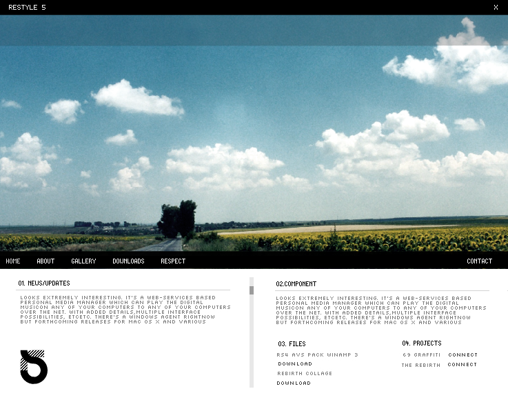
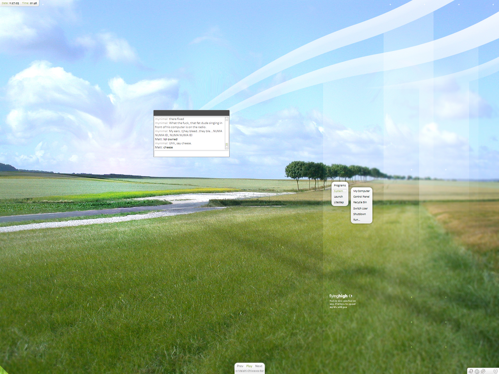
Once again this is another peice that i dug up but also modified slightly.Related content


Comments: 97

I have just look at the web interface gallery... there are too much website of you in the top favourite list...
Gret job.
 (Wink)")
👍: 0 ⏩: 0

Huge banner vs small content area - I always love this ratio
👍: 0 ⏩: 0


Looks great  (Smile)")
👍: 0 ⏩: 0

")

Dude those two are to hard to pick. There both awsome man!!!
👍: 0 ⏩: 1


I like this one better than the darker one in your scraps, m8.
This one looks more friendly, open and almost screams "WELCOME"
👍: 0 ⏩: 0

I'd say this is your best work. Best colours, good equilibrium between header and main part and I like the small "close window" button in the upper right corner.
Fav!
👍: 0 ⏩: 0

i usually like photos with the kind of color balance you used in the other scrap version of it but i must say i prefer this one a lot better. It needs this color vibrancy to live!
👍: 0 ⏩: 0

mmm looks like the sky picture is not of the best RESOLUTION, like if it has broken dots all over it...
👍: 0 ⏩: 0

very cute! clean and nice... i like such web sites
👍: 0 ⏩: 1

nice one, simple, but clear and clean, great.
👍: 0 ⏩: 0

this one is better, the other looks washed out.. this one is so much more vibrant
👍: 0 ⏩: 0

Nice work. I'd say this is better than the one in your scraps. Vivid colors work better for this layout.
👍: 0 ⏩: 1

yep i made up mind to use this version. thanks for your input.
👍: 0 ⏩: 0


Very Very Beatiful, the picture on the back is amazing.
One question, wich font did u use for this great layout?
👍: 0 ⏩: 1


Bold choice with the large header. Though the rest of the site's content are seems a bit dull in comparison.
👍: 0 ⏩: 1
what do you think of this? lowered the sat : [link]
👍: 0 ⏩: 1
Content seems more vibrant, but it's still a little plain. Need's more graphical interation with the image.. maybe some vector sunflowers or something..
👍: 0 ⏩: 1
i understand what you are saying but im not going for that type of look or feel. thanks anyway.
👍: 0 ⏩: 0


v. nice, did you take that picture yourself?
also, i really love the way you're consistent with your navigation and stuff. how do you present those interfaces, flash, etc.?
👍: 0 ⏩: 0

Good design, I have nothing to complain. Or maybe some editing to the picture would make it even better, like more contrast, slight desaturation and maybe a little hue change.
👍: 0 ⏩: 1
hey i remembered your comment from last time and did the disaturation i will upload it into my scraps if it lets me. da is acting up today. thanks for the fav
👍: 0 ⏩: 0
well, i have to say it, but this is one of your best yet... congrats
👍: 0 ⏩: 0


The lines of the horizon in the picture complement the horizontal lines in the lower half quite nicely. Great layout.
👍: 0 ⏩: 0

I have not been to Deviant in while.. well I [i]have[/i] but i have not found the feeling to actually comment on anybody's work... although, when I went to the site (www.deviantart.com), yours was on the front page, and it looked appealing.. so I clicked..and I looked at it, and I see it is in this category, that I am not familiar with..
"Designs & Interfaces > Web Interfaces"
I think you have a beautiful "web interface". I am not sure whether that picture is yours or not, or what this is supposed to be, but I liked it. I will say that this has been the only thing that has made me feel like commenting on a person's work since May.. I believe? You know... there is something appealing to that picture, and also the fact that in your little paragraph there, it is an interface for something that you call, "digital musicon".. I am not savvy in this department at all, nor do I understand the nature of this category, the point behind it.. but the style of this website you have made, is lovely. I like it.. it feels fresh.. open.. inviting.. it makes me want to explore more of this Restyle 5 world you have created..
Truly,
Karen
👍: 0 ⏩: 0

this is awesome.. so professional and clean as usual
👍: 0 ⏩: 0
<= Prev |