HOME | DD
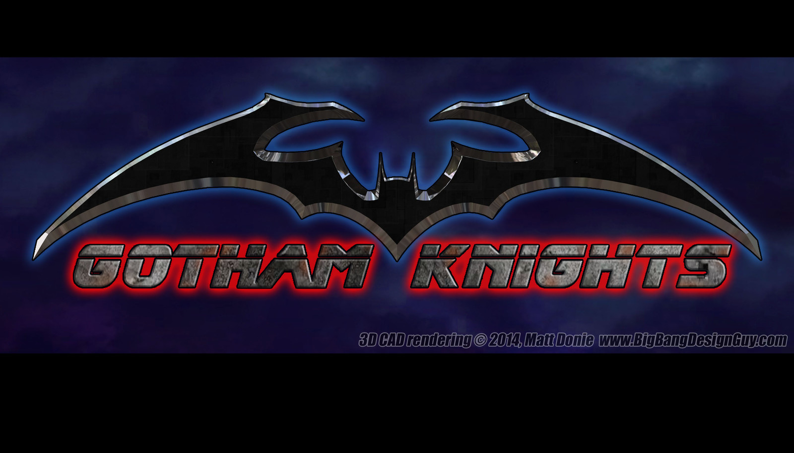
 Ravendeviant — Bat Emblem 04
Published: 2014-05-13 21:18:54 +0000 UTC; Views: 1394; Favourites: 12; Downloads: 33
Redirect to original
Description
There have been many versions of Batman's famous "Bat emblem" over the years. Here is my take on this iconic "logo" design. I wanted to give the design a fresh "dangerous" look, so I gave the bat some exaggerated "shoulders" and pronounced "claws" (like a pterodactyl) at the tops of the wings. I also like the wings positioned high over the head to give it a more ominous look. The sharp metallic edges make you wonder if this is actually a razor-sharp batarang, and the subtle black "techy" texture hints at Batman's many high-tech gadgets. I hope you like it.