HOME | DD
 readme-txt — Layout - Office Equipment

Published: 2006-07-28 09:53:20 +0000 UTC; Views: 1871; Favourites: 7; Downloads: 111
Redirect to original
Description
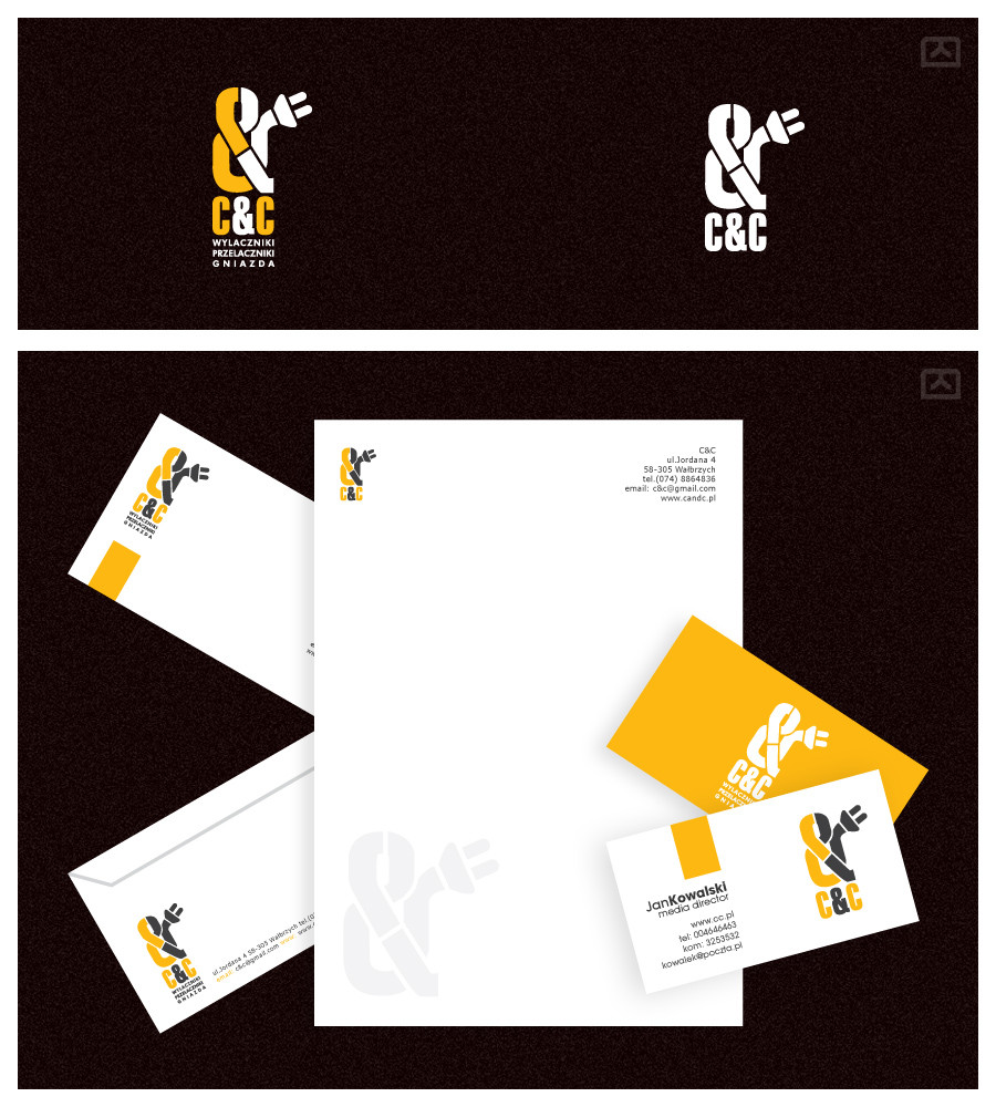
A small layout ... they didnt want too much eye candy so I tried to keep it simpleEdit: They wanted to see da slightly differen color-scheme ... so I did a yellow/gray based subpage.
Related content


Comments: 10

great layout: clean, simple, elegant, appropriate colors and fonts, and great choice of photos for the header.
👍: 0 ⏩: 0


Thanks for all the comments  (Smile)")
👍: 0 ⏩: 0

yeah, simplicity isn't bad. i'd say simplicity in design 'ist ziemlich gut'.
i find it funny you have the 'nach oben' link on such a short page... tempalting isn't good, mr.
the horisontal blue line next to the 'firmenprofil' in menu is no good. looks odd to me.
not a bad photo in the top are. i'd set all the lights in equal position. they look too disharmonic this way. disorder doesn't suite here imho.
left bottom greyness (under the 'fr. 08.00...') is odd.
generally, i enjoyed the design. cheers.
 (Wink)")
")
👍: 0 ⏩: 0


")

