HOME | DD
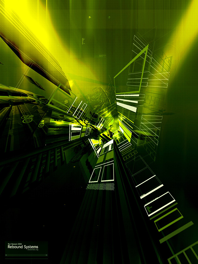
 recussion — Rebound Systems
Published: 2004-06-23 17:19:59 +0000 UTC; Views: 535; Favourites: 15; Downloads: 243
Redirect to original
Description
digital abstract imaginationsRelated content


Comments: 25


luv this 1 too.. but its kinda like an industrial art..however a 
")
👍: 0 ⏩: 0

I can't believe I didn't comment on this yet.
This is just awesome man. I love the 2d typo that has depth.
Awesome colors too, goes so well together.
+fav
👍: 0 ⏩: 0


this is fukkin' awesome man, im gonna fav it and put u on my watch list
👍: 0 ⏩: 0


tight renders but i think a variation in color wouldn't hurt it.
 (Wink)")
👍: 0 ⏩: 0

ik vind em wel lekker hoor : )... eens anders dan dat je normaal ziet kwa kleuren en perspective etc
👍: 0 ⏩: 0


great colors, render and very nice typo except for most of the perspective rectangles, and those little circles on the left. I see you're really improving in typo work, and this is a very nice image.
👍: 0 ⏩: 0

looking good recussion, nice to see your submitting work. The best part about this is how the color grabs my eyes and makes me explore it more. Great work
👍: 0 ⏩: 0

Nice work. Interesting combination of perspectives and some fresh colours. :]
👍: 0 ⏩: 0

absolutely amazing, im drawn back once again,
and definatly a devWatch!
👍: 0 ⏩: 0


thats awesome, i love the colors and small details, really make this piece stand out.
👍: 0 ⏩: 0

whoa, this impressed the hell out of me. well done.
👍: 0 ⏩: 0

nice shit bro!
ull get a
👍: 0 ⏩: 0

Lkkr, hier kan ik het wel mee vinden.. +fav
wat beter had gekunt eigenlijk niets, hij is goed zo
👍: 0 ⏩: 0

 (Smile)")

Hmm , it's allright I guess , the color scheme is nice and the typo is ok but the perspective is all wrong not that of the structure model but of the perspective " linework" and should be ( in my oppinion ) more transparant.
just my 2 cents .
👍: 0 ⏩: 0

