HOME | DD
 rg-fn — fn the hive - version b
Published: 2002-10-11 18:06:19 +0000 UTC; Views: 878; Favourites: 7; Downloads: 85
Redirect to original
Description
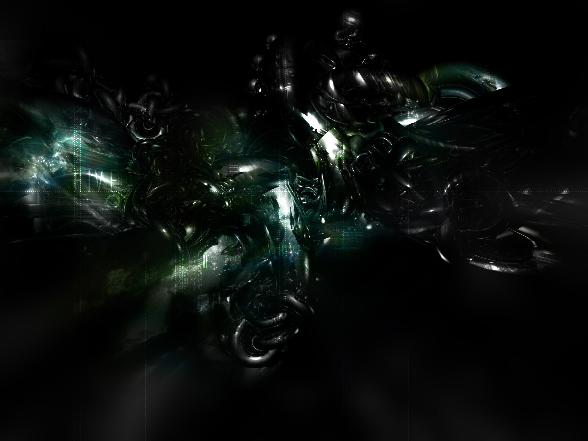
ive been making a lot of crap recently which is really annoying me. So i sat down and set out to create a really stunning image to redeem myself.This is what i came out with, its sort of a follow up to 'hive' . Well the same theme and some of the same renders.
Spent ages working on this so i hope you like it. Please comment even if its just a few words - i need your input!
Related content


Comments: 22


hey rg, so u did finish that render after all, nice one. yeah this is sweet man. itd look sweeter if it had some of your signature rg lighting skills thrown in there.
👍: 0 ⏩: 0

that´s a truly great style
u better keep up with it for a while
👍: 0 ⏩: 0

Very very nice mate, i like the dark view of it a little mystery
Keep it up
Ik.
👍: 0 ⏩: 0

it's,...um,....dark to say the least. heh, good work.
👍: 0 ⏩: 0

very nice man, its oh so dark and mysterious, i like, ah ha.
👍: 0 ⏩: 0

I mean do "without". Forgot to add that i love the simple typo you have done to it.
👍: 0 ⏩: 0
Like it. The forms are complex looking which is a good thing.
One thing you could do away is the alien font just below the title "HIVE".
👍: 0 ⏩: 0

thats so cool! great 3D work man, you should make it a walpaper
👍: 0 ⏩: 0

GREAT, love how dark it is and everything all around. yeah, this does deserve more comments...
👍: 0 ⏩: 0


this kix ASS! awsome shit here! snooger is right.... u should b seen more man!
👍: 0 ⏩: 0

WTF?! only 4 comments and 2 fav's? u r underrated my friend
👍: 0 ⏩: 0

holy coW!
that's amazing. great dark piece. good work
👍: 0 ⏩: 0

Im shocked this only have 2 comments, it really is stunning. Wicked work
👍: 0 ⏩: 0

holy f'n shit. +fav for sure . you improved it tremendously
👍: 0 ⏩: 0