HOME | DD
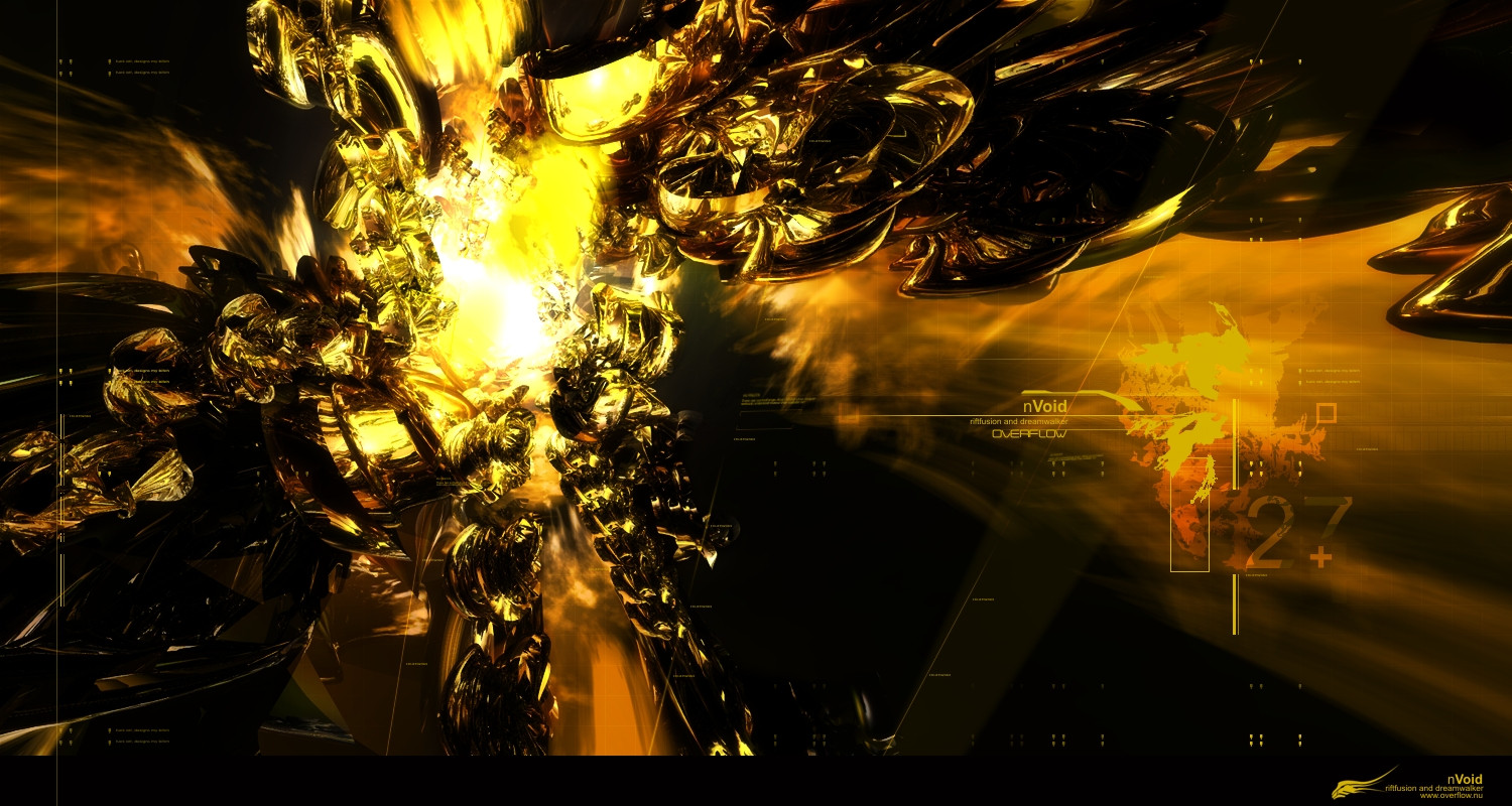
 riftfusion — Arachana Form 02

Published: 2004-06-30 21:42:41 +0000 UTC; Views: 2885; Favourites: 32; Downloads: 3761
Redirect to original
Description
Another study in form and compostion. Some people commented on my other form piece. Saying that it looked like a spider. So I did a little creative tinkering. Webbing sort of 3D and elements. I hope someone can use it as a background. (Smile)")
(edit): I lowered the opacity of the bottom right corner element. Never meant it to be so opaque.
")
Related content


Comments: 57

i like it
")
👍: 0 ⏩: 0

nice study again.-
crazy render and good 2d parts.
greetz bro
👍: 0 ⏩: 0

Nice 2d bud, i like the colors too, not a big fan of the render tho. Overall looks nice.
👍: 0 ⏩: 0


Exceptional work.
 (Cool)")
👍: 0 ⏩: 0

awesome! definately going to use it as my wallpaper
👍: 0 ⏩: 0

Woow nice WP!! I smacked it right to the desktop!
Btw. Yes it doe look like a spider jumpin in from the right.. If you could make it more obvios that it is indeed a spider i think it could get more interresting
👍: 0 ⏩: 0


I think it looks like a horse charging through water, with a fallen knight on it's back...but that's just me...
👍: 0 ⏩: 0


i love it, looks kinda like a winged horse to me... nice job
👍: 0 ⏩: 0


Whee- love this! Kinda reminds me of a horse... maybe with wings, I can't tell  (Wink)")
I love your talent with digital skills. I can do nada in that area, so I admire you greatly for it
👍: 0 ⏩: 0


Yeah cool render and texture which programm did you use?
👍: 0 ⏩: 0

Whoa, it looks like it's made of black glass and water...
👍: 0 ⏩: 0

weird mix of colors and models, but nice result. unusual is a must
👍: 0 ⏩: 0


sorry, just don't dig it, the render is way too sloppy and the 2D stands out too much, no blending
👍: 0 ⏩: 0


looks sweet bro 
👍: 0 ⏩: 0

It looks very technical but also very basic. (compliment by the way) Looks like thick brushstrokes of paint but on closer inspection you see detail and a very technical looking erm thing!
Very nice.
👍: 0 ⏩: 0


Impressive! One of those that look ho-hum in a thumb, then makes your eyes open wide when seen full size. good work.
👍: 0 ⏩: 0

very nice work, I wonder why more people didn't comment on it.
👍: 0 ⏩: 0

I like this one........
Gives me the sensation of destruction but on the other hand of something that is being created...
Good work

👍: 0 ⏩: 0

I dislike the composition, but is like the style of 3d. Then again, i think the background really isnt cutting it. I see an interesting 3d style, but its not put to use very well. You can do better.
👍: 0 ⏩: 0

interesting, but the alising and the pixelation just ruin the whole image.
👍: 0 ⏩: 0


muy pero muy interesante
me encanta
suerte!!!!!!
👍: 0 ⏩: 0


Hmm, I dont man I dont think that shape works very well with the color of the bg....stands out to much and no real blend...the 2d is cool though, and not overdone....its not bad though.
👍: 0 ⏩: 0

very cool man, has a sec type of format to it, love it awesome job. Colors everything awesome job
👍: 0 ⏩: 0

2D and background are cool..but the render...hhmm.....??
👍: 0 ⏩: 0

that is a flippin' crazy render.. wow. and your 2D sets it off impecibly... damn dude. ahhh, okay.. i'm speechless

👍: 0 ⏩: 0

some parts of the render look great others not so great. sorry!
👍: 0 ⏩: 0


great composition on this. the webby things on the left are the clearest renders that you've done, and personally i'd like them a little bit sharper. the color scheme is great.
👍: 0 ⏩: 0

some parts of the render look great others not so great, but generaly its pretty good.. but I still don't like the incorporation with the rest of the image.
I don't like the blurred forms in the background up the top. and I don't find the colour of the BG complementing to the render. and again the 2D stands out a bit to much.. seeming to be its own thing, not helping the flow very much.
still good work though.
👍: 0 ⏩: 0


very original......the 2d shows up a lil too much tho try lowering the opacity
👍: 0 ⏩: 0
| Next =>