HOME | DD
 riftfusion — SpatialVerge-Nighseara

Published: 2003-06-14 19:29:19 +0000 UTC; Views: 2060; Favourites: 10; Downloads: 176
Redirect to original
Description
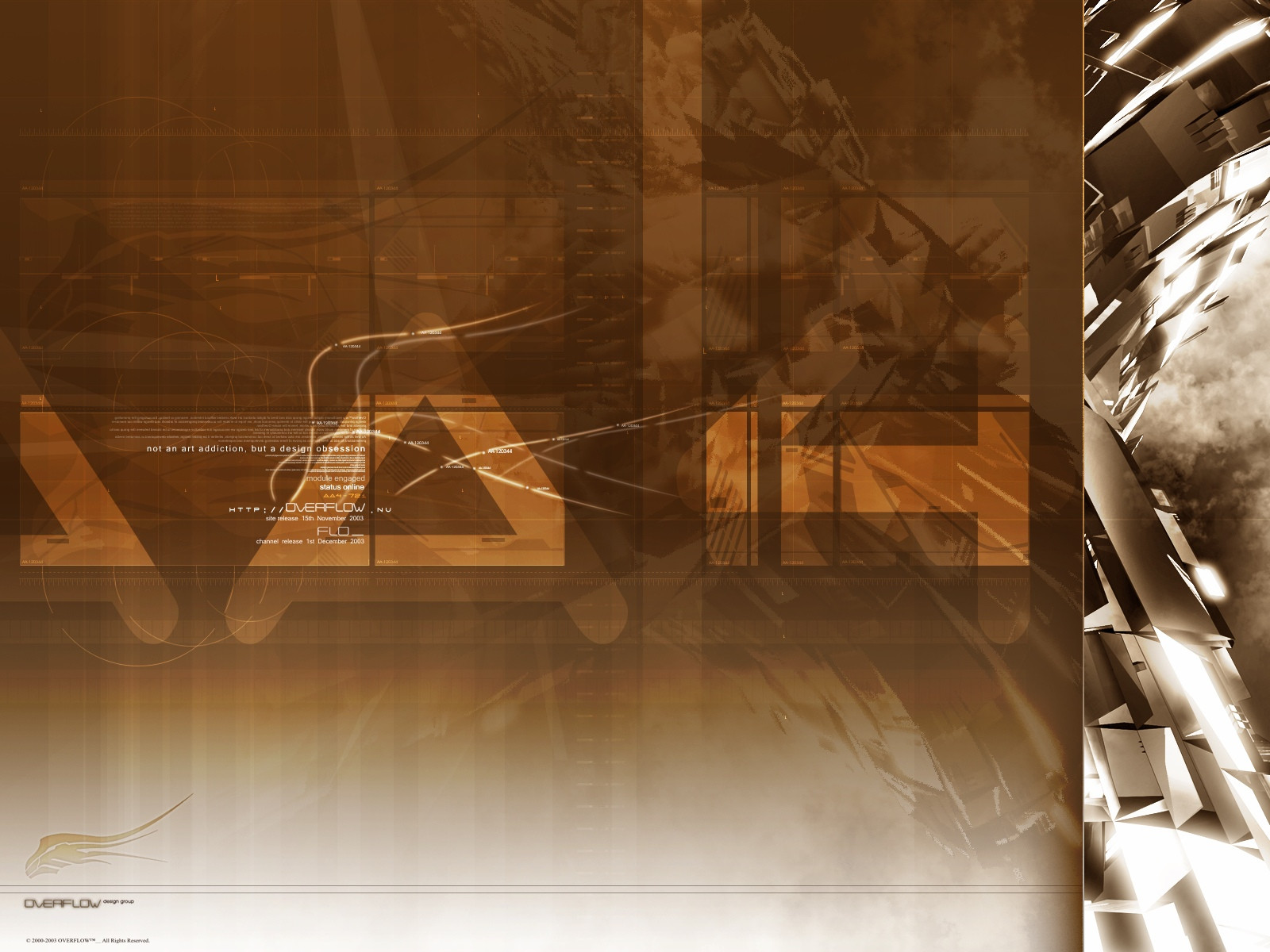
Well this wallpaper is based on the indy art I submitted a few days ago. And a comment on it got me thinking about the piece. So I went back and did this wallpaper. And this is the first piece with my new logo. I think the next piece will FOR SURE not be blue. Been using the hell outta it.Related content


Comments: 15

very nice piece and render. this seems to be one of your style right?
 (Wink)")
👍: 0 ⏩: 0


YOINK aah a new background worthy of my pc... finally!
👍: 0 ⏩: 0


Very nice piece here, very nice clean render, but i think the 2d could either have less opaticity and more detail of it or none... It kinda takes your eye off the piece behind..
But amazing work
👍: 0 ⏩: 0

Concept: 10/10
“This is damm good, I love how instead of making something in the middle you randomized it.”
Effect: 10/10
“Can’t complain in this department”
Effort: /10
“looks good as hell and from what I can tell, you know abstract well”
Trendyness: /10
“N/A –And this really doesn’t need any”
Brushwork: /10
“The brushwork in this is amazing. You’re my new idol man.”
Overall: 10/10
“I can truly say there is no way this can be better, maybe some more airbrushing but there is no way. You get nothing but props from me”
👍: 0 ⏩: 0

I absolutely LOVE the renders.
Great job on the lighting too.
👍: 0 ⏩: 0

FREAKING AMAZING!
I love it! The effects you used were awesome! great job!
👍: 0 ⏩: 0


nice work
im loving the 3d model and lighting. the 2d coulda matched more with the 3d i think or maybe no 2d at all. the typos nice as well
👍: 0 ⏩: 0
