HOME | DD
 Robert-Shane — Darth Vader - seeing red

Published: 2010-11-10 22:29:53 +0000 UTC; Views: 26502; Favourites: 483; Downloads: 2707
Redirect to original
Description
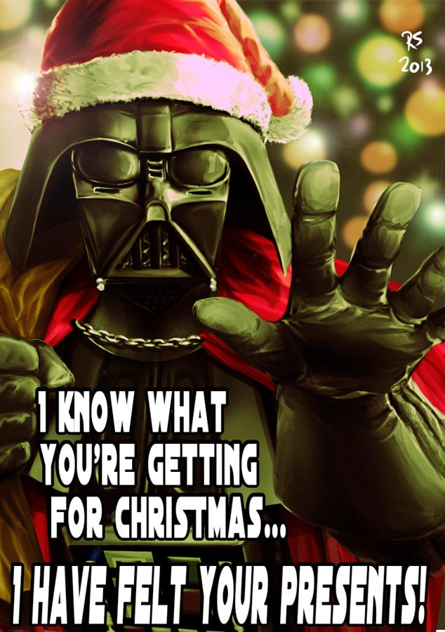
There are lots of pictures of Darth Vader around. But I don't think many of them make the most of the character and end up with him looking like he's just standing waiting for a bus. So I wanted to draw him in an original, almost comic-book style - and try to make him look really evil and menacing.This is a completely original piece drawn in Photoshop with a Wacom tablet.
Hope you like!
Related content


Comments: 93
 (Smile)")


Thanks Dee. You have a great talent yourself - in particular your Sade picture is perfect!
👍: 0 ⏩: 1

you're welcome...and thank YOU...much appreciated!!!
👍: 0 ⏩: 0

"Standing waiting for a bus"... HAHAHAHA!!!! This is so funny!
Now he reminds me of when he was in that Duracell bunny commercial.
👍: 0 ⏩: 1

I love the effect and the lighting. Details are great too. In my mind, the "mouth" (lower part of the face) is too low.
👍: 0 ⏩: 1
The 'mouth' grill on Darth Vader's mask actually projects out quite a bit - Ralph McQuarrie's design influence was a dog's snout. So when viewed slightly angled downwards - like how I've drawn it - I think the perspective would make it appear lower than if viewed straight on.
Thank you for the thoughtful comment though - I appreciate you taking the time to look at my picture.
👍: 0 ⏩: 1
I understand perfectly what you said. But however, it appeared strange to me, the first time I saw it.
👍: 0 ⏩: 0

VADER: Where the hell is that bus?!!!!
seriously, though. great job and accurate observation about most vader pics.
👍: 0 ⏩: 1
Haha! glad it's not just me on that then!

👍: 0 ⏩: 0


Indeed! They don't come any meaner.
👍: 0 ⏩: 0

 (Wink)")

You definitely got the evil and menacing down pat. Love it!
👍: 0 ⏩: 1
Evil and menacing is what Darth Vader does best!
Really impressive gallery btw - extremely well put together

👍: 0 ⏩: 1

wow, this is really good! I don't see how this is not like getting a gazillion favs!
👍: 0 ⏩: 1
Thanks Kamkam. I like it and so do a bunch of people here - so I'm happy. And a quantity vote isn't necessarily a quality vote!
👍: 0 ⏩: 0

Every well drawn, I admire such talent you've expressed into this!! Absolutely wonderful texture along with fine toning, the image clear to see with well-shaded outlines. The creativity is great as intended, and I am impressed with this!! Well done, 10/10 of course!!
👍: 0 ⏩: 1
Thank you! but... only 10/10 ?
I was hoping for 11/10 !

👍: 0 ⏩: 1
No Problem, it seriously was worth going over your art!! I really admire it and hope you continue to make submissions because yours is worth seeing ^_^
👍: 0 ⏩: 1
Very kind. Thanks again!
👍: 0 ⏩: 0

Awesome... just awesome.
Love what you have done with Vader here and the red lighting just makes him look all the more evil.
👍: 0 ⏩: 1
Thanks Simon. I thought the red lighting would help set this off. I'm a big fan of the red/black/white combo - except, of course, in a World War 2 context!
👍: 0 ⏩: 1
I concur, it works very nicely.
👍: 0 ⏩: 0

Thanks man. I remember seeing your At-At picture from a few days ago - great work!
👍: 0 ⏩: 1
No problem - that picture is very effective and stuck in my head (I also remembered seeing your version of the cover for John Byrne's Superman #1!)
👍: 0 ⏩: 1
Thank you. Almost as impressive as the amount of Lego stormtroopers you have!

👍: 0 ⏩: 1

Haha, thanks dude! And you're very welcome!
👍: 0 ⏩: 0

Thanks for the compliment. The lighting is everything in this piece - so I'm glad I got it right. Congrats on an amazing gallery btw!
👍: 0 ⏩: 0