HOME | DD
 roobarb — The Forging of the Code

Published: 2001-08-05 16:55:40 +0000 UTC; Views: 437; Favourites: 5; Downloads: 95
Redirect to original
Description
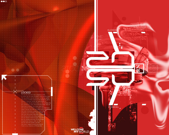
Right then, I have yielded to peoples' comments to reduce the number of colours used, but I decided that hot.. er.. "burning" colours suited this best. But other than that it is the same as "a symbol of the code". Comments are very welcome.Related content


Comments: 1

Though I can't say I agree with the color selection, I do love the shapes in the center. I hope the japanese text says something, rather than just being an effort to be trendy, but I'll give you the benefit of the doubt : ). I guess I like everything except the colors, but that's just me.
-------
..::[apathy is healthy]::..
👍: 0 ⏩: 0