HOME | DD
 rougeux — Communicate -

Published: 2003-03-31 03:58:08 +0000 UTC; Views: 2714; Favourites: 42; Downloads: 491
Redirect to original
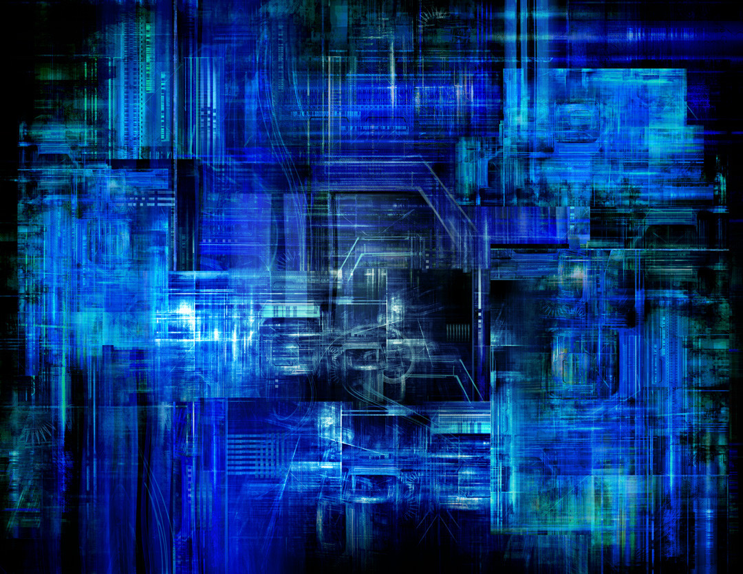
Description
One of three images I submitted for Instance's first pack. Check out the pack and other works here:[ Instance ]
Program used: Ultra Fractal 3.01
Zazzle: [ Print / Poster ]
[ C82.net ]
Related content


Comments: 36

Greetings,
This image is being featured in this news article [link] that is showcasing work, that has been posted in the "Abstract" Digital Art categories here at DA.
If you enjoy the article, clicking the green "love it" icon will help make it possible for more people to be aware as well.
Appreciate,
~hewsan
👍: 0 ⏩: 0

Once again, I was convinced this was a flame! Very unusual work. Another fave!
👍: 0 ⏩: 0


now this is unusual....and AS usual its really really good.......good depth, great message and most of all....its damn good looking....!!!!
.k
👍: 0 ⏩: 0

I really love the glowish feel of it ... awesome work !
👍: 0 ⏩: 0

Nice inner fractal, but I hate the jagged edges on it. It makes it look too collagey for my tastes. Otherwise though, what can I say? I love blue!
👍: 0 ⏩: 0


wow! very nice man... i love that effect you used, i tryed something similar on one of my fractals and it did'nt evem come out half as good as that!
👍: 0 ⏩: 0

reminiccent of RKO radio mast thingy....
nice work
or was that pathe ??
👍: 0 ⏩: 0


You never cease to amaze me. Good grief, can you share that talent with the rest of us?!?
Great work!
👍: 0 ⏩: 0

Cool shades of blue...
Is this a fractal? Am I too stupid to see it? How the hell do you do something like this in UF?
weird, yet very nice.
👍: 0 ⏩: 0

Son of a... This would look great on my wall. Or any wall. Any wall, digital or physical, would benefit from this pic. It is a thing of beauty. Another thing that it will look good in will be my list and wishlist. Great job.
👍: 0 ⏩: 0


Very cool. The blue tones are great. I also love the repetition of forms...
👍: 0 ⏩: 0

the different tones of blue and the lighting effects is so nice to look at in this image...
👍: 0 ⏩: 0

Love the blue. Great to see something different in fractals.
👍: 0 ⏩: 0

Dude is that even posible to do in ultra fractal. I love it.
👍: 0 ⏩: 0


Lovely work, really liking the composition you got going here
👍: 0 ⏩: 0

Neat concept. I donät have so far any constructive critisims to write, so I'll just stick with " I like you picture".
👍: 0 ⏩: 0


The signal radiation thingmajiggy is what I like best about it, though I can't help whishing that the rest were more dynamic and flowing... somehow I don't like squares that much. Personalt taste imho.
👍: 0 ⏩: 0

I like the difference in the textures across the image vertically. If I knew more about fractals I could be more specific, but I can say that you seem to go about 5 extra steps with your fractals and turn them into incredible art. This is on exception.
👍: 0 ⏩: 0

wow nice!
i like the pattern of the curves and the blue is nice as well
👍: 0 ⏩: 0

All i can say is wow this is by far the best yet my fav+ so far i like out you jumped from your normal style and did something new like this Tight design
👍: 0 ⏩: 0

Wow! This is amazing! I don't know how you made this, but it's very good. A great example of a fractal in a nice style (although not your usual one).
It's a bit like the mainframe one you did only better I think. I love the loops coming from the top of each iteration. Great choice of location too.
👍: 0 ⏩: 0

Looks like corparate shows, telecommunication head quater and its branches. Nicely done.
👍: 0 ⏩: 0


I was waiting for this one (i took a look at the pack friday) and this one is my favorite of the three. Sculptor is amazing, but this one is really different, really good use of a not too often used formula.
Beside that, the title fit perfectly the image as the other way around. I dont know if you usualy start your fractal with a previous idea in mind or you choose your title from what came out of it, but one or the other, the overall result is always great.
Nicely done!
👍: 0 ⏩: 0

its like one of those mirror images that loop within itself, IN one of those mirror images that loop within itself..yay! ^_^..love it dude... only wish i had a good enough printer for these...they'de plaster my wall ^^
👍: 0 ⏩: 0

Great colour, and the lighting almost blinded me ^_^
Very strange geometric layout here...it doesn't seem to have the same flow as your other pieces...but I think the asymmetry paired with the lighting/shading kind of adds to its charm. It kind of grows on you. ^_^
👍: 0 ⏩: 0


Hmm... I like the design, but the 'fractalization' is a little too boring for me... too simple. Overall, I like it, but I don't think it's your best....
👍: 0 ⏩: 0

just so cool!
the intense blue really caught my attention!
👍: 0 ⏩: 0
