HOME | DD
 Roygenbas — MatteRenderingTest Colored
#robotgirl
Published: 2023-03-24 21:35:32 +0000 UTC; Views: 179; Favourites: 3; Downloads: 0
Redirect to original
Description
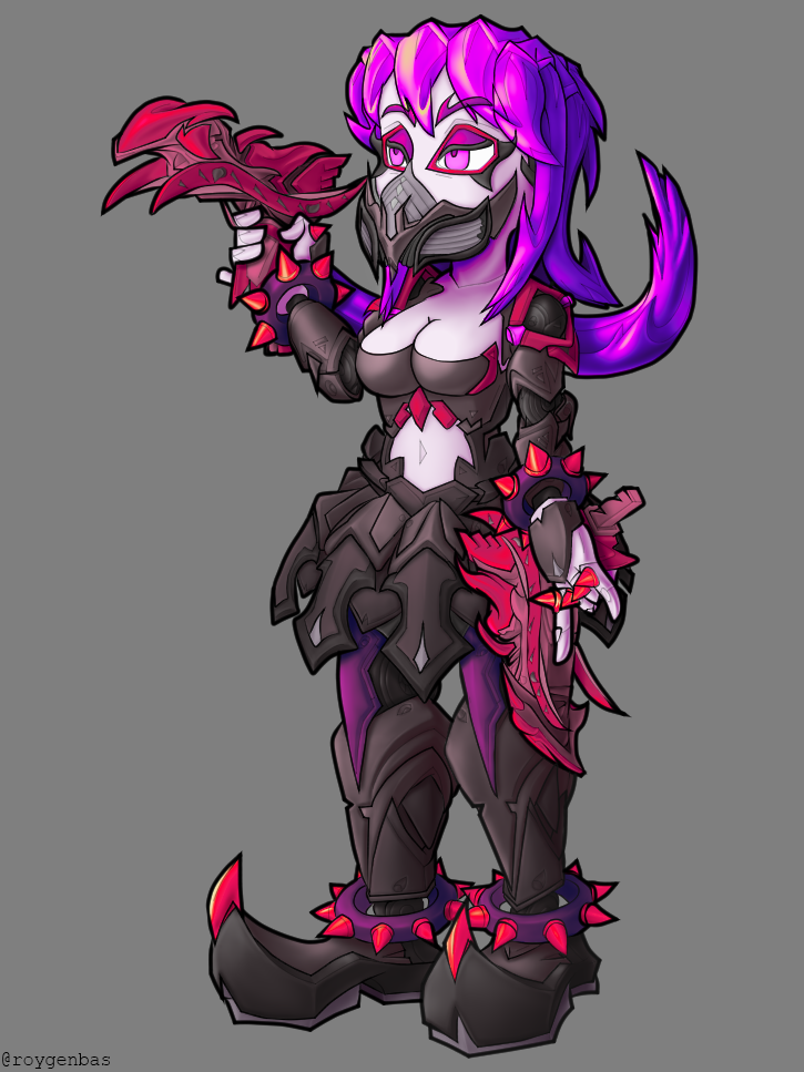
So for this image I took a completely different approach than what I usually take.First, I read "How to Render" by Scott Robertson and did a couple of the exercises. Mainly I paid attention to some of the matte rendering tutorials that were used for vehicles in that book. I could post the results online, but I think it's taboo to post what is essentially a duplication of an image you would find in an art education book. Anyway, Scott Robertson's resources introduced me to the soft brush tool, which I was never really able to figure out.
So to make this image I did the following:
1) I created a rough sketch in Clip Studio Paint and spent some time coming up with details.
2) I used the Vector layer feature in Clip Studio Paint to create smooth lines for the character. The outer border is a thick line, the borders separating colors are thinner lines, and then there are some very thin lines in there for details.
3) In grayscale, I shaded the character entirely, using what I learned from "How to Render", assuming that the character was a statue made out of a single gray material like clay or stone. To do this I used the soft round brush tool in Photoshop with a very small amount of pen pressure sensitivity, so that several strokes were needed to create significant value changes. This allows me to be more free with my movements without drastically changing grayscale values. Also in Photoshop I had to make sure that the image used 16-bit color depth or else color banding artifacts would appear due to integer rounding errors with the semitransparent pixels of the soft round brush.
4) In Photoshop after the grayscale image was complete, I use gradient maps to color the various sections of the image. Gradient maps are basically magic because they allow you to interpolate between vastly different colors in an extremely smooth fashion. I'm pretty sure I'll only be using gradient maps to color images from now on, otherwise blending colors seems like an impossible task to do perfectly.
This piece took quite a bit of time to create, but I'm very happy with the result.
One more thing, I posted this image on Twitter and it seems that the Twitter version got horribly compressed while the DeviantArt version is very sharp and clean. Not sure what's going on there.


