HOME | DD
 rsp — devID-rsp v2

Published: 2001-10-23 15:13:52 +0000 UTC; Views: 394; Favourites: 4; Downloads: 35
Redirect to original
Description
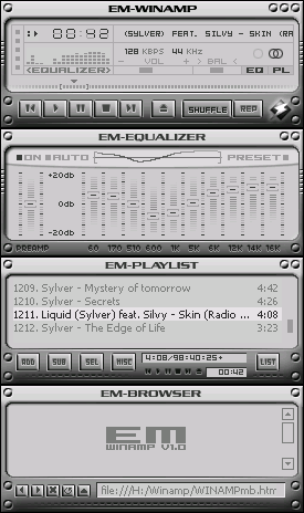
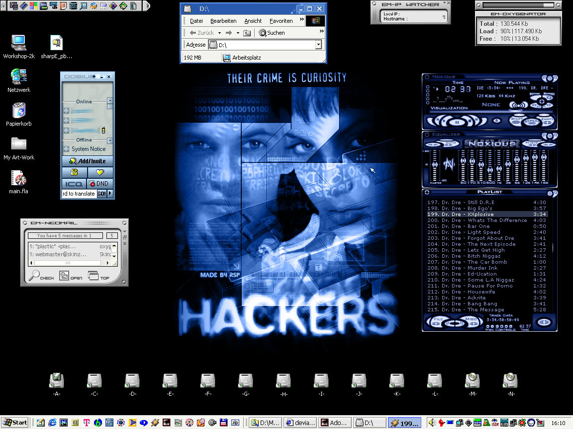
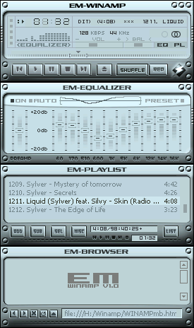
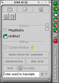
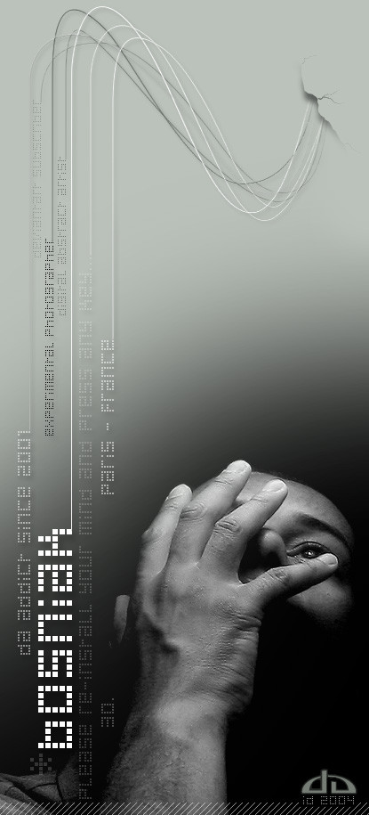
My devID...but somehow I do not really like it yet. Maybe I could do some changes later.*** Update ***
I think now they is ready. I reduced the size and made still some changes.
Related content


Comments: 7


Man well I like this ID its alot better than mine, mine looks like shit to this LoL.
👍: 0 ⏩: 0

Very nice, devId. Agree. The green is nicer!
But blue also rocks..
👍: 0 ⏩: 0

this blows mine to hell
{ + } d9ine MOooOo
{ + } Disrepute.net
👍: 0 ⏩: 0

awsome design. i like the gren on much better though.
👍: 0 ⏩: 0

Whee... even better than the original! You didn't make trendwhore boxes like I suggested but even better: lines!!
That looks sweet, great devID, one of the best around. (love the blue btw )
https://chosenone-.deviantart.com
Creative Assistant to myself
👍: 0 ⏩: 0

It sure does look great!
The only complaint i have is the colours, a greenish coloursheme would do better here i think. Since devart is green
But other then that it looks very hi tech, and neat!
[Daewon] [Inspecter Gadget] [Secret Agent Man] [Scooby Doo] [ http://www.jeroensmeets.nl]
👍: 0 ⏩: 0