HOME | DD
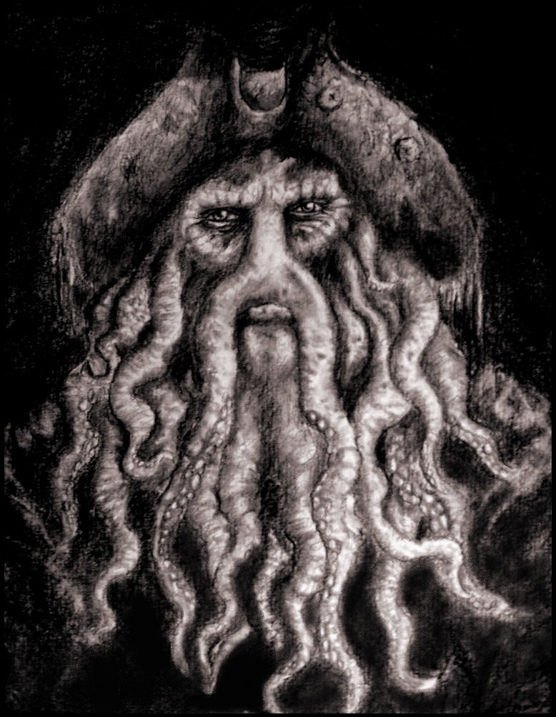
 Ruth-Tay — The Two Captains Fight.

Published: 2006-08-23 01:28:19 +0000 UTC; Views: 4592; Favourites: 119; Downloads: 22
Redirect to original
Description
FULLVIEW PLEASE!As the sun comes up
They start to fight
full of fury
and dispite
Who will winn this battle
between these two?
I wonder who?
Yes I finnaly finished the second edition of the two captians. This is the fight between them.
As you can see they are more detailed en look more realistic. This took me about 16 hours to draw.
The upcoming sun is a great time for a battle as a upcoming sun is. It shows more emotion and it nice to see.
I'm even happier with this one than the first.
The third may be better... I have no idea.
The swords were difficult, I just coulden't figure out how to get them right.
The mouth of jack was really irritating! and i'm stil not really satisfied with it.
It's done on Ps Cs2 with the mouse. No lineart. About 20 layers.
Anyway I hope people like it and if you have any critics go ahaid and say it! I need some tips.
Greetzz Ruth.
Edit: I've made the swords more detailed and gave jack his gold theeth, I think it's better now.
Related content


Comments: 84

That is very impressive.
I especially love the detail in jones face.
Great job.
👍: 0 ⏩: 0

Astounding work. I love the amount of detail you put into it, especially on Davey's face. +fav
👍: 0 ⏩: 0

This is really excellent work - you've obviously put a lot of time into it. The area that stands out as being absolutely superb is Davey Jones' face - the detail and the texture are both perfect.
The swords look a bit blurred compared to the rest. Perhaps some extreme highlighting along the edges could help, but I'm no expert. I think Jack's mouth needs to be a bit more upturned in the top corner, and possibly a bit wider - the best way to get it right though would be to take a photo of someone snarling and use it as a guide. There's also something about the angle of Jack's right arm that makes it look a bit short and stubby. The position of the hand is fine, but I think the forearm itself needs to be tilted downwards more.
Wow - that looks like a lot of criticism! But I hope it's all constructive, and this really is an amazing piece that you should be very proud of. I couldn't achieve anything like this!
👍: 0 ⏩: 0

Wow thats really good. I like how there aren't any clearly defined lines but the image is still strong and sharp
👍: 0 ⏩: 0

The textures on Davy Jones are FANTASTIC.  (Smile)")
I also love the highlights on Jack's nose!
A few suggestions: one thing is just that I think that Jack's chin and lips are a little flat, I think that's why you might not be totally satisfied with it. I'm also wondering about the background, the colour seems to clash a bit with Davy Jones - perhaps a more subtle background colour would have worked better? You might also want to try and make those swords look a little sharper and shinier.
However - this piece is truly dramatic and captures both characters well (especially Jones!!!) so really, really great job!
")
👍: 0 ⏩: 0

wow, u did that with a mouse? Bloody good, well done!
👍: 0 ⏩: 0

ruthy, this is great, I remember your "Davey Jones" drawing, you really are good
👍: 0 ⏩: 0

very nice work, i love all the detail that you put into their faces and the colors are really great. this looks like it took a lot of time
👍: 0 ⏩: 0

Hmm, I liked the first one better. De faces are great again (except, as you said, Jack's mouth), but the hands seem a bit out of focus to me. Jack's hand is a bit too big, and Davy Jones hand a bit too small, but apart from that the hands are good.
I really like Davy's head, again absolutely marvalous how you did that! Can't wait to see the third one (drawing and movie!  (Wink)")
👍: 0 ⏩: 0

i agree with you about the mouth... but all in all, it's freakin' awesome. I bet if disney saw this, they'd want to hired you right away, after a small interview, of course.
👍: 0 ⏩: 0


Wooow! Impressive!! You did an awesome job! ^_^
👍: 0 ⏩: 0


Davvy Jones looks fantastic! Jack Sparrow looks really good too! Nice!
👍: 0 ⏩: 0


No they didn't but it would be way cool if they did! maybe in the third movie...
👍: 0 ⏩: 0

Did those two accually fight in the movie? I can't remember. Oh well, great picture!
👍: 0 ⏩: 0
Yeah, i'm stil not really happy with the swords eather. I may edit this. but thanks though!
👍: 0 ⏩: 0

Yes, very good job on this. As you've said already, though - the swords are off. They just seem very smudged and don't seem to match the rest of the piece. 
Other than the swords, though, you did an incredible job.

👍: 0 ⏩: 0


")


Geez! Wow, on the computer? Nice, I can't even draw a decent heart on the computer thing..Haha
👍: 0 ⏩: 0


WOW. pure awesome. you deserve SO many favorites and comments on this.
and i'll help you there O:!
👍: 0 ⏩: 0


<= Prev |