HOME | DD
 sally-acorn-fans — Super Sally Contest Winner
Published: 2004-05-29 14:40:44 +0000 UTC; Views: 3114; Favourites: 30; Downloads: 334
Redirect to original
Description
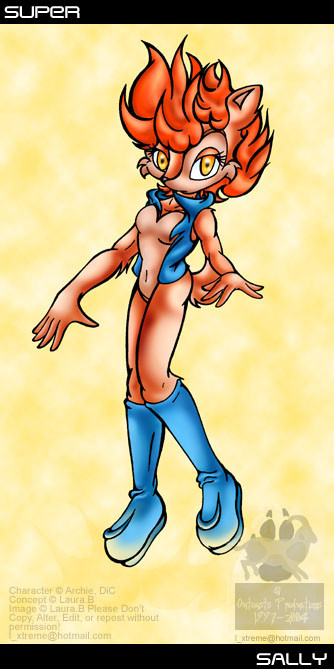
pic by Winner of the Super Sally Contest.outcastsproductions' description:
Fwee! Lookit the bright colours!
")
For the ~sally-acorn-fans latest contest, draw Super Sally. The contest goes for about two months, but knowing me I'd get lazy and not enter, and I wanted to! .. Enter, that is, not get lazy.
Anyway, I was going to colour her hot pink, you know as a silly homage to 'prototype Sally' (remember in the pilot episode of SatAM Sally was pink? And for a while in the comics?), but someone else bet me to it. So I made her a bright copper colour with firey red hair and spiffy amber eyes (sense a theme? 'cause I don't...).
Ignore the background, it's ugly and bright and it burns.
And I drew Sally with her vest! And it looks all right! Hell has frozen over yet again.
Related content


Comments: 11

they should make that a cover of a sally acorn game if they ever take sally to be in a sonic the hedgehog game
👍: 0 ⏩: 0

Excellent, OC!!! Great Super Sally I could have imagined.
👍: 0 ⏩: 0

Wow.
This is cool! One arm is too big, but so what.
👍: 0 ⏩: 0

YOu, sir, have blown my mind... that is such a cool idea!
👍: 0 ⏩: 0

Needs work on the arms... theyre out of scale with her body, her right arm seems longer and larger than her left, and the left hand is... well... yeah... A tip I can give you that allways works, is stand infront of the mirror, and pose as youd like the character to pose, then draw it out just like in the mirror. anyway heres my review
Originality: 5 (not your character)
Detail: 9
Simatry: 6
Perspective: 3 (Right arm looks iffy and the left... why is it smaller?)
Coloring: 10 (cant argue here ^^)
Total Review: 5.8 Try a bit harder, otherwise dood Good Job, Im not much of an artist but I can determine a good pic from a bad one... thisone isnt bad... just needs a bit more effort into it its all ^^ kinda seems like you rushed it. Keep up the good work and someday you might be workin for Archie COmix
👍: 0 ⏩: 0


I also salute you and your outstanding work on this one, OC! Keep up the good work!
👍: 0 ⏩: 0


