HOME | DD
 Sayael —
Moonlight Shadow - Collab 02
Sayael —
Moonlight Shadow - Collab 02

Published: 2005-04-03 13:37:30 +0000 UTC; Views: 23974; Favourites: 733; Downloads: 7504
Redirect to original
Description
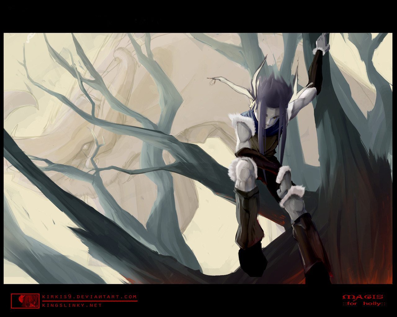
Here's another collaboration with AzuChan.She liked how I coloured the pic of Raijin so she gave me a few other. *lol*
Thats one of her original character... uhm she didnt told me his name. *swt*
Well.... the colouration was splitted on a few days, cuz I always had to think about the colours. I will upload another version without this crappy blue Background... you won't believe how the look changes without BG. *swt*
Greetz~!
Saya
Character-Sketch by AzuChan / A.Manriquez
Inked & Coloured by Saya / A.Strube
Related content


Comments: 129

Its utterly beautiful the way it is. It gives a feeling of a mysterious and maybe even misunderstood character. I love it
👍: 0 ⏩: 0


Whoever he is, he's just radiating cool. Great job on both your parts! Congrats on the DD, as well. +fav
👍: 0 ⏩: 0


Truly an awe-inspiring piece.
The blue on the walls and the moon on the window work beautifully together. Nice job
👍: 0 ⏩: 0

I love the solemn look on the character's face, it goes very well with the theme of the picture. The ghosts and ghoulies are a nice touch adding a threatening, dark feeling and the moon shining through the window adds a nice gothic touch.
I love the blue. ^_^ Nice highlights in the hair and an awesome job on those eyes.
")
👍: 0 ⏩: 0


love it. . awesome lighting and character. really see emotion in this characters face too.
👍: 0 ⏩: 0

Pretty! I love this! 

👍: 0 ⏩: 0

WOW! This is very beautiful! I love the colors, and the coloring job is very well done. I like the smoothness, and the artsy style to it. He looks very expressive, and this has so much feeling in it! I have to go check out your gallery now! ^__^
👍: 0 ⏩: 0


This is really good! It reminds me of Kingdom Hearts!
👍: 0 ⏩: 0


Awsome i love the work the dark colors really bring out the almost mournful or calm look of the face which seems like someone in a silent contemplation it like a story its realy inspiring keep up the good work
 (Smile)")
👍: 0 ⏩: 0

I really like it. Does it go with the song "Moonlight Shadow"? I like the colors. And the mans face and eyes <3
👍: 0 ⏩: 0


👍: 0 ⏩: 0

Beautiful work. I love the little shadow creatures.
👍: 0 ⏩: 0

he is thinking that the darkness smoke thingys are amateurs and he could scare people better than that! muahaha! lol. i dunno...thats just what it makes me think hes saying
👍: 0 ⏩: 0

Really frekin awesome, dude! My only little concrit is that the monster things look a little washed out and unfinished, if that makes any sense. But really, that's not even a big issue. Congrats on the DD.
👍: 0 ⏩: 0

Three words. Wow. (All that is actually three but now there's twelve.)
👍: 0 ⏩: 0

Whooo !
congrats on the daily fave
I hope you get more someday ^^

👍: 0 ⏩: 0

Hmm. The way the lines show up at the edge of the shadows makes it look a little unfinished to me. Maybe you should darken the shadows or lighten the lines?
👍: 0 ⏩: 0

Beautiful Work!!! *applauds* The contrast between the bright moon outside and the dark gloomy room is magnificent. The yellow eyes really do it for me too.... Congratulations!!!

👍: 0 ⏩: 0

OMG! This si awesome! I want to huggle him so much - and I love the shadowy things in the background!

👍: 0 ⏩: 0

wow.. that's realyl good ^^ kinda creepy but really good! i think i'll watch you ^_ ^ w00t~~
👍: 0 ⏩: 0


This is probably the most overrated DD of all time. First of all, the contrasts are lackluster, and the design is not only derivative but unremarkable. Given how well-contrasted the face and trees are, the grayness of this is really flat-out poor. When you look at it, all you see is a muddy gray shape and a ball of white in the middle. I don't mean to be rude, but you really need to learn more about using blacks and greys. Grey is far too neutral to make it look eye-catching enough to be pulled in to. Just switch all the gray to black, with some dark blue parts to make up for the current lack of atmosphere. Really, this is so fundamentally flawed that it didn't take more than 2 seconds to figure out what with wrong with it. The lineart is also flawed. The monster things on the right aren't very well done... they need a more abstract, flowing feel to them, even though they don't really add to the picture at all. In fact, I'd leave them out entirely. And the outdoors area is too bright, and it's not possible to tell it's a moon. Bring the branched over the moon or something. Really, it's forking easy to see what's wrong with this... I don't know who I should be more frustrated with, the artists here or the admins for oooing an aaahing over this so much. It's decent at its very best.
👍: 0 ⏩: 1

oh look...someone other than me got a daily deviation. Lets find all the reasons why it shouldn't have because if I cant get one...neither should they. CONSTRUCTIVE CRITIQUE IS A GOOD THING YES! But going out of your way to make someone feel as much like shit as possible on a day that should be their moment in the spotlight is childish, cruel, rude, and just flat out wrong. Just because you dont agree with a color scheme or you think 'the lineart is poorly drawn' doesnt mean your opinion is already right. Obviously I saw something in this artwork, and so did silentkitty for choosing it. And to call it the most overrated daily deviation of all time...you are just a giant ass. I've seen scribbles get daily deviations...OMG its such a wonderful ABSTRACT artwork...and I didn't get it. But I figured there was a reason it was chosen, and someone saw something in it. Attitudes like yours...ones bent on discouraging others to feel better about yourself...get you nowhere...and I hope you realize that some day. Constructive critique...=constructive...helping the artist improve, giving them a chance to learn how to rid themselves of their flaws, not ripping down on them and trying to rid them of their self confidence. And another thing...Sayael did not CHOOSE their artwork for daily deviaiton. She didn't know about it, she had no part in selecting it. So you go out of your way to make her feel bad about it...I'm sorry but I'm a little pissed at people like you. I hope you never ever get any recognition for anything you do until you learn to be the kind of person that deserves that kind of recognition.
👍: 0 ⏩: 3
I didn't sugar-coat it for a reason. 200 favorites and a DD doesn't really warrant me having to make it all laced up and pretty for you. This is overrated. And if you don't like the comment I left, too bad.
The piece is just sub-par and amateurish. I think that is should be KNOWN that there are issues with this, so I made my point as clear as I could.
"Just because you dont agree with a color scheme or you think 'the lineart is poorly drawn' doesnt mean your opinion is already right"
No shit, sherlock. OF COURSE it's my opinion, moron. So yeah, my opinion is right. You just can't argue that. So stop trying.
Anyways... you're going on and on about me trying to 'rip her apart', but I'm not criticing her at all. Think about that a little. I'm criticisng the lacklusterness of the piece, and that's it.
So if you can try telling me what an ass I am, but at least I KNOW about art and how to point out what's wrong with it (if that's what the comment option isn't for, then what is it for)?
Dumb people should be shot.
👍: 0 ⏩: 0


Well sent Centi, good work 
Beside, I love this DD, the colors are bright, yet dark enought to fit the setting and gives a creepy feeling to the picture, and I wish i could do shadows like those
Congrats Sayael.
👍: 0 ⏩: 0


Beautifull colors! I like the blue and the way the moon lights the scene.
👍: 0 ⏩: 0

O-ho, swanktastic collaboration power, here. I do'o'nt see why you dislike the blue in the background, because I'm quite fond of it, myself. There is such personality in those swirling black forms, and the mood set by the colors is perfect. I like the limited palette choices, as it makes all the focus go immediately to his face. =3
👍: 0 ⏩: 0


<> that poor boy looks so depressed!
Don't you just hate it when your clothing makes faces at you?
*shudder* Ooo. My favorite part is either his face or that amazing window. There's just something deliciously creepy about the moon and the mist the way you've got it here. Amazing work!

👍: 0 ⏩: 0

I love the window. . .the moon shining of light and the silhouette of the trees are really spine-tingling.
Awesome and artistic!
👍: 0 ⏩: 0


Great attention to detail to color and the actual colors you chose for this piece! Fits the mood perfectly and works very well with the style drawn in.
👍: 0 ⏩: 0


Hrrm, If that's all I need to do than I'm not all that far off base. *realizes she is writing this all down.*
AGGH!
I like the color blue and I like the shadow creatures. I'm not a huge fan of anime, though I could direct you to a couple of my friendly peers who are.
👍: 0 ⏩: 0


Wow! This looks like it could be on the cover of the next hit-manga. Outstanding...
By the way, congrats on making the Daily Deviation! You deserve it.
👍: 0 ⏩: 0

did you listen to the song too when you did this??? the picture is ace!
👍: 0 ⏩: 0

| Next =>