HOME | DD
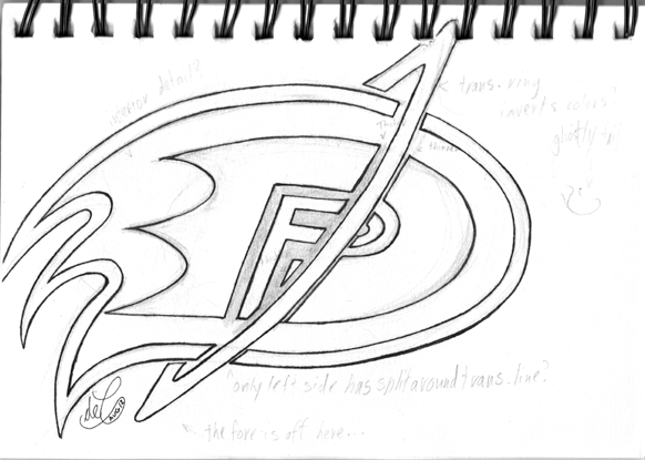
 SBDec — Danny Phantom Logo -- Version #2

Published: 2012-08-17 20:54:20 +0000 UTC; Views: 1127; Favourites: 9; Downloads: 78
Redirect to original
Description
First attempt at redoing the logo.For those curious, I mostly redid it because the bottom left is all screwy. Too much stuff going on down there, screwing with, for lack of a better term, the "force" of the drawing.
... Okay, that's probably confusing the hell out of anyone reading this, so to clarify:
- The oblique (AKA "italicized") angle to the original DP logo has a forward force. This is to give it a dramatic and action-y feel, which is a good thing to have in a super hero logo. If you're like me and have drawn it without the tilt only to think to yourself "man, this looks really, really dorky", then you'll understand why its there.
-The transformation ring's force is forward and down. This is because the ring usually appears around Danny's waist, so for it to be angled like that means he's ether flying upwards to the left, or downward to the right. Because the bulk of the ring is pointing to the right, and because we think of the right of the D as the "front" of the letter, the force of the rings goes towards the right. On its own the ring fits quite well with the DP logo -- because the logo gains it force by playing with our typographical understanding, the force may be directed forward, but by using an angle that closely matches the one used by the transformation ring. They reinforce each other.
-The tail end of the outline, however, has a force that's upwards and to the right. Its supposed to be an extension of the back of the DP logo, but instead of reinforcing it, the force of the tail cuts across the back of the logo. This means that, to make the whole picture fit together, the force of the tail is warped into the logo, and not smoothly ether. This makes the bottom left of the picture both messy and overcrowded, and even now you can see the weird gap at the top and nearly touching at the bottom, like a tilted V or \|. It isn't pretty.
Beyond that, the combined forces of the tail>logo>ring make something that goes up>across>down. Its like Danny took a tight turn in mid air while transforming, which isn't the intent behind the picture at all. The fact that the part with the most stuff happening in it is hackneyed and patchy is just an added bonus.
So with that, it hopefully makes a lot more sense why most of the changes in the third version are in the tail -- it was just the odd one out. The original version also had this problem, but since it was originally just the Danny Phantom and Fenton Works logos combined, it didn't seem in the spirit of the picture to change it.
Related content
Comments: 1

I like how it has all 3 initials of his name. We all know where the D for Danny & the P for Phantom are, but if you look closely at the P, you can see how the diagonal ring cuts into it, creating the F for Fenton also.
👍: 0 ⏩: 0


