HOME | DD
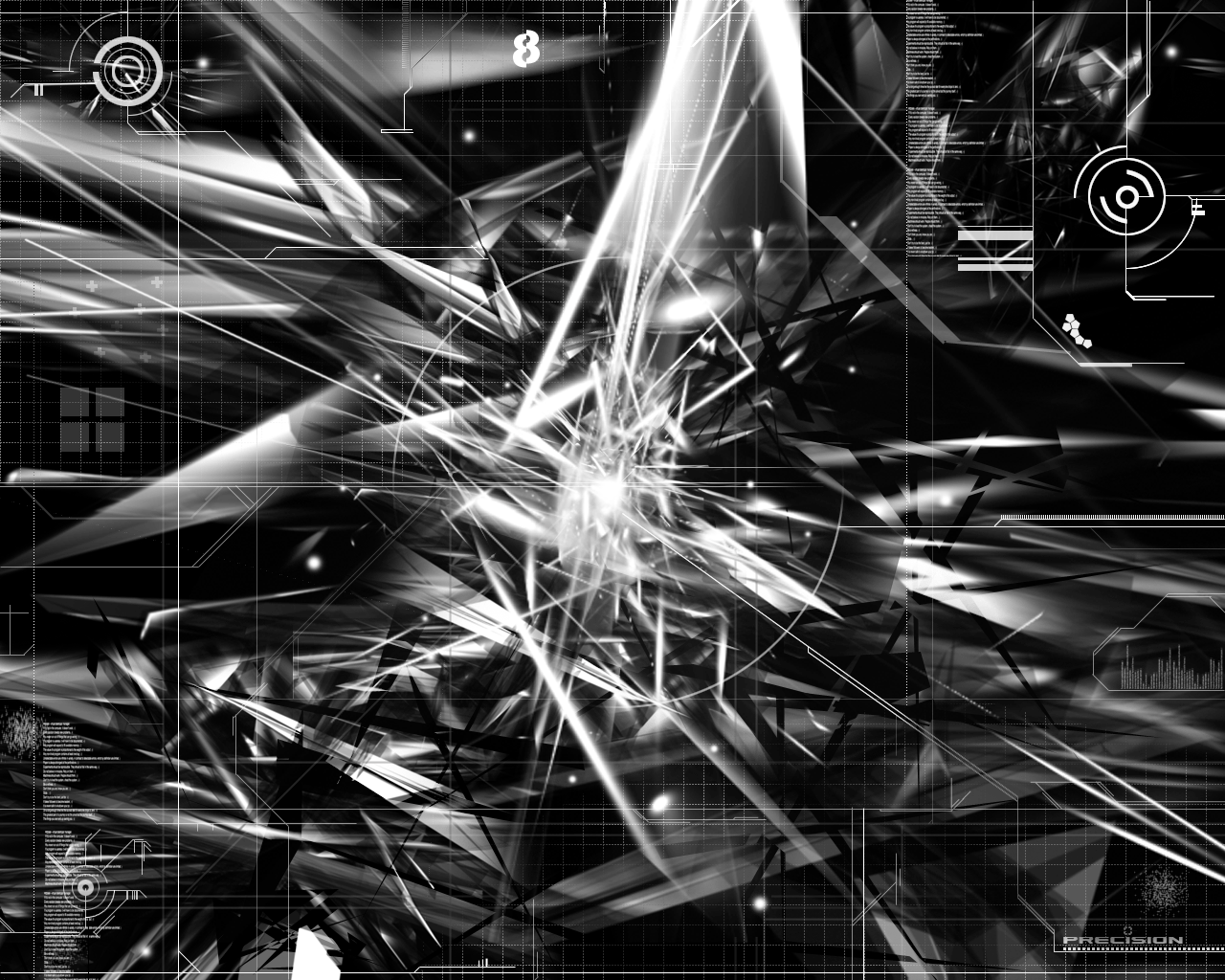
 sbr — phantom apocalypse

Published: 2003-06-15 01:26:47 +0000 UTC; Views: 7511; Favourites: 34; Downloads: 1000
Redirect to original
Description
hey... everyone gets a little bit trendy sometimes. i apologize.i spent a lot of time on this, if you wouldn't mind, leave a comment, leave some criticism (always welcome), or go look at my gallery. i'm sure i have something which will interest you.
:::::::::::::edit::::::::::::
no 2d/text version here: [link]
Related content


Comments: 67

It is not original but is still good, you could have added something like a snowish sky backround.
👍: 0 ⏩: 0

looks great. i love it. love the silver color scheme, the typo and the whole pic in general. it's very cool.
👍: 0 ⏩: 0

stylish!
I like the lights in it.
what else should I say?!
 (Wink)")
👍: 0 ⏩: 0

Dude, that's crazy! good job keep up the good work!
👍: 0 ⏩: 0

despite wanting to give a balanced crit of your piece i would like to allow myself the chance to go - WHOOOOAH!!! - good now that i got it out of my system onto what i think of it. i have no problem with following trends - hell im a bit of a vector trendwhore myself - i agree with some of the previous comments that the 2d needs more work - it feels almost slightly overdone and doesnt balalnce the rest of the piece. now i really like abstract pieces like this but my only feeling is that the centre gets a bit too um 'complicated' - you have some awesome structures coming in from the edge of the piece but they seem to get a bit lost in the centre. although it fits the theme of apocalypse i feel it could be a bit tighter.
👍: 0 ⏩: 0

love the detail on the 3D and the colors work great, too
good work on all of it, cept i agree w/ that 2D needs a lil' work, but overall awesome work
keep it up 4 sure...
*mP
👍: 0 ⏩: 0


you can live in this image for a week !!!!!!!!!!!!! !!!!!!!!!!!!
👍: 0 ⏩: 0

"Kick ass brush work and rendering. I like the vector work on the left side too. Great work"
Totally agree with ~infected7, sweet piece
👍: 0 ⏩: 0


Very suave, mmmmm.
I want to so be able to do that
GJ +fav
👍: 0 ⏩: 0


wow the 2d on this is superb and the renders are great....not to mention the airbrushing is smooth..gj!
👍: 0 ⏩: 0

Awesome work, The trendy tech stuff must have taken for fucking ever. I don't realy like it but it looks like it took forever. the actualy background itself is pretty sweet though.
👍: 0 ⏩: 0

really awsome... best art of this kind that i have seen in awhile. But I would remove the typo, as cool and nice as it is done.... it just makes the wallpaper look dirty and cluttered. The whole thing is great though
👍: 0 ⏩: 0

looks great
i dont quite like the 2d ..looks too bz i guess..but dude its just me
i like the objects and the arragement and the placing for the brush outburst...very good colors.simple colors but its chaotic i shall say
and ....this is a
cheers
👍: 0 ⏩: 0

d00d! OMG! Im silented. I cant say anything, I might insult it. It's too good
👍: 0 ⏩: 0


Great job. i could never do that. but i do feel that this style is becoming very very played out.
👍: 0 ⏩: 0


now we know SBR can be a whore if he wants to luv ya man
👍: 0 ⏩: 0

the image is great, but the 2d on the left is way too overdone.. it doesnt add to the pic imo, cuz its just some area filled with grey shapes.. change that and it will be awesome
👍: 0 ⏩: 0


the complexety of the piece is fantastic, altho the 2d work is all situated on one side. also there seems to be a lack of colour
but if you chose no colour, it is your work. good job m8.
👍: 0 ⏩: 0

Amazing!Love the 2d work,but I think the render could be better.Keep up!
👍: 0 ⏩: 0


lol that 2d is shit... the rest is OKAY. Not great...
👍: 0 ⏩: 0


the 2d, at best, needs work. It's fairly innovative, but really its just the same stuff duplicated over and over again and rotated here and there, not to mention the jaggedness of the majority of the circular parts. It would definitly look better without the 2d. This is one of those few pieces where the abstract part of it can hold the weight on its own, and it really doesn't need any 2d to "enhance" it.
👍: 0 ⏩: 0

Im guessing the 2D took your time here ?
Very nice and good details!
👍: 0 ⏩: 0

I like the colors you used for the 3d work. I also love the 2d work you did, i really haven't seen anythig like that befor. Great work!
👍: 0 ⏩: 0

very nice, the 2d needs to be taken out completely though.
👍: 0 ⏩: 0

Well it is a bit trendy as ya said i still like it lol hell i love those kinds of wall paper so who cares if it trendy long as you do what you feel is right as far as the art goes
👍: 0 ⏩: 0

that 2d is fuckin crazy man...keep it up, plus fav
👍: 0 ⏩: 0

I think the color he used is perfect.....keep it up
👍: 0 ⏩: 0


That 2d is just horrific. You need to take the shit off. The forms presented look pretty good but the one really white part is way too bright. Lastly, add some fucking colour!
👍: 0 ⏩: 0

dude your shits awesome! how the hell do you do it!i already have a wallpaper of your and i love it!
👍: 0 ⏩: 0

The image is awesome, but I hate hate hate the typo. It'd be a +fav if not for that... courier is just /so/ not a good font ~_~
👍: 0 ⏩: 0

I'd love to know the secret to making one of these "styles" of abstract images. While there may be one's out there along the same lines, NONE are the same. This one's actually one of the best one's I've seen. Maybe it's just cause I like black and white.. who knows. Well done.
👍: 0 ⏩: 0


Kick ass brush work and rendering. I like the vector work on the left side too. Great work
👍: 0 ⏩: 0

Very cool, I like the colors used and the overall "layout" of it. It's clean and makes a great wall. I'd love to have the other versions since my video card doesnt go up to 1600x1200 =/
I'll keep an eye out for them! Nice work!
👍: 0 ⏩: 0


| Next =>