HOME | DD
 sc3L —
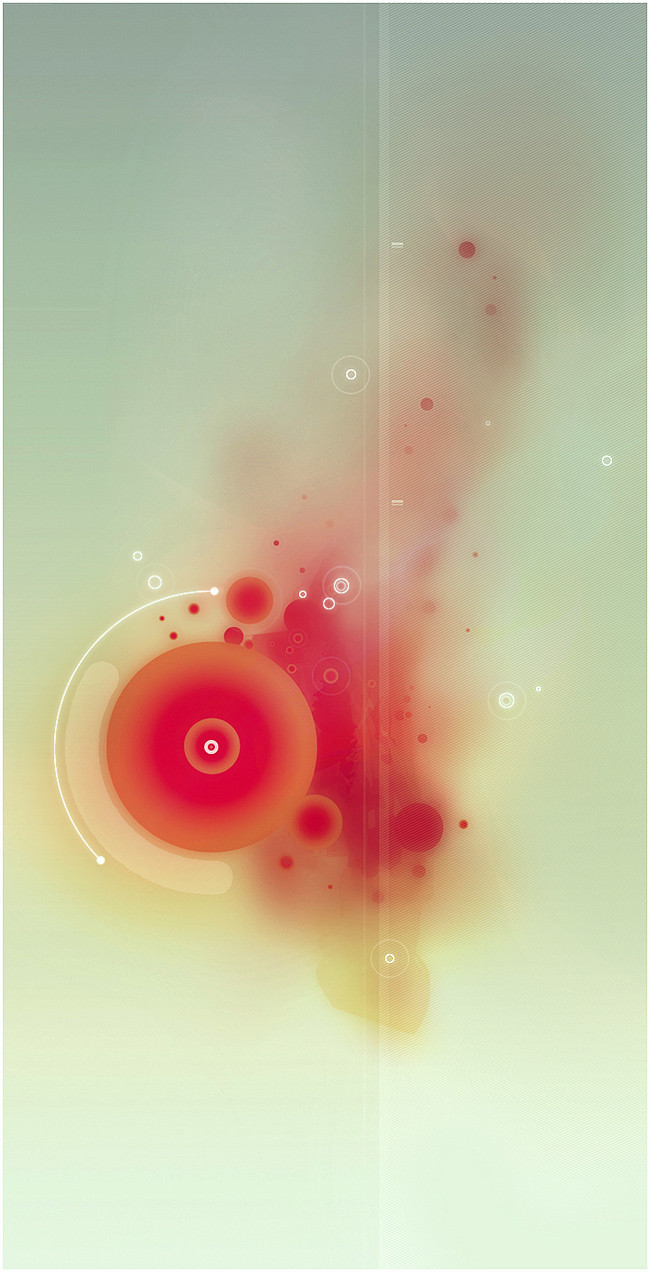
_Drip
sc3L —
_Drip
Published: 2004-09-06 15:33:22 +0000 UTC; Views: 68185; Favourites: 1871; Downloads: 11406
Redirect to original
Description
Another one with Illustrator, bored again...-
-
Thx to Faros, for some inspiration...
Related content


Comments: 331

")


here is a GREAT color and a new style.
very very cool
i love it >
👍: 0 ⏩: 0

wow this is beautiful i think, i love the colors! and the blur effect is so nice.

👍: 0 ⏩: 0

how the hell do you guys do that? I wish I could vector
Thats awesome by the way.
")
👍: 0 ⏩: 0


very nice.. reminds me of ~cashew's ink drawings.... love it...
Angyl
👍: 0 ⏩: 0


* omg bashed on enter but was not finished yet.
The scanline pattern and circles are really overused through the years but you seem to place the pattern so well that it totally fits this one!
👍: 0 ⏩: 0
No one ever could make something like this, I'm still in Love with this one, since the first time I saw it...
a lot of respect.
👍: 0 ⏩: 0


 (Smile)")


This just struck a chord with me, and I really like it!
Excellent blending and choice of shapes.
")
👍: 0 ⏩: 0

Digital watercolour, nice.
Lovely colours.
Great work.
👍: 0 ⏩: 0

Very good work, the blur, the colour, it looks like a drop of blood in a glass of water, the white pionts like bubbles, everything is just in the right place
👍: 0 ⏩: 0

This was nearly the same thing I wanted to try and experiment with. You played this out very, very well. Great job.
👍: 0 ⏩: 0

Wowww the blur and the colors make me a little warmer. This is just a hot pix
It like autumn but on screen...
 (Wink)")
👍: 0 ⏩: 0


It's just not fair... I wish my boredom worked this way too
Simply great!
")
👍: 0 ⏩: 0

wow
how did you manage the diffused colors?
and I love how you can barely notice the intricate texture interwoven into the dissipating red...like fingerprints!
this is gorgeousness - a kind of ephemeral qaulity,almost...
👍: 0 ⏩: 0

stunning- Im trying to get my stuff more fluid like this- how did you do it im jealous?!
👍: 0 ⏩: 0


I really like this. I feel a sense of peace looking at it. The softness works great with the colours. I find the light line just right of centre a bit distracting though.
👍: 0 ⏩: 0


Nice. A new abstract expressionism. It reminds me a "cock", is it a will ?
👍: 0 ⏩: 0


i actually thought it was a jellyfish. what is it? impressive stuff
👍: 0 ⏩: 0


This looks good. Did you use the mesh tool to do some of those gradients?
👍: 0 ⏩: 0

wow..thats all i can say...
rawk on \m/\m/
Koko_yuki
👍: 0 ⏩: 0

This piece is perfectly balanced, both in content and in color. I really like it.
👍: 0 ⏩: 0

| Next =>