HOME | DD
 scabrouspencil — Venom
Published: 2005-06-02 18:52:13 +0000 UTC; Views: 35334; Favourites: 988; Downloads: 1764
Redirect to original
Description
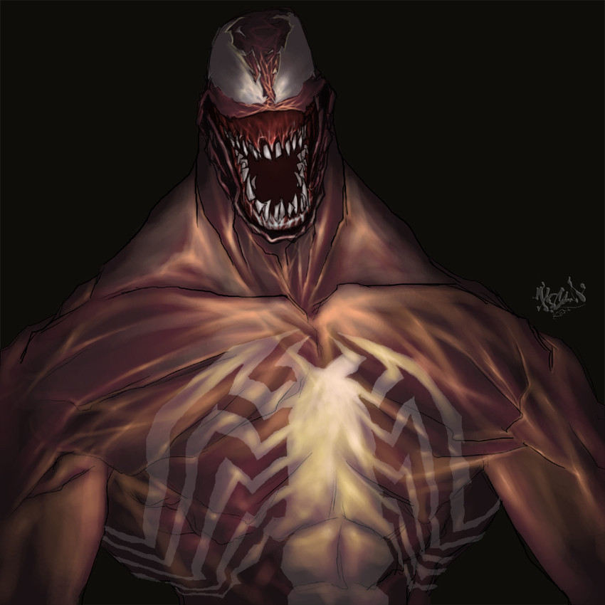
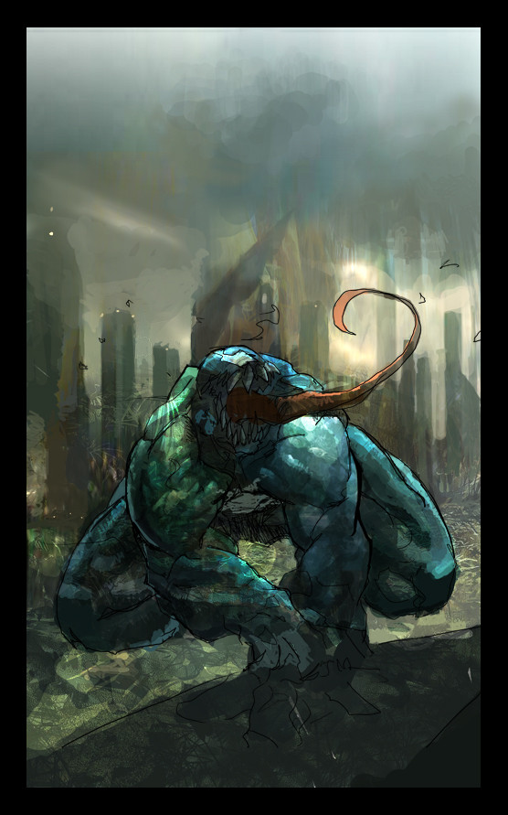
Another fanart of Venom, Marvel's character from the comic book of Spiderman. I tried hard to make Venom look as if he is in a dark space like a nightmare kind of thing ,sumthing like that. Hope its ok to u all though . Anyway all i wanted was to make a better version of Venom then the first one i did then (Smile)")
Intially i painted him Navy Blue in color but i adjust its color to purple or pinkish purple.
Photoshop 7
Related content


Comments: 177

sweet thats awsome I would never do beter than that
👍: 0 ⏩: 0

Thanks man, well i hope i did surprise u on tis one then coz i've been working more on paintings tis days jus to get used to Photoshop inorder to paint a proper pic haa. Alrite first off, im glad the evil grin was affecting u enough coz tats wat i wanted to show of him. And as for the 10legs instead of 8 ,yeah well again i overdo it haha guess was excited at e moment and lastly u mention abt e highlights dun really blend into e blacks, mm i tried lowering the secondary hightlights tho. Btw thanks many , i'll take note of them all. cheers!
👍: 0 ⏩: 0

yo,that's the shit!keep up the good work.
👍: 0 ⏩: 1

you really did venom some justice here!!
Great Job!
👍: 0 ⏩: 1
Thanks alot! i like to bring more evilness to his character coz he is e only bad villian that i find him amusing. I guess the only thing missing, is his tongue tho. Coz if i did ,its gona block abit of his symbol or maybe sumwhere else then.
👍: 0 ⏩: 0

....man....look really...sinnister....

👍: 0 ⏩: 1
Cool thanks,i like the word Sinister! glad u like it too
👍: 0 ⏩: 0


Oh maaaaan...awesome lighting and attention to detail @____@
👍: 0 ⏩: 1
Thanks babe! love lightings and details coz it fills e total satisfaction of it all.
i am glad to hear from you, and btw i read abit of ur journal earlier on jus wana congrat u on ur selling of ur works
👍: 0 ⏩: 1
i definitely need to learn more about lighting!! You use it so well to set up the mood ^^
Thanks so much!
Ah i must admit, i'm quite terrible with keeping up with messages and deviations XD
")
👍: 0 ⏩: 1
Thanks!! im glad the lightings was alrite, been studying on tat area lately too
u're welcome!
👍: 0 ⏩: 0

Dude, that's nuts-ass crazy hardcore awsomeness!! You make me wanna work harder on my colouring skills.
👍: 0 ⏩: 1
Thanks ! great then we'll discuss shit abt paintings stuff from today onwards man coz i tink im head over heels on painting now hehe but hey Lineart is still the ultimate yah
👍: 0 ⏩: 0

OMshit this is AWESOME dude , nice job again ( i'm not enough god in coloring for give you some should so..... , i suppose you weere note looking for that )
👍: 0 ⏩: 1
oh hey thanks alot man! nah its ok ,but at any point of time, if u feel any areas that can be improve better let me know again then
👍: 0 ⏩: 0

dude that is fucking NICE man, very hot
so hot i think i burned myself
👍: 0 ⏩: 1
Hahaha thanks a abundant! i am sure glad u like it
see u ard man! cheers
👍: 0 ⏩: 0

Sick, dood. That's just too sick! TOO SICK!
👍: 0 ⏩: 1
Thanks man!! btw if there is any areas u want to point out ,pls do coz im in the process of learning how to put more depth n stuff to my painting though.
👍: 0 ⏩: 1
Sure no prob man! Let's see... I think it's a combination of your shadows and hues. For the shading in this, it's pretty tough to find a strict light source. Your detail is off the chain, but it seems that on certain body parts, like the muscles on his neck, seem to throw the painting off a bit. I think to me, it's because I see the Sienna shading as a highlight on his collarbone. That's where changing hues come into play. If you were to change your Crimson into maybe, a purple tint, it'd give it more of a transitional effect. Sorta drawing away from the other tones.
👍: 0 ⏩: 1
Great i like the logical explaination and the areas u arrowed down on, i agree on the collarbone lightings which i guess i over do it. I admit its my first intense painting as in trying to target on Realism and unreal rendering or shld i say surrealism? On digital painting wise i guess i was too overwhelm by the possiblities of digital painting in Photoshop that i actually experiment and explore at the same time on every area of Venoms body throughout the painting process haha. Intially e original colors which i mentioned on the Navy blue version didnt had much of Sienna but i guess i wanted to see sum and tat i change it then but for Crimson i totally agree on ur opinion on that. Hey thanks man its always good to shared around ,appreciated it dude. Cheers! for ur info ,tis is the longest reply i ever did since i first join DA haha.
👍: 0 ⏩: 0

Thanks alot! yeah i will and i appreciate ur fav too
👍: 0 ⏩: 0
<= Prev |