HOME | DD
 scissors-hands — -SUN-

Published: 2004-01-18 20:25:02 +0000 UTC; Views: 2376; Favourites: 55; Downloads: 642
Redirect to original
Description
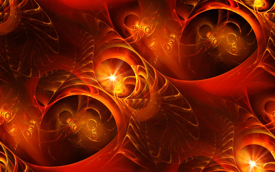
my annual contribution for abstract sectionRelated content


Comments: 58

Greetings,
This image is being featured in this news article [link] that is showcasing work, that has been posted in the "Abstract" Digital Art categories here at DA.
If you enjoy the article, clicking the green "love it" icon will help make it possible for more people to be aware as well.
Appreciate,
~hewsan
👍: 0 ⏩: 0


beautiful use of contrast.
the color, the drippy melting smooth into and out of is wonderful work.
nice to see some of your work again..i've been away too long.
good stuff.
👍: 0 ⏩: 0


i just discovered you so i haven't had much time to really go over all your work, but this is my favorite so far. i like how the peice feels to me, warm and flowing nicely. nice touch with the black negative space as well, i tend to fill the whole page, but the bankness there seems to work quite well, i might have to try that on one of mine later. +fav for me since i know i'll want to see it again.
👍: 0 ⏩: 0


I love the organic feel of this... the textures, the colours and the movement. Excellent.
👍: 0 ⏩: 0

awesome colors.. they seem to flow so well.. aslo the contrast between the bright colors and the dullish gray is great..
amazing work
👍: 0 ⏩: 0


great work friend. Looks really good an detailed. Almost like liquid fire
👍: 0 ⏩: 0

its always the colors... always... i mean... the yellows meld into orange and then red... its always the colors.
then its the texture underneath... and the movement of each subtle piece....
its the lighting too  (Smile)")
scissors forever.
but you already knew that
:fav:
👍: 0 ⏩: 0

Such firey brilliance! Love the subtle textures too-- fabulous imagery my friend
👍: 0 ⏩: 0

WOW
Wonderful work my friend! Simply amazing! I love the colors and the effects. An instant fav!
"I want to spawn epiphanies in every generation."
~harlequin02~
Have something to say? Publish a book; I did (Wink)")
Comment, to get comments.
Share your kindness, not your hate.
Love the art, before yourself.


👍: 0 ⏩: 0


Preciosa escala de colores, es algo un poco diferente a lo que vi de tu gallery.
Excellent work.
👍: 0 ⏩: 0

absolutely beautiful. i love the colors you use. you are brilliant with a tablet
👍: 0 ⏩: 0

Hmmmm what a deliciously sunny abstract piece. The textures are fantastic, especially in the left bottom corner. Although in the middle of the lower part it gets a little bit blocky and that seems a bit wrong but it doesn't really bother me much. I love the warm atmosphere in it... I see phallic figures in there too, are those done deliberately or are they only in my perverted mind?
Rock on.
👍: 0 ⏩: 0

")
")

oh hell yes!
just awesome.
love it
but what do you mean annual contribution to abstract section?
that sucks that there won't be much...I'll miss your work
I actually allready do.
where else could I view more of your newer creations..if indeed there will be?
👍: 0 ⏩: 0

bueno.. la verdad no se ke poner aca.. excelente los colores bien contrastados!!!
")
👍: 0 ⏩: 0


 (Cool)")

I wish I could airbrush like you, it got such an unique style of all components. Its great and refreshing. Fav
👍: 0 ⏩: 0

that's a very nice piece, bro
i really like the design, its very different
the use of colors is great too; excellent job

👍: 0 ⏩: 0

weeeee brilliant, so to say
Only the red part at the bottom looks jaggy and fuzzy... purpose? somehow doesnt contribute to the over-all quality of the picture
You and ~jigit should get together and collaborate, since your styles are quite similar...
👍: 0 ⏩: 0


gorgeous. i love it. it's warm colors are lovely.
👍: 0 ⏩: 0

Scissors my friend, it does my heart good to see the beauty you create once again. This is wonderful. I love the vibrant colors, and your textures are always superb. You can almost feel the heat radiating from this. Wish this was wp size, its about time for a new scissors wp on my desktop you know
Hope all is well with you hun.
👍: 0 ⏩: 0


I love the decay. The colour is nice too, but that's what I really wanna look into for awhile.
👍: 0 ⏩: 0


The colours are definately awesome...it's quite relaxing to look at (for me at least
👍: 0 ⏩: 0


you better be joking 'bout this anual shit man.
👍: 0 ⏩: 0

I love your style, it's dark yet heartwarming
Very well done!!
👍: 0 ⏩: 0


i dont know how many times ive told you this, but Carlos, your style is unmatched, i absolutely love what you do! Congrats on another well designed piece of art 

👍: 0 ⏩: 0


i like the clarity on the upper half, but on the bottom half, the quality becomes distorted.
👍: 0 ⏩: 0


| Next =>