HOME | DD
 screwbald — Fake Hungry Panel

Published: 2009-08-04 17:21:22 +0000 UTC; Views: 25877; Favourites: 737; Downloads: 337
Redirect to original
Description
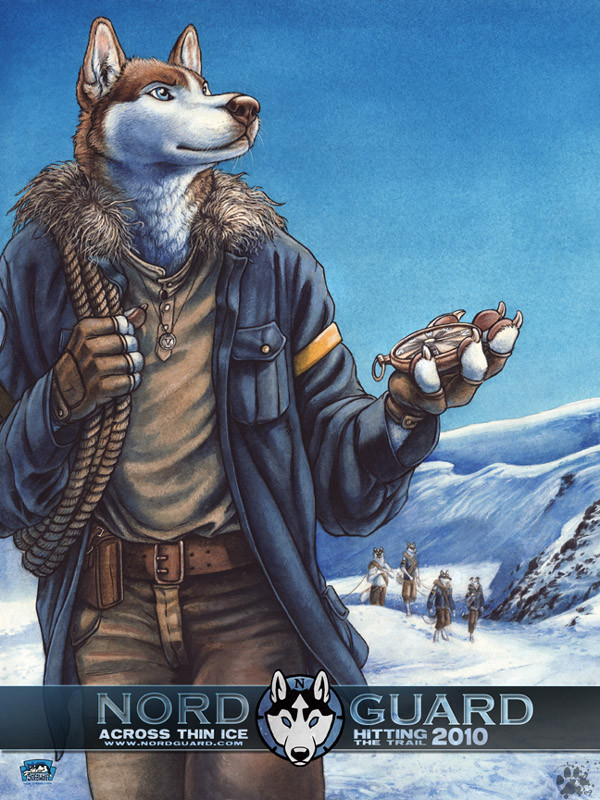
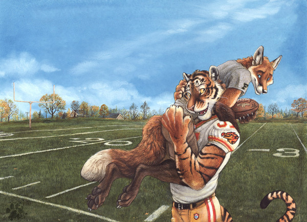
This is a "fake" panel I did a couple weeks ago to test a few things before starting in on the actual pages from the Nordguard comic. ( [link] )Pi is unimpressed.
But, It does serve to say that the Sofawolf fellows gave me a handful of the free 18x24 Nordguard promo posters to give away at Rocky Mountain FurCon next weekend. So, if you missed out at AnthroCon and you're in the Colorado vicinity, now's your chance! :]
Here's a photo of the posters ( [link] ) with a Diego for scale! :]
Related content


Comments: 110

Thanks; I really appreciate that.
👍: 0 ⏩: 0


lol that was really really funny. i feel sorry for that boar though or pig i cant tell XD it still looks awesome ^^
👍: 0 ⏩: 0


lol though the pig doesn't look amused at all
")
👍: 0 ⏩: 0

")


It must be SO hard being the only non-carnavour animal on the team. LOL=XD
👍: 0 ⏩: 0

I love the looks on their faces! Great expresions.
👍: 0 ⏩: 0

Lol, reminds me of Forrest Gump.
Great job on the panel, I like the attention to detail.
👍: 0 ⏩: 0


Heh, very humorous pic and love the details and the expressions in this piece. It's always a masterpiece with whatever you paint.  (Smile)")
👍: 0 ⏩: 0


The fact that something this good is just a "test" strip is just... mindboggling!

👍: 0 ⏩: 0


")

You ever think of using semi transparent comment boxes? They're neat in the way that they don't cover up any part of the art
👍: 0 ⏩: 0

*laughs*
That's mean!!
. .. .. .Sadly, that WAS making me hngry!

👍: 0 ⏩: 0

Beggin' Strips...heheh. Great work as usual, can't wait for more :3
👍: 0 ⏩: 0

God, I am SO excited for this comic to come out ! It's driving me mad!
👍: 0 ⏩: 0


Hahaa, thats a little mean isn't it
Great pic
👍: 0 ⏩: 0


Oy vey the detail! Looks like you didn't use anything to ink with but the paint itself (I cheated and read the replies XD). Quite tedious indeed, but I love the outcome. Gives it a very natural, earthy quality to it, instead of the harsher tone you can sometimes get with other inking tools.
I also absolutely LOVE the furshading that you've done. I may be wrong, but in what order do you apply paint? It looks like watercolor-acrylic, but I'm curious as to how many times you went back to the picutre.
👍: 0 ⏩: 1

Yes, I put down the watercolor washes first to build up the colors and the shadows. There's no set number of washes I use (people ask a lot) it's just however many it takes for that particular piece to look good.
The last thing I do is add a bit of acrylic to (attempt) to fix any mistakes I made and touch up highlights.
👍: 0 ⏩: 1
So how big are the canvases you usually use? Only reason I ask is because of the detail to the shading and fur detail, it seems you'd be using a rather large one in order to get that degree of detail, but I may be wrong and the years you have of experience might be more than enough to reach that degree of perfection
👍: 0 ⏩: 1
Nah, I just use a tiny paintbrush. ;]
This panel was about 4x6 inches.
On just the regular paintings, they're usually around 8x10.
👍: 0 ⏩: 1
lol, tiny is right. Some of the detailing there is difficult to do at a larger scale, let alone 4x6/8x10.
I salute you, my good sir.
👍: 0 ⏩: 0

Nice pic
but I guess a wild pig wouldn't say "no" to
eggs xD
don't know whether cannibalism exists amongst them but
they certainly eat flesh and sometimes a horde wild
pigs even shoos away wolves from their bait ^^
However, I really like the way you colored this
pic ")
with the foreground (I do have this prob. a lot V__V)
and the fur is awesome xD

👍: 0 ⏩: 0


i'll eat my candy with my pork and beans, excuse my manners if i make a scene. XP
👍: 0 ⏩: 0

That looks awesome, you did a super great job on that.
👍: 0 ⏩: 0

Somehow this reminds me of the Blacksad comics
👍: 0 ⏩: 0

This looks really promising! I can't wait until it comes out! I love this picture too. What are friends for right?! Keep up the good work.
👍: 0 ⏩: 0

this is cool and funny cause there like a pig right there
👍: 0 ⏩: 0

I like how you make the anthros more human-like than what other anthro drawers do.
The fact that you made his hooves his fingernails is AWESOME and more human-like.
I wish you luck w/ Nordguard!
👍: 0 ⏩: 0

Love the character design on the boar!
Only thing that's throwing me is the shape and placement of the word balloon. I've always been partial to oval word balloons, as I find rectangular ones jarring (and also feel that shape should be reserved for captions -- makes things easier to distinguish at a glance). Ovals also have a nice organic look that sets them apart from the hard shape of the panels, and that makes them seem less intrusive.
Just my take on it, as one who is also working on some comics.
👍: 0 ⏩: 1

I disagree, I've seen many good and professional comics that use rectangular word balloons (like Blacksad).
I think the problem with this is more that the balloon's "tail" looks weird.
👍: 0 ⏩: 1
It's of course a matter of personal opinion.
I just look at this panel and think how nicely a wider oval would fit. It would occupy that dead space to the left more, and cover up less of the one character.
👍: 0 ⏩: 2
And by "rectangular panels" I mean word balloons! Sigh. I need to keep the jargon straight!
👍: 0 ⏩: 0
You have a point there. And I think it would look much better if only it were positioned more on the left, because of the composition.
👍: 0 ⏩: 0

Checked out your site for the comic and I'm highly impressed! 

You have a new fan.
👍: 0 ⏩: 0

very creative, it looks like this is going to be a beautiful style of comic ^^
👍: 0 ⏩: 0

Your work is incredible!! Wonderful work!
👍: 0 ⏩: 0
| Next =>