HOME | DD
 sdl — Invitingly Delicious

Published: 2011-08-15 08:10:32 +0000 UTC; Views: 8117; Favourites: 285; Downloads: 79
Redirect to original
Description
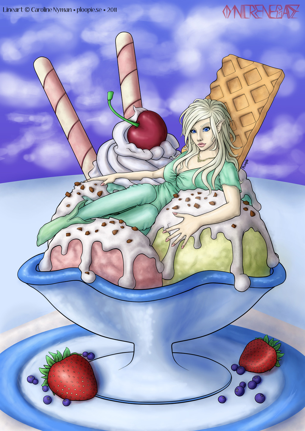
Before you ask - yes, there is a man's face reflected in the cherry. That's my ugly mug you're looking at.")
This was my entry to the August lineart coloring contest [link]
And it won! [link]
Line art by the incomparable Ploopie
[link]
Flats by sunrisetillsunset [link] were extremely helpful
Wall Clock stock by ~objekt-stock: [link]
Necklace light beams brush by Obsidian Dawn: [link]
All other textures mine (and special thanks to a special friend who showed me tricks on how to make semi-realistic ice cream textures).
A special thank you to BlairSanne for her invaluable suggestions on how to improve this (and now also Gracey Anne Iseki and several others to whom I am extremely grateful)
This has challenged and taught me more, and on more levels, than anything I've played with in a very long time. I wanted everything to appear deliciously enticing, including our pixie. So for me, her boots and clothing couldn't be just leather and/or cloth. I wanted an almost edible, or latex-ish, appearance for her entire outfit, all in the colors of sweets - dark chocolate for the boots, regular chocolate for the leggings, and rich, chewy, glowing caramel for her top.
Warm Above, Cool Below - For a temperature contrast, I stayed deliberately with warmer colors, primarily red, brown and gold tones, pretty much throughout the upper part, with the ice cream and the blue dish and the floor carrying all the cold below.
Our pixie's face had to be beautiful enough to haunt me (and it does now). Eyes, otherworldly. Gray-blue and piercing, like metallic water, including the whites. For pupils, starburst shapes. I changed the shape of the eyes and mouth ever-so-slightly (but still within the lines) - just enough to give some additional personality and character.
If you'd like to see how I did the basic strawberry, I've uploaded a Photoshop file with all the basic layers I used to get myself started on the one on the right (it's all about the seeds, man).[link] Have fun!
Related content


Comments: 296

Wow, this is original ! And well done ...  (Smile)")
👍: 0 ⏩: 0


I love this! Creative and adorable.
👍: 0 ⏩: 0

Fantastic work! I love it! <3
👍: 0 ⏩: 1

Cheers, and your "Cherry Keys" [link] is amazing! Wish I'd studied it when I was working on this, I think I got my cherry stem too dark!
👍: 0 ⏩: 0

wow, I definitely didn't see this one or I totally would have voted!
👍: 0 ⏩: 1
Cheers! The note voting phase for this contest (coloring line art #2) ends after tonight. The poll voting doesn't starts until the 6th (tomorrow). But I'm not telling you to vote for me, because that's against the rules!
I know, I said it already in a message, but there's evidently been confusion with the two contests, and I wanted to clear it up for anyone else who might read your response and think the voting period was over.
👍: 0 ⏩: 1
thanks for posting
👍: 0 ⏩: 0

hands down i just love it. one of my top faves.
👍: 0 ⏩: 1


Mums. Good work! 

👍: 0 ⏩: 0

this is REALLY delicious *w* the strawberries,the chocolate on the ice-cream...it all looks very realistic and yummi X3
👍: 0 ⏩: 0

DAAAAAAAAAAAAAAAAANG
It was already amazing but the coloring on the strawberries, and the reflection? Absolute perfection, right down to the last damned detail. Lovely job, really.
👍: 0 ⏩: 1

Wow! This is super special awesome!!!
👍: 0 ⏩: 0

WHOOOOOA!!This is absolutely one of the prettiest things ever!
👍: 0 ⏩: 1
That made my day - and quid pro quo, your Lily Severus [link] piece is both gorgeous and flawless.
👍: 0 ⏩: 0
I love the way you put that. Thank you.
👍: 0 ⏩: 1

no problem, i love the color scheme! and the uhhhhhhhh... toppings XD hahah!
👍: 0 ⏩: 0

Thanks! I think you'd laugh if you saw what I go through to figure out how reflections are supposed to go.
***run into the kitchen, grab a shiny thing, hold it up to the light or another thing...stare...stare some more...***
👍: 0 ⏩: 1

Well, that's how it works
👍: 0 ⏩: 0

I bet she's delicious!! Yum yum nom nom I like this one!!
👍: 0 ⏩: 0

I like the textures and the reflection in the cherry is a nice touch!
I can see you worked real hard on it
Your highlights though, shouldn't be white all the time. It makes things look plastic. On her clothes it looks latex. I'd suggest looking at some references for clothes and hair.
I especially loved the way you did the strawberry. You need to do a show and tell
👍: 0 ⏩: 1
Firstly, you are talking to someone who loves constructive feedback and advice, so thank you! I toned down the hair highlights to a more subdued gold/yellow instead of the stark white, and you're right, that does look much better. I'm having a long-standing battle with the hair, but I'm learning, and determined to get it perfect eventually (my version of perfect anyway, which it isn't now).
Strawberries - I actually posted a layered .PSD file of the right strawberry, in case anyone wanted to study what I did to that point, but there didn't seem to be any interest. That, and what I did with them later was such a messy trial and error process (still) that I didn't consider it all that easy to explain, let alone valuable to anyone, so I took it down.
The clothes, as I wrote in my description, were actually intended to look like latex, the idea being that it would make them look edible, and therefore her more part of the sundae. However, you're the second person to remark on plastic 'shine' of the clothes, as if it was a mistake, or somehow out of place. Is that really the case? Do you think the clothes should look less like latex, and more like something else?
Again, thanks for taking the time to give me an honest critique, it really is welcome, and does help!
👍: 0 ⏩: 1
Oops, sorry I didn't notice it D=
There's nothing wrong with latax, just that the highlight is a little too stark looking and real latax is not that stark. Go! Random google image! [link]
Notice that there's some grey before the white highlight and the white isn't the flat default photoshop white. I try to use neither extreme, black nor white. hope that helps!
And, I'm interested in your strawberry!
👍: 0 ⏩: 1
That does help, thank you. And just for that, just for you, here's the strawberry! [link]
It's very basic - kind of one of those, "If you like sausage, don't ever watch it as it's being made" kinds of things.
👍: 0 ⏩: 1


I love the texture of the clock on the background!
👍: 0 ⏩: 1
Oh, so do I, thanks! Wish I could take credit for it, but it's a stock image (credited and linked in my description). But I do want one of my own, so think I'm going to make myself an old clock in the same vein as that one and replace it.
👍: 0 ⏩: 0

Yep, this is good proof how the night of sleep i missed to finish my entry was pointless from the get-go. Perfect enough to look completely real.
👍: 0 ⏩: 1
Well, the voting isn't over yet, but if it makes you feel any better, this has cost me a couple of *weeks* worth of decent sleep. I don't know why I've obsessed on this so much, but the time that I've put into this may be good proof that I'm certifiably insane.
I really envy the speed painters (of which I am NOT) and all the naturally gifted artists, traditional and digital, who can express with one or two strokes what sometimes takes me a thousand detailed tries and fails just to get somewhat right. A perfect example of that: I've come back and stared at the bottom fruit on your entry [link] at least a hundred times. I can't do that. I wish I could. I'm stuck with going for as real as I can make it look, because I can't "express" it artistically.
👍: 0 ⏩: 1
Oh, when i said i lost sleep it was just the night to finish on time, not that it took one night...
I'm no speed painter
Tho my sketches are decent sometimes.
👍: 0 ⏩: 0

Cheers! (just looked at your skull in charcoal - NICE shading job!)
👍: 0 ⏩: 1

Thank you Sherylis. Strawberries are so much harder than I thought they would be, because the dimples reflect light and catch shadows so differently than each other. I was disappointed in mine, and still working on it, but your comment made me feel better about my progress so far, so THANK YOU!
👍: 0 ⏩: 0


")


Very nice painting. I especially like the textures in the background.
👍: 0 ⏩: 1
OK, trying again (I put this comment in someone else's reply, getting it right now). Thanks for the comment - I recognized your name, but couldn't figure out why until I went back to your gallery. Your Cowboy Concept Sketches [link] made an impression. They are off the hook great!
👍: 0 ⏩: 1
<= Prev | | Next =>