HOME | DD
 sec — UTEP

Published: 2004-10-09 23:09:43 +0000 UTC; Views: 1915; Favourites: 33; Downloads: 502
Redirect to original
Description
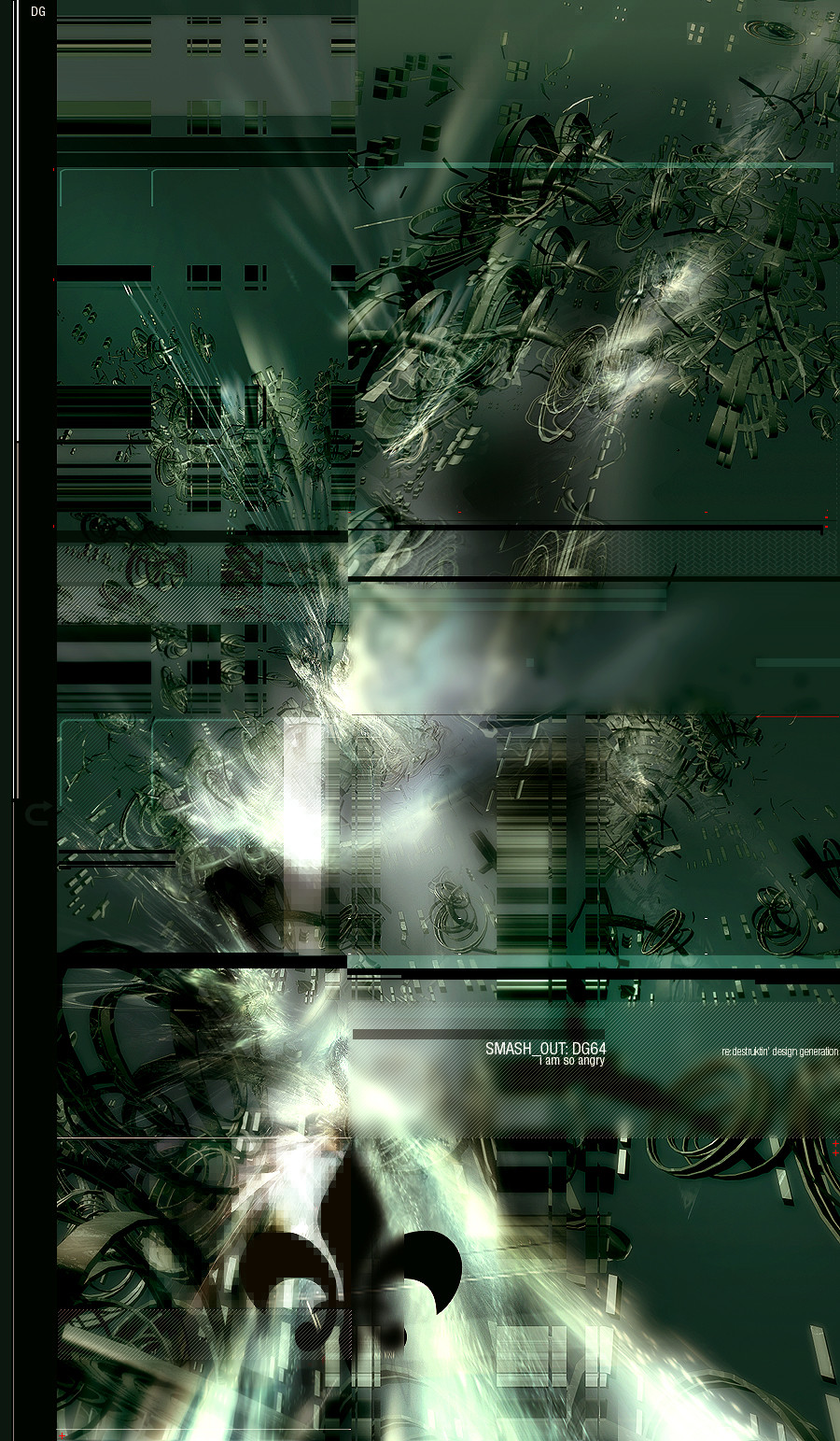
UTEP.vittuRelated content


Comments: 31

when i firstly saw this image i couldnt close my mouth [link]
Amazed
its very nicely divided into parts ... great work with red  (Smile)")
👍: 0 ⏩: 0

This piece is sick! Symmetry is in my heart, please have a look at mine if you have a sec.
👍: 0 ⏩: 0


I like it. awsome. I would like it better wihtout those dots at he bottom but hey! it's your work not mine.
👍: 0 ⏩: 0


")


wonderful stuff, and the symmetry works great. I love the variety of shapes too

👍: 0 ⏩: 0


Beautifully weighted image... how it channels out into more detail so intricately, the way it gains more form and then sublimely fades away again.
The dots to the bottom do slightly detract from the overall effect I described at the top, but the forms really do outweigh that sligh negative point.
The symmetry just seems to work in this image and further enhances the weighting of it. I think that the texturing in the background is a nice platform to build the forms onto, but maybe the ink / blood spots are too large, they take from the intricacy of the wispy, crawling lines.
Colourwise, the selection is excellent, deep brooding reads with the balcks and grubby, cream colour is surprisingly refreshing, in a way that is slightly itchy to the eyes. But I like it.
How the black lines at the top perfectly encase the "UTEP" typography is another sublime touch that finishes of the image, gives it that extra class. I also love how it is the only thing not symmetrical over the whole workspace, it really does cleanly break up the symmetry, that would normally just deserve a quick glance, but when combined with all described above is an excellent touch.
I 

👍: 0 ⏩: 0

Really coll man
Looking good.
Vittu is not a nice word ^^
👍: 0 ⏩: 0


lol nice name
Looking good but im not sure with those balls.
👍: 0 ⏩: 0


This is one of those images the scary doctor shows you and ask "What do you see here" and if you answer correct you dont need to wear that white jacket with straps ..
on..
anyway. I like it. and I see a forest with happy people.. and I love how the tiney orange shows its face
👍: 0 ⏩: 0

like one of those ink blot tests.. tell me what you see in it..
nice work
👍: 0 ⏩: 0


nice work, i usually dont like symmetry, but this is totally different
awesome work
👍: 0 ⏩: 0


Really nice, love the dots. Type may have looked better in a heavier weight tho. Of course thats just my opinion. good work.
👍: 0 ⏩: 0

you just keep getting better and better, its crazy man
awesome colors and composition, the shapes are original too
i think this deserves a 
 (Wink)")
👍: 0 ⏩: 0