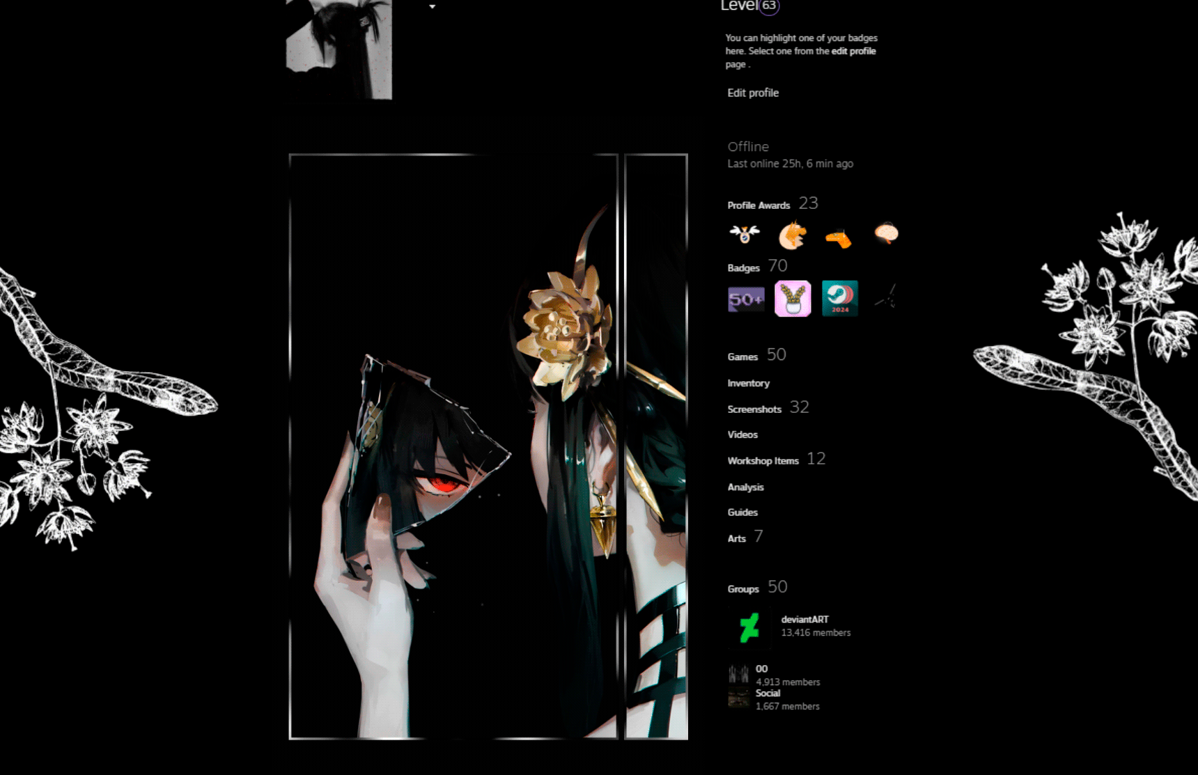
HOME | DD

seron — DeviantART 88x31 Button Tech

Published: 2002-07-27 08:00:45 +0000 UTC; Views: 915; Favourites: 2; Downloads: 52
Redirect to original
Description Ok, this is the second version, I truely believe this is the sweetest one yet.. Lub joo all.
Related content
Comments: 20

scottdoom [2002-07-30 07:03:46 +0000 UTC]

One of the best buttons I've seen. Great job.

👍: 0 ⏩: 0

adras [2002-07-29 13:55:00 +0000 UTC]

Sweet.

👍: 0 ⏩: 0

boheme [2002-07-29 12:39:04 +0000 UTC]

Oooofft.
Very nice!

👍: 0 ⏩: 0

deathsun [2002-07-28 13:50:58 +0000 UTC]

tech-a-rific

👍: 0 ⏩: 0

avnonstudios [2002-07-28 07:02:28 +0000 UTC]

very dope. what program did u use?

👍: 0 ⏩: 0

onederlnd [2002-07-28 04:57:04 +0000 UTC]

I feel you on it. Fits the site very well, and very clear.

👍: 0 ⏩: 0

queenoffools [2002-07-27 10:29:09 +0000 UTC]

awesome

👍: 0 ⏩: 0

nytro [2002-07-27 10:27:04 +0000 UTC]

*thumbs up* I like the style.

👍: 0 ⏩: 0

brianc [2002-07-27 09:09:54 +0000 UTC]

I love this one really cool.

👍: 0 ⏩: 0

losah [2002-07-27 09:09:23 +0000 UTC]

I haven't been keeping tabs on the contest in a while, but snce I checked last.. This rocks.

👍: 0 ⏩: 0

yawn2oo [2002-07-27 08:42:48 +0000 UTC]

tis very sweet indeed.

👍: 0 ⏩: 0

icore [2002-07-27 08:15:56 +0000 UTC]


Agree, this IS sweet. I really like it.

👍: 0 ⏩: 0

achfoo [2002-07-27 08:13:51 +0000 UTC]

:#!: Aww yah to its sexyness.

👍: 0 ⏩: 0

the-joker [2002-07-27 08:13:28 +0000 UTC]

Looks nice....But coild be better..DOnt like the stripe thing in the background....

👍: 0 ⏩: 0

antiantichrist [2002-07-27 08:11:54 +0000 UTC]

n33t

👍: 0 ⏩: 0

serendipity2 [2002-07-27 08:10:29 +0000 UTC]

this is awesome. it looks fantastic.

👍: 0 ⏩: 0

ekimver [2002-07-27 08:10:21 +0000 UTC]

Sweet indeed! Thats a sick button.. I can't think of anything wrong to critize on it. Nicely done

👍: 0 ⏩: 0

nimrodfunk [2002-07-27 08:06:29 +0000 UTC]

Dude, schweet. I love the way the dialogue pops open, hehe, but the logo is about 1 or 2 pixels too small, I think. You should make the center part a little wider and the logo a little bigger, then it will be perfect, or something.

👍: 0 ⏩: 0

coderebel [2002-07-27 08:05:05 +0000 UTC]

Very sexxy. I WANTED FIRST COMMENT! Very sexxy. Hope it wins.

👍: 0 ⏩: 0

tragic-prose [2002-07-27 08:03:49 +0000 UTC]

I like. Looks pretty good.

👍: 0 ⏩: 0