HOME | DD

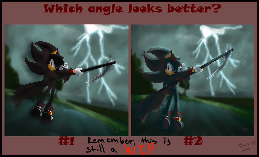
ShadowReaper12 — Angle (ShadowReaper Remake)

Published: 2013-05-29 23:34:07 +0000 UTC; Views: 781; Favourites: 49; Downloads: 0
Redirect to original
Description I'd appreciate feedback. Obviously, Shadow is flat Don't think I don't know
Related content
Comments: 28

Gaara-Lover-24 [2013-06-11 13:34:27 +0000 UTC]

#1

👍: 0 ⏩: 0

naxhyeli [2013-06-06 23:09:48 +0000 UTC]

2

👍: 0 ⏩: 0

Jak456 [2013-06-04 10:10:18 +0000 UTC]

#1

👍: 0 ⏩: 0

Shadow-of-a-storm379 [2013-06-02 22:06:39 +0000 UTC]

1

👍: 0 ⏩: 0

sonic-the-vamphog [2013-05-31 00:43:25 +0000 UTC]

#1 i like

👍: 0 ⏩: 0

ClassicMariposAzul [2013-05-30 23:50:23 +0000 UTC]

#1

👍: 0 ⏩: 0

Anzoul [2013-05-30 19:12:02 +0000 UTC]

I say that the #1 is better for the angle, make a angled pic looks better than a regular not angled pic (#2) but, The colors you given to #2 make it looks better, So...

An angled pic like #1 but with colors like #2

👍: 0 ⏩: 0

Twichl [2013-05-30 15:11:03 +0000 UTC]

Angle 2, and 1 makes him look disproportionate somehow.

👍: 0 ⏩: 0

Shadowlover2 [2013-05-30 14:25:42 +0000 UTC]

2

👍: 0 ⏩: 0

X-TeaBlood-X [2013-05-30 12:42:47 +0000 UTC]

1

👍: 0 ⏩: 0

Luna-Mei [2013-05-30 12:39:53 +0000 UTC]

#1

👍: 0 ⏩: 0

Aidenunu [2013-05-30 11:06:43 +0000 UTC]

i think 2 owo

👍: 0 ⏩: 0

Art-in-heart4va [2013-05-30 03:00:03 +0000 UTC]

1

👍: 0 ⏩: 0

Aramayo93 [2013-05-30 01:40:00 +0000 UTC]

In my opinion the pose #1 with more zoom could be epic!!

👍: 0 ⏩: 0

CeceLovesSoShSi1415 [2013-05-30 00:22:00 +0000 UTC]

They both look awesome!!!!!!!!!!!!!!!!

👍: 0 ⏩: 0

Sonikku-Ze-Hedgehog [2013-05-29 23:56:53 +0000 UTC]

Both look good T-T
I guess #2

👍: 0 ⏩: 0

AquaAngel1010 [2013-05-29 23:53:51 +0000 UTC]

2 is better

👍: 0 ⏩: 0

ShimeCM [2013-05-29 23:42:41 +0000 UTC]

1!

👍: 0 ⏩: 0

sonicgal17 [2013-05-29 23:39:57 +0000 UTC]

#2 most definetley

👍: 0 ⏩: 0

T0XllC [2013-05-29 23:36:46 +0000 UTC]

i say #2 ^^ to me shadow's angle looks a bit off on number 1 thats my opinion X3

👍: 0 ⏩: 0

Shadowhe [2013-05-29 23:36:18 +0000 UTC]

with the shading of shadow and his scythe

👍: 0 ⏩: 1

ShadowReaper12 In reply to Shadowhe [2013-05-29 23:40:58 +0000 UTC]

Not the shading; the angle

👍: 0 ⏩: 1

Shadowhe In reply to ShadowReaper12 [2013-05-29 23:41:41 +0000 UTC]

oh sorry

👍: 0 ⏩: 0

Bluevampy [2013-05-29 23:36:05 +0000 UTC]

#1, #2 is too bland

👍: 0 ⏩: 1

ShadowReaper12 In reply to Bluevampy [2013-05-29 23:41:32 +0000 UTC]

Not the shading; the angle

👍: 0 ⏩: 1

Bluevampy In reply to ShadowReaper12 [2013-05-29 23:48:32 +0000 UTC]

I actually meant the angle xD Having him parallel to the edges of the picture seemed to bland

👍: 0 ⏩: 1

ShadowReaper12 In reply to Bluevampy [2013-05-30 00:15:19 +0000 UTC]

Ah ^^ ok

👍: 0 ⏩: 0

Shadowhe [2013-05-29 23:35:36 +0000 UTC]

Awesome! I can see a lot of improvement. Excellent job ^^

👍: 0 ⏩: 0