HOME | DD
 Shapetwisters — Interface
Published: 2004-04-02 20:43:05 +0000 UTC; Views: 46895; Favourites: 271; Downloads: 15076
Redirect to original
Description
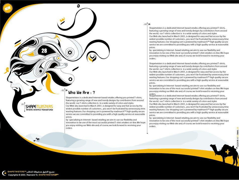
it's me again (Smile)") i'm working hard on my own small projects in my free time. the mag and the web site will b online as soon as they r done 14 page of the mag is already done .. still lot to work on ..
i'm working hard on my own small projects in my free time. the mag and the web site will b online as soon as they r done 14 page of the mag is already done .. still lot to work on .. P.S : special thanx and respect gose for those who comment my works ..
shapetwisters™
Related content


Comments: 89


 (Wink)")

fantastic! when will shapetwisters open? ive always wanted your tshirts
👍: 0 ⏩: 0

Oh mate, this is fantastic
Love the choice of colours an the little details, like the camels, the blue/gray dunes (they're absolutely charming), the text compliments... everything is nicely and calmly done.
The most impressive element here is the face, composed by an unnumbered forms and colors. Things that got my attention most were the eyes and the mouth.
Everything just compliments the other elements. This is going to be my fave for now.
👍: 0 ⏩: 0

wow that is one of the best looking website i have sen in awhile.. great desgin and stuff..
👍: 0 ⏩: 0

slick lookin', man
glad to see things are progressing smoothly.
👍: 0 ⏩: 0


ya waad ... eih el7arakad deih ?!! mashallah altasmim raw3ah ... alalwan wil altarteem miyya 3ala miyya ...
ya3ni kollo ala ba3do mitaktak w 7ilo 2awi ...
👍: 0 ⏩: 0

great work here!
just some things: I am not sure about the "new" in the upper left corner, it doesn't fit the atmosphere and the page won't be new forever anyway. I know that it maybe looks a little bit empty in the corner there, but I think you should find something else than a 0815 star with a "new" in it.
Then, just a little thing: write "who are we? or "who we are. " who we are ? doesn't really work, or does it?
and lastly, i am not sure about the cross on the camel. you already used the moon and the star on the lower left, I feel like the star is one symbol too much and the cross with one edge cutted can be seen many places now anyway.
👍: 0 ⏩: 0


the moon and the star at the right bottom corber look like turkish flag
very nice job though...
👍: 0 ⏩: 0


")

Awesome design. Very good placement. It's different and thats what makes it so great.
👍: 0 ⏩: 0

The complete layout for this works extreemly well.
The colors also compliment each other.
👍: 0 ⏩: 0

Thats cool!
its looks very original, I like the illustration its great.
👍: 0 ⏩: 0

Holy mother of god! this is DIRTY man! well done! keep up the good work!
👍: 0 ⏩: 0


Wonderful work Rami .. I really love to see your deviations and this one included. What interests me most of it all is that your work is "vector" art but not as most people do it. I have to admit that my vector works are like "standard" designs, things people with a bit drawing technique and illustrator knowledge could create but your work is different, it's original.
👍: 0 ⏩: 0


you have to be the most original artist on this site. i can't wait to see this in its final stage.
👍: 0 ⏩: 0


You're one of those people that exhude style in everything they do. As always, some incredibly pimp work. I'd tell you to keep it up, but I know you will anyway.
👍: 0 ⏩: 0

very nice, i like the arabic details in the typo at the bottom...arabic has such beautiful glyphs!
👍: 0 ⏩: 0

ummMm I like it, Great design ! Are you a designer graphic ?
👍: 0 ⏩: 0


Wow. Great the way you've framed the piece with 'dunes'. Loving the main figure too. Sick work.
👍: 0 ⏩: 0

as always, the colors and vector work are MINT, cant wait to see the website
👍: 0 ⏩: 0


Awesome, really awesome. I didn't get the idea this was an actual web interface, untill I looked at the category you placed it in. I like that, too many websites are using standardized layouts (of which I sometimes am guilty off as well). I must say, I fell in love with the Arabic looking text in the bottom left .. though, did you misspell [i]"Reserved"[/i]?
Very nice work 
")
👍: 0 ⏩: 0

I love the dune with the camel, very slick. The face is badass too. Keep on working, it will be awesome.
👍: 0 ⏩: 0

Awesome as always, I'm sure the whole project is
👍: 0 ⏩: 0