HOME | DD
 shawneboy — Desktop Dimension Version 2
Published: 2002-07-21 09:06:53 +0000 UTC; Views: 2281; Favourites: 10; Downloads: 360
Redirect to original
Description
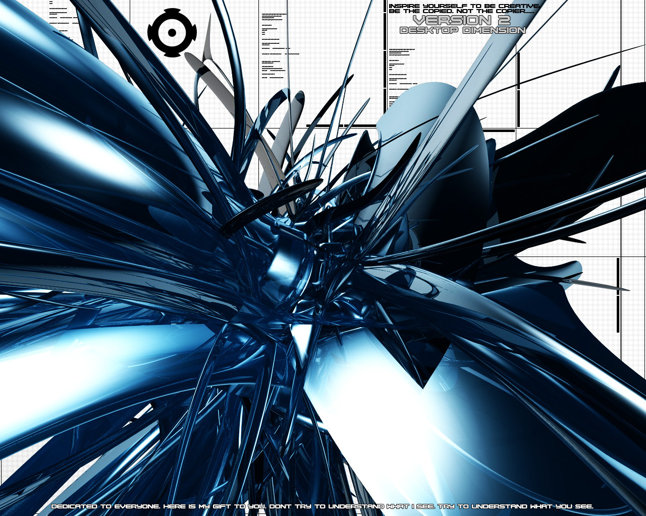
Well. Its early in the morning here. I've been listening to very mellow trance all night. It reflect's my work.My past few submissions have been my first models in 3d. But I haven't neglected this form of art. This is still my favorite. And I will continue to do this.
Big shout out to ussjgoku217 . [link] He's one of the nicest deviants I have had the chance to interact with. He took the file I made in cinema4d and rendered it for me. Because my computer just could'nt handle it. Thank you. You are respected.
Many will view this, few will comment. Heres a thanks in advance for those kind enough to take the time to comment. Take care.
Related content


Comments: 30

Ok so I picked something that caught my eye the most from the list hard deciding but this one I liked a lot Don't have much type to comment on all 29 devs
I like it, shiny, glassy, smooth. Very nicely done The color looks really good too, then again Iam in love with the color blue. Keep up the good work.
👍: 0 ⏩: 0

Shit that's insane lookin', I loves it. Definatley a fav man.. def.
👍: 0 ⏩: 0

This piece is totally chaotic when done bad, it looks awful, but when done good it looks just awesome. Which is exactly what this is, awesome
I like the colours and the overall design. You seriously have talent
👍: 0 ⏩: 0

Nice image bro a little more work on the text and this would be +fav. No doubt. The render owns tho good job
👍: 0 ⏩: 0

Ooh. Love this. This is going to be my wallpaper! :+Fav:
👍: 0 ⏩: 0

wow this piece is simply amazing. wow, it's chaotic looking, but at the same time it's totally not. asdlkha just awesome.
👍: 0 ⏩: 0


shawn get job my friend this look really nice, +fav
👍: 0 ⏩: 0


...I understand what you see
...and...thank you to feel one of everyone
..anyway...I like your 3D perception...colors...and lights...
...and like this little blue/smooth/metalic chaos...
👍: 0 ⏩: 0


love that form and the colors rock. not diggin the typo though
👍: 0 ⏩: 0

...visions of bunnies getting decapitated by small smurfs....
....its all groovy....dude ya!
--
bacanos...the sapient hippie.
👍: 0 ⏩: 0

it was no prob, i ran it in the background while gaming on zsnes.... Siken Densetsu 3 ownz...
yea, shawn, i took a little looky-poo at the file u sent me, and im STILL trying to figure out how ou did that.
took a torus, selected a portion and matrix extruded'?! i have no clue, really awsome what you did though... if u make anything else, send it over, id be glad to do some more. its always interesting to get into the other person's mind and see how they manage thier objects in cinema.
👍: 0 ⏩: 0

now why would only a few comment? that is very nice work. the typo is a little to BOLD, but there is nothing wrong with that. very nice render, and thanks to ussjgoku217 for doing that kind deed for you!
👍: 0 ⏩: 0


I'm always open for all kinds of comments. In my defense I would like to take the chance to state that its tough being original when you work with a popular style of art. I always try to make each piece I do different than my last one. I dont try to submit the same thing every day. And I may not be the best at 2d. But I try to do what looks clean, even if some people may not like it. It's more about impressing myself. Thanks.
👍: 0 ⏩: 0


Everything is an exceptional job except the little white part in the background. Seems to draw your attention away from the chaoticness in a bad way. But other than that, the design is awesome and it still got my
👍: 0 ⏩: 0


like this nice shapes cool colors .. but the typo isn't looking good
keep it up
Ik.
👍: 0 ⏩: 0

I agree with breakthecycle, too much text. Actually, all I think needs to be removed is "Version 2 Desktop Dimension", otherwise it's not that bad.
And yeah, whether you try to be completely different or not, your idea has probably already been thought of by someone else, regardless of how far-fetched it is.
👍: 0 ⏩: 0


IMHO, too much typography. The grid in the background adds a lot to the 3d.
👍: 0 ⏩: 0


I like the render, but the 2d isnt as good. It says "Be the Copied, not the Copier" But in this wallpaper you've managed to copy over thousands of people. No one can be unique these days, there is always going to be someone you (as in the general public) are copying. Im not trying to put you down, Im just stating the obvious to the qoute you have. Nice render though.
👍: 0 ⏩: 0

nice 1. must have taken a long time but its reeeaalllll sweet. ~
👍: 0 ⏩: 0

simply awsome.. but the text is a little corny..way over used.. besides that..GJ!!
👍: 0 ⏩: 0

whoa sweet.....awesome wp mate.
i love it.. D
and yah! first comment lol
excellent wp
👍: 0 ⏩: 0