HOME | DD
 Shawnichols333 — assignment 1 picture 1
Published: 2011-09-29 14:31:15 +0000 UTC; Views: 48; Favourites: 0; Downloads: 0
Redirect to original
Description
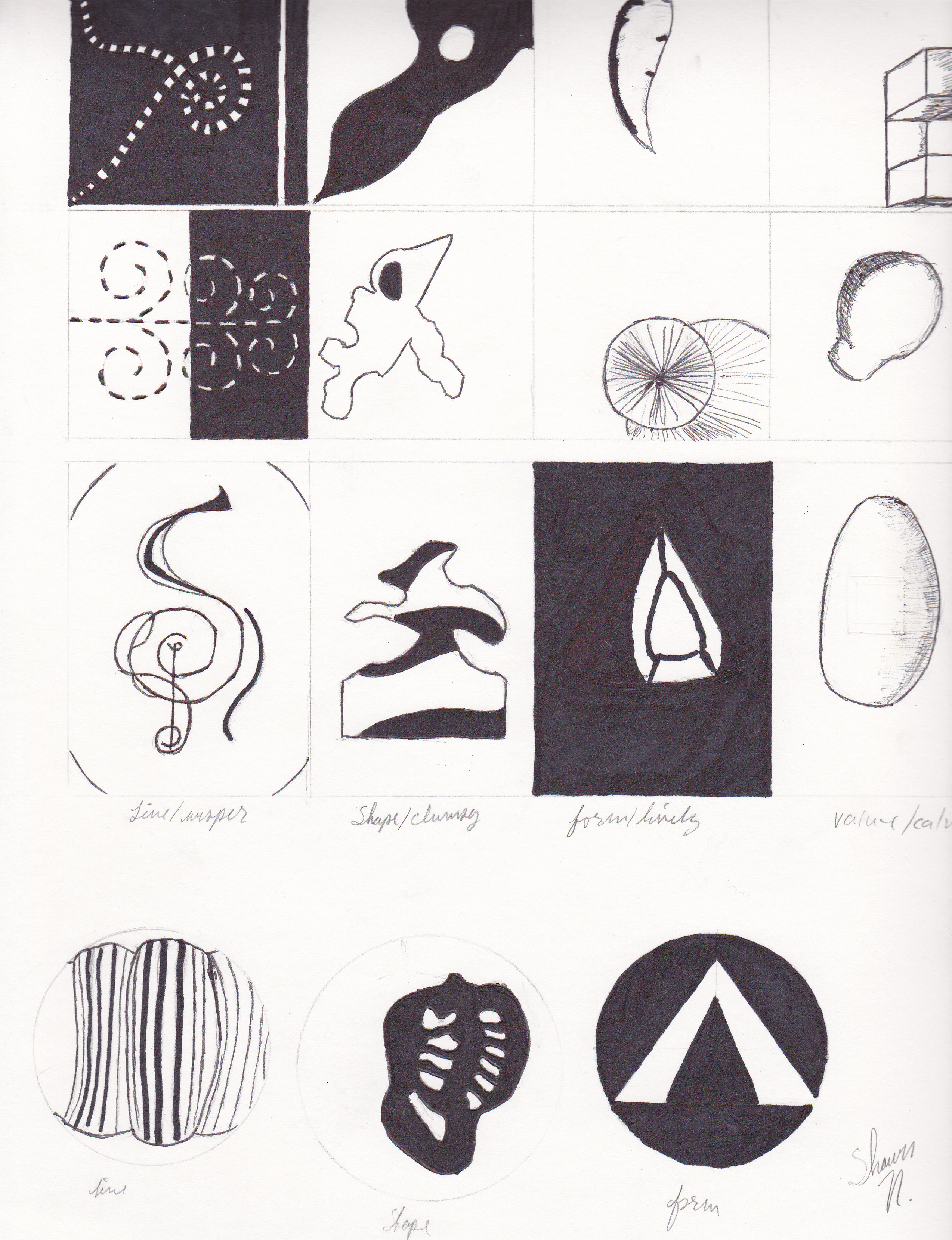
I felt so stupid when doing this. I should have clearly known what to do, but no, I didnt.told you guys I would be putting my best and my worst up here.
and its sapose to be the seven elements of art but I did horrible on it. At least Iv learned to not do what have done.lolz
Related content


Comments: 2

Thank you so much.
Comments like these help me out sooo much, like you really have no clue. It will help me to improve in what I do and get better. Thanks love.
ps. always share your wisdome with us. love you
")
👍: 0 ⏩: 0

First up is the line/whisper column. I'm going to start with the second box down from the top. I really liked this one, it really gives me the feeling of being a whisper, plus I love the dynamic change between black and white. It just makes me feel relaxed and smooth inside. The top box gives me more of agitation and denial feeling, mainly cause the free flowing line looks cut off because of the straight vertical line. Lol, makes me wonder if you were unknowingly releasing your feelings into your art. The third box has a lot of potential. I thought that the curved lines in the corners were a good idea to make the viewer focus in the middle, and I like how you infused the idea of music into it as well. The only thing I thought that would have made it better would be more alternating with thick and thin lines. Not too thick or it would be loud and not a whisper, but maybe medium or in the middle between medium and thin thickness.
The line circle was very interesting in composition. I like how the the lines seemed to get further and closer towards the viewer, it gave me a feel of what one would see through the sides of a telescope. U know how you look through and only the middle is not distorted, just the edges are warped.
Shape/clumsy
The Third one down gives the most feeling of clumsiness, if i said that right. I myself have no idea what clumsy would look like except to maybe branch it off of mistakes like ink blots or something that would be slightly off, contrasting between something straight. The second box from the top seems misdirected and in that sense clumsy. Though, my eyes are directly looking at the black dot, inside what i thought of like a bird like shape lol, making it hard to really focus on the rest of the inking. The top one is the least clumsy to me, but that by no means doesn't mean that it is not compositional wise very interesting. I really like the invading feeling and fear it gives me. Though I feel sorry for the white getting violently invaded by the black, makes me kinda want to know what you were feeling at that time or maybe its just meh.
The shape circle is very nice. The focus was shape and you did that exactly. and it was interesting too. By making a thick black shape rounded around the white you kept the viewers focused into your work. And I was really intrigued by how you made your idea. Innovative my man!
Form/lively
In all three boxes I noticed the same things. All of them have form but none of them really have liveliness. Maybe the second one from the top has some by the lines shooting out from the center point, but they all give a cold conformed feeling of staying in line. Though I really can see how hard it is to think about what to do with this, cause to me Form and lively are two opposing ideas.
I liked the form circle. It would be awesome if it was like a batman sign.
I can't really say anything on value and calm cause i really can't see the whole thing, but yeah there you go. I hope this might have helped out.
👍: 0 ⏩: 0