HOME | DD
 Shirokaze2012 — Versus Character
Published: 2011-04-16 06:03:19 +0000 UTC; Views: 834; Favourites: 17; Downloads: 35
Redirect to original
Description
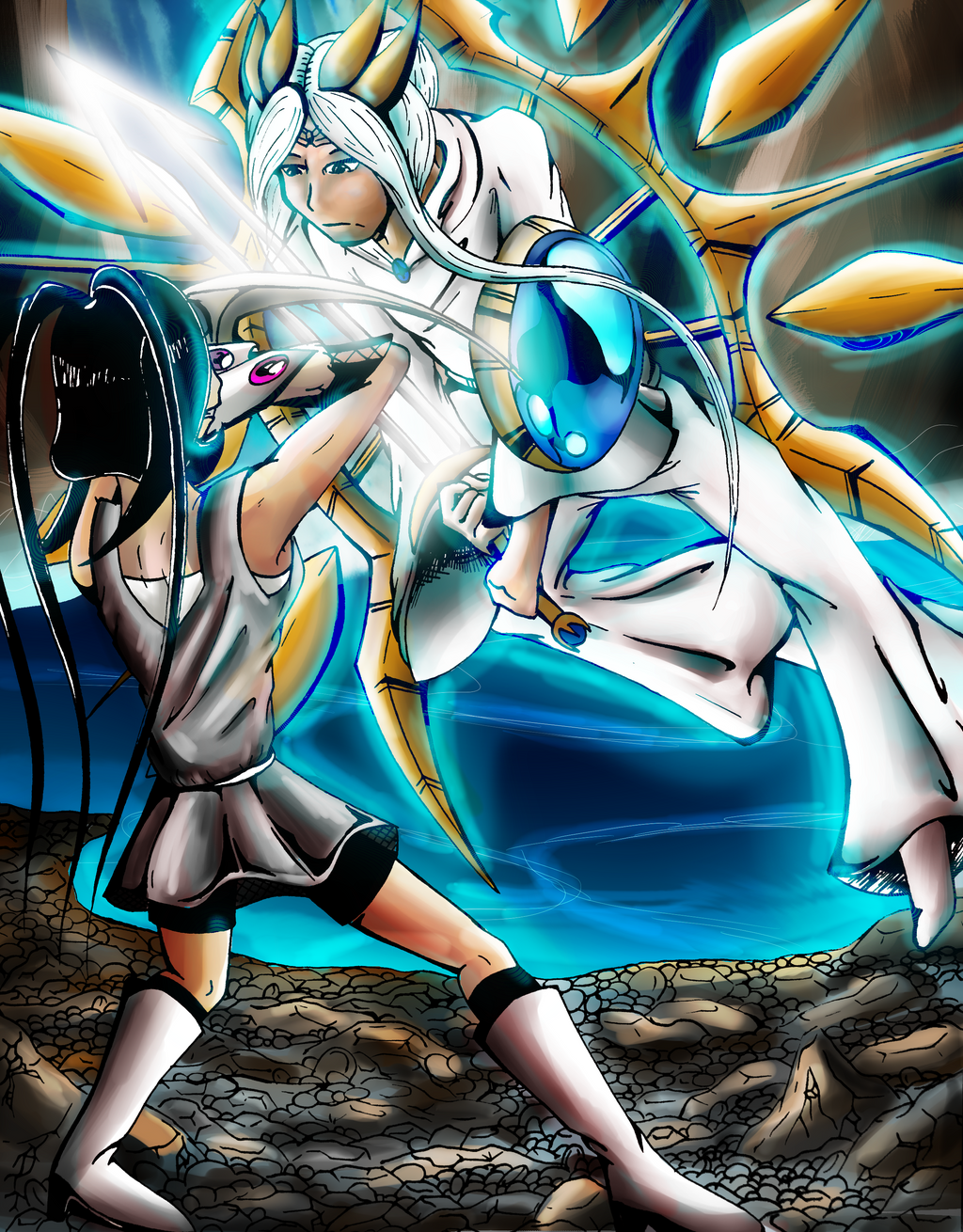
Edit: There seems to be some undesirable lines in the pic, this is most likely result of the line art being take with a digital camera.I started drawing this during today's art assembly (ironic, i didn't actually attend the art assembly, too noisy.) but i did start drawing this, at first it started looking cool and i was all like, this pose rocks
 but then i messed up in 10 different places, so i re-traced the pose on a different paper resulting in the line art you see here. then i was all like. HMMM i should colour this....so i did. i did most of it in sai, but then i was all like HMMMM why you still no epic piccy!? so then i took it to photoshop and added some magic.
so these are a couple of my characters
 the one with the glowy stick has a name but i don't feel like saying it just yet Characters are still in developement
anyway enjoy and plz critique
also, if these characters are similar in more than a few ways to another character, lemme know so i can change their design
well at least the sword dude he's one of the main characters and such
Related content


Comments: 4

You put a lot of effort into this one; particularly in the line and coloring. Attention to detail is also important.
👍: 0 ⏩: 1

i was reeeeeally bored at school....thats why the lines lines look super detailed., the only real digital work i did to them was make them look digital from the raw camera image
👍: 0 ⏩: 0

i no like it anymore
👍: 0 ⏩: 0