HOME | DD
 Shuma87 — COFFEE and TEA DESIGN
Published: 2007-04-24 11:47:17 +0000 UTC; Views: 14089; Favourites: 54; Downloads: 741
Redirect to original
Description
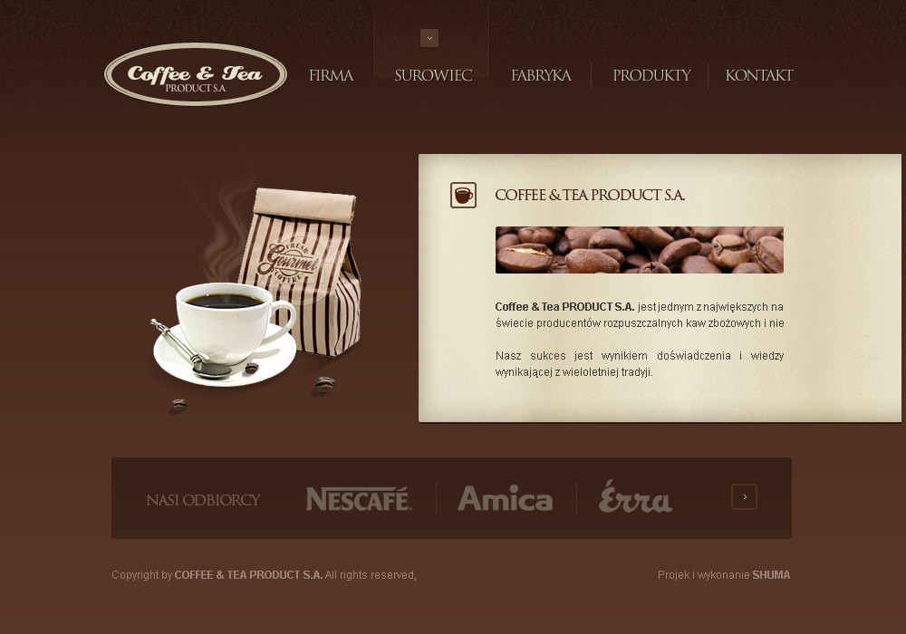
MINI DESIGN for COFFEE & TEA DESIGN (Smile)")
DESIGN and LOGOTYPE is MINE
Related content


Comments: 17
premierpixels [2010-08-03 03:12:55 +0000 UTC]
Nice layout, maybe should try to experiment more on the background. Las Vegas Web Design
👍: 0 ⏩: 0


niiice! Im taking "Graphics Design for the WWW" in school this semester, someone tried to do a site really similar to this and failed miserably. You didnt
👍: 0 ⏩: 0

Yes, Poland. I have always said Poland has greadt designers.
Great concept here. Very very nice work.
 (Wink)")
👍: 0 ⏩: 0


I think the area where the coffee brands are listed could be quite smaller. I have an idea on how to make it work with the rest of the site, too, but not sure if I can explain it very well. Feel free to contact me on instant messenger if you are interested in my explanation.
Other than that, I wouldn't extend the background of the "Coffee and Tea Products S.A." section completely to the right edge of the site. A consistent margin width would work, imo.
And I really like how you haven't included much texture. It's nice and smooth just like coffee and tea should be.
I gotta go make some coffee now... ")
👍: 0 ⏩: 0


Wow, nice pictures ... where are the stock's from?
👍: 0 ⏩: 0

Love the colurs and concept! Although i luv almost all of ur works lol! Keep it up mate!
👍: 0 ⏩: 0

Really nice! Second the great colour choice!
Though I think you need to do something about the nav. Having the hover state stop half-way through the text with nothing as a sort of bottom retainer to tell you the button extends beyond that point is very confusing. I'd either extend what you have a bit farther down so it's behind the text or add more of a gradient so it fades before you get the text.
👍: 0 ⏩: 0


cos onmouseover ci sie chyba skopał albo nie kumam tej koncepcji
👍: 0 ⏩: 0


")
