HOME | DD
 silentfox9200 — UI Test
Published: 2016-08-22 23:35:09 +0000 UTC; Views: 179; Favourites: 2; Downloads: 0
Redirect to original
Description
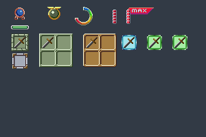
Hey everyone!I need your help again!
I'm currently trying to design an UI for Guardians of the Rose, but creating a good UI is rather difficult.
When it comes to UI, you shouldn't think about right or wrong. Anything can work if it gives off the right feeling, right?
So, I just tried various ways of creating UI elements.
I started with some simple designs (as seen in the top left)
I created 2 HP bars, 2 skill tree image holders, a skill tree skill level bar.
The rest is just interface for items.
Please give some feedback, tips for a better UI, preferred colors etc.
Thanks in advance!
")
Related content


Comments: 2

UI is really difficult! I have done very little of it myself. Something I found really important is readability. It has to be recognisable from a quick glance. I like some of the designs you have come up with so far! I would really need to see them against the screen inside the game world to judge how effective they really are though.
Really liking your work. Always look forward to your next artwork!
👍: 0 ⏩: 1

Thank you! More will come in the near future!
I already discussed this with the game developer and the UI will be a Grimoire, so that's going
to be the next UI post I'll submit!
👍: 0 ⏩: 0