HOME | DD
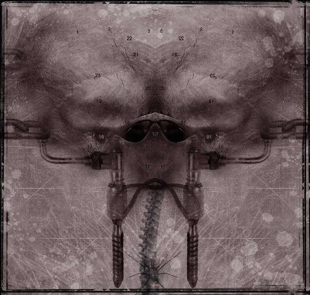
 silvermind — Phantom

Published: 2001-11-12 14:24:29 +0000 UTC; Views: 559; Favourites: 4; Downloads: 94
Redirect to original
Description
something I worked on the other night after work. As always thanks to Chip [link] for the photos.Related content


Comments: 13


whoa, although this isn't really the style of art I prefer, this is stupendous keep up the awesome work silvermind
👍: 0 ⏩: 0

Very very nice! I really like the dark imagery and colors in this piece. Nice textures as well. I like the grungy feel of it, but the interesting silvery shape does stand out - but that could be the intention? If it is, I think it works well. If it isn't meant to stand out, you could always try blending/fading it a bit more? It would be interesting to see the face maybe faded and distorted a bit more to? Just ideas...might look terrible when tried out. This piece looks great as it is. Good work!
👍: 0 ⏩: 0

Nice yet again...love the layers and textures...it just lays over the eyes like a soft blanket ...wonderful
👍: 0 ⏩: 0

so pretty, but I think it needs a splash of color... or at least should be sepia...
-[Transmission terminated]-
👍: 0 ⏩: 0

Reminded me very much of the Nerve piece. I dig the weathered paper look.
- u - b - u -
👍: 0 ⏩: 0

Excellent as usual sara. those tools are damn scary hehe
your canvas' always amaze me
Very Nice
its been awhile give us MORE MORE
👍: 0 ⏩: 0


I like the whole grungy aspect of it, but as was said before the wheel is too bright.
-] pha|anx.out
👍: 0 ⏩: 0

I like the border you make on a lot of your art. Its grungy and broken but its still there intact somewhat. The manipulation is good, the wheel does seem a bit off but I dunno. I like the colors you use the dull grey's.
DV
👍: 0 ⏩: 0

cool. i love it. could do with being more semetrical. the face kinda throughs it off.
..:: ART|hive http://jamesmusgrave.cjb.net ::.
👍: 0 ⏩: 0

Cool... there's a lot of texture and some interesting imagery happening in there. Kinda freaky. I'm not sure that spoked wheel on the chin really fits though... since it's so much lighter than the other elements of the piece, it becomes the central focus which probably wasn't the intention I guessing. *shrug* I really dig this piece though.
👍: 0 ⏩: 0