HOME | DD
 silvermind — Violet Ray

Published: 2001-10-29 13:35:29 +0000 UTC; Views: 766; Favourites: 0; Downloads: 153
Redirect to original
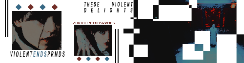
Description
a possible new look for my domain violet-ray.netRelated content


Comments: 18

cryptic and elegant
like the ghost of a victorian woman inviting you to tea
also kind of reminds me of the pixies... death to the pixies particularly... maybe that's just my brain trying to connect it to something though.
👍: 0 ⏩: 0


i like it sarah.. the design is original... i like what you have now on your site but a change is always good
👍: 0 ⏩: 0

a possible look?! it's a must! the esthetic dream came true ... !
// biopfoten //
____________
didn't bring a gift? take a hostage
👍: 0 ⏩: 0

Yeah its look preety cool, Would like to see it when it is done
http://www.johnp.f2s.com/
::My Web Site::
ICQ:53178041
Check out MANNNNNNNN!
👍: 0 ⏩: 0

That's pretty nice lookin... reminds me of this game, Journeyman Project 2, where you go back in time to Da Vinci's studio and look at all sorts of old documents with big curvy words and whatnot... yeah... anyway...
--
[Please consult a physician if subsequent exposure to Skrath results in subdermal fecal matter expulsion]
👍: 0 ⏩: 0


that's awesome silvermind looks kinda rustic, with a light grunge, and the text looks great too
keep up the awesome work
👍: 0 ⏩: 0

lookin' AWESOME.
would love to see this in action....is it up yet?
👍: 0 ⏩: 0

I really think this has potential, and would be a great design for your site. I like the stained effect it has to it too.
DV
👍: 0 ⏩: 0

thats really nice! i like the font and it suits the whole layout
but the menu item text is quite hard to read. maybe you should enlarge it a bit? and you could replace the pixelCore footer also by your own font and images, this shouldnt be a problem for them. and: you could enlarge your visible area. just some tips
👍: 0 ⏩: 0

Very nice...for the web, the colordepth could be dropped a ton...i would expermiment with useing gif file format and slowly start reduceing the final output color depth until you have a nice balance between speed and quality...save for web in photoshop will give you download speeds on the graphic for different modem speeds, maybe 2 entry pages...High and low?
the link text could be in transparent gifs if you dont use shadowing...drop them into tables on the left side
all n all the design kicks ass
great work
👍: 0 ⏩: 0

Looks like it should be very sweet, I will have to visit the actual site now.
KrasH
~We are the music makers and We are the Dreamers of Dreams~
👍: 0 ⏩: 0


Thanks for the comment. Yeah, this is actually a cropped version of the layout...when it is in full screen seeing the cable makes more sense.
The font I used is called Zothique.
[ - sarah
http://www.violet-ray.net
👍: 0 ⏩: 0

Nice design. Looks like it might take a while to load on a 56k though. I don't know what your surfing habits are but if I hit a site that takes too long to load (i.e. I don't see stuff start to pop up on screen after at least 15 seconds) I usually leave, no matter how cool it might be. I will make an exception for some Flash pages IF there is an interesting load screen.
And I'm not sure I understand the relevence of the readout thingy and cable.
I like the font, what is it?
WATCHITMAN!
http://www.watchitman.com
👍: 0 ⏩: 0

whoo!
Looks good
::Breed:: » http://www.breedart.org
::Exordium:: » http://www.exordium.f2s.com
Arts Longa I|I Vita Brevisis
👍: 0 ⏩: 0