HOME | DD
 SilverVanadis — Cain and Mabel - chapter 1 pg 26
#comic #pokemon #silvervanadis
Published: 2016-11-01 11:53:43 +0000 UTC; Views: 2305; Favourites: 52; Downloads: 0
Redirect to original
Description
previousnext
The comics webpage
Tapastic
There is also a DA group !
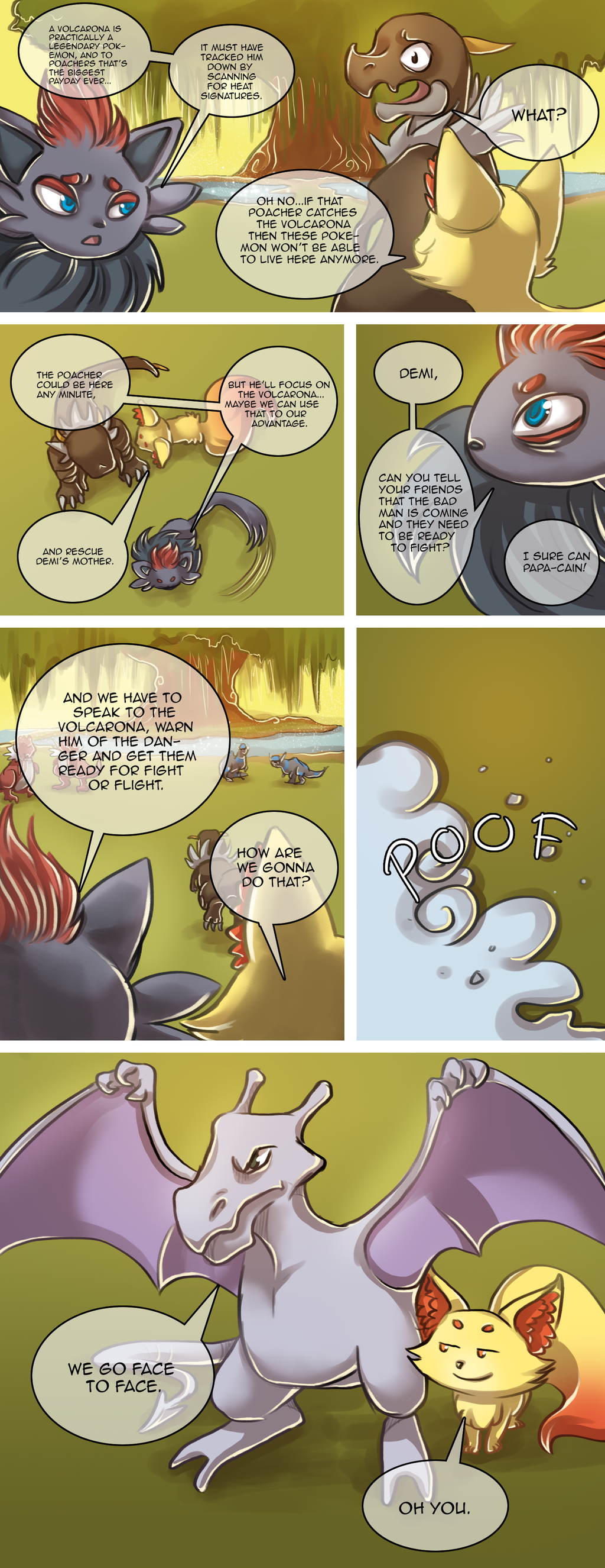
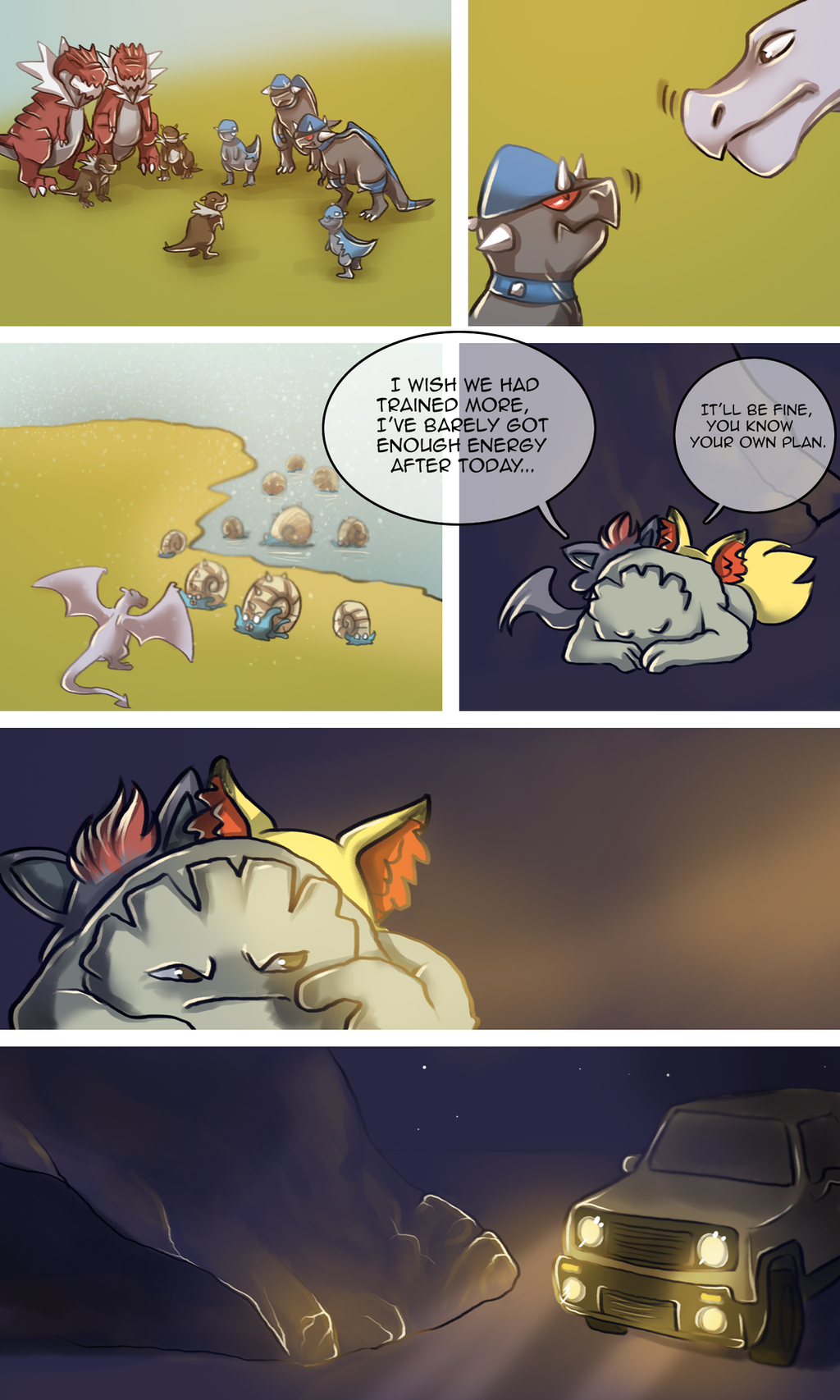
Join us for the journey of two wild fox pokemon trying to find their way in the world, all while battling threats and saving the day! These characters have a life outside of pokeballs, who says you need a trainer to go on an adventure anyway?
Colaboration with Rhys Horton and Andy Anaya .
Story by: Rhys and Andy.
Art by: Me and Andy (prologue).
Related content


Comments: 11

👍: 0 ⏩: 0

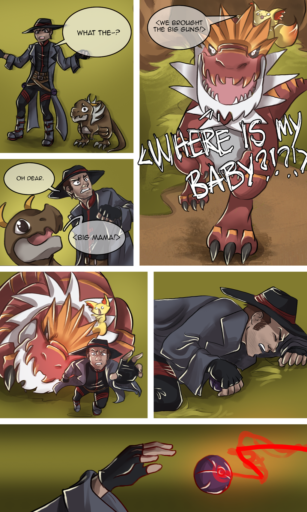
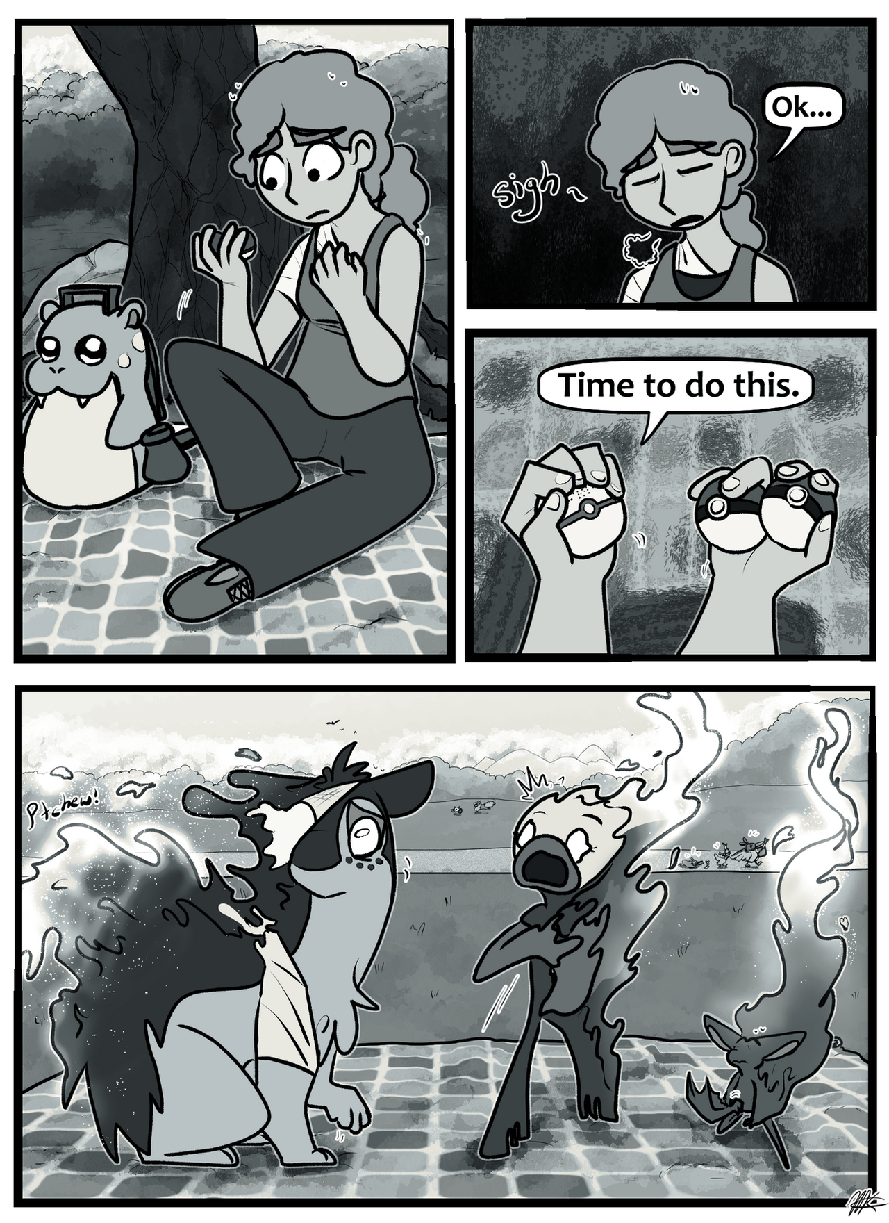
"Mommy is very angry"
-The Lost World
(I regret nothing! X3)
👍: 1 ⏩: 0

Hello from ProjectComment !
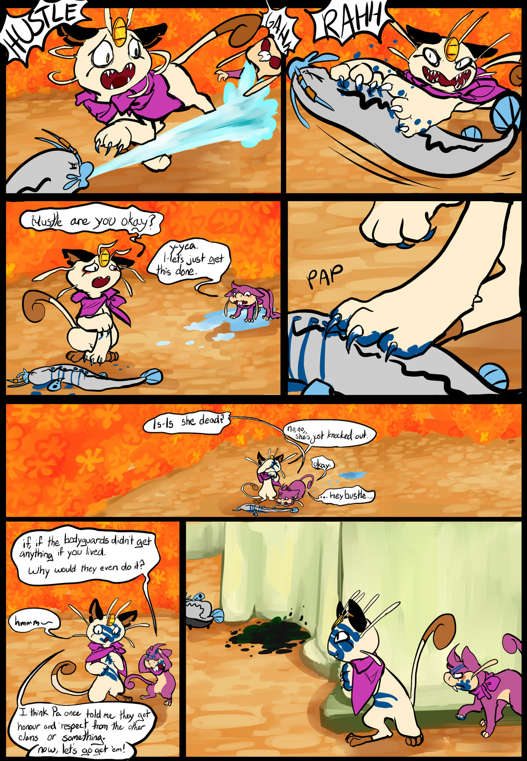
I would like to start out saying that I really, overall, like this piece. You're style is consistent , your lines are very lovely. The detail on the characters is simply stellar. I like your usage of the semi-transparent speech bubbles. You don't lose any of the artwork behind the dialogue and yet everything is still clear and easy to read. What is even better about this, is that despite me not knowing anything about this comic is I am able to tell who is the bad guy versus the good guys.
I also love the word useage of the "bad guy." Using "oh dear" is pretty funny to me.
Now there are a few things I have noticed about this, and they're not really problems (this is a good art). However I see a lot of places you could do even more. I will go panel by panel with what I noticed (both critique and compliments because each panel you have done could be an artwork on it's own it's so well done).
P1: The blurry effect to show movement is just a little off putting. It took me looking it over twice to understand it was to imply that the ground was probably shaking. Action lines around the characters might be able to help with this, or a wobbly lined back drop to show wobbles. The blurriness alone could be mistaken for some as poor brush choice.
P2: To me this panel is perfect
P3: I really love P3. I am not familiar with the names of the pokemon, so I'm just going to go with Big Mama and Smol Hero. These two are supposed to be the highlight of this page. For this panel you could actually have made them larger and overlap the gutters. When you're doing comics, things don't always have to stay inside of the gutters. Otherwise this is a great panel.
P4: I am not really too sure what happened here. Did Big Mama trip or did she lunge at him? This is another panel where action lines would help direct the idea of action to fill in these blanks.
P5: My reaction "That is what you get for messing with a mother's baby"
P6: Ok, this is a good panel, you did the background nice to show the direction of action and such, but you could have added some lines of action from his hand to show he was moving it to throw.
Overall, I really like this. You're a talented (skilled) artist and you've got an interest comic here. My suggestions on the action lines are merely that. It really helps bring a comic to life, as do sound effects. Thank you for submitting this piece to ProjectComment, it's a remarkable comic. :3
-Red
👍: 0 ⏩: 0

Hello! I found this piece through and would like to give you a constructive comment. (I don't know much about pokemon and am critiquing this page alone without context to the rest of the story, so I will try to steer clear of anything that can be explained with context.)
Having done a few comics myself, I must commend how clean and easily read this page is. Though your gutters seem a bit thick in my opinion, your paneling choice makes it easy to follow along. The font choice and speech bubbles are also easily readable, though I'd say the speech bubble in panel one is unnecessarily large. All the characters' expressions look great, too.
My biggest critique with this page is that only one of the six panels has a proper background. I totally get what a pain backgrounds can be, but this page would really benefit from more background. In the first panel, for example, adding a solid color as a ground for the characters to stand on would add some atmosphere and clues as to where the characters are located. Panels like the last one or the "Big mama!" one can get away with gradient backgrounds. But the reader loses atmosphere in panels 1 and 4.
I'm also just a bit lost with some actions in this scene. For example, I can't tell if the mama monster fell or lunged in panel 4 (though I do love the perspective of the human character jumping for his life). I also had a bit of trouble with the last panel. I am assuming that the pokeball(?) is jumping out of his hand since he's holding it in the previous panel, but some action lines or motion blur could add to a sense of motion and clarify some of what's happening.
Overall, I really like your consistent style, the color and shading, and just about everything else with this page. Your art and storytelling seems very clean and visually appealing, but motion lines and backgrounds would really elevate it all.
👍: 0 ⏩: 0


A mother Tyrantrum! Poor Poacher now, but he asked for it XD
👍: 0 ⏩: 0

You dead Poacher. Don't ever get in a mother's way when she protecting her babies.
👍: 0 ⏩: 0