HOME | DD
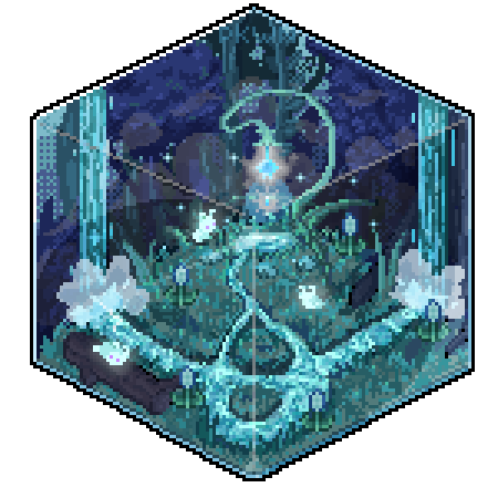
 Simmar — Falling In Between

Published: 2006-02-03 19:03:55 +0000 UTC; Views: 2859; Favourites: 27; Downloads: 284
Redirect to original
Description
Thank you for viewing.And thnx to my boyfriend for making up a nice title

Programms;
Chaoscope & Photoshop
Related content


Comments: 177


wow! Thats great! And the title fits perfectly!
👍: 0 ⏩: 0


It's subtle, soothing to look at. Nice title too!
👍: 0 ⏩: 0


 (Wink)")

hm, my computer screen is making it rather hard to see all the details, but from what i *can* see, well done! ")
")
👍: 0 ⏩: 0


Wow
I love the coloring, man.
Good job
 (Smile)")
👍: 0 ⏩: 0


Though my computer's resolution is very BAD...it looks rather nice. Like a set of stairs.
👍: 0 ⏩: 0


oh wow that looks awesome!
it looks like a path into a forest or the 'unknown'
👍: 0 ⏩: 0

Is really interesting. Looks like an optical ilussion
👍: 0 ⏩: 0


Nice, interesting, little too blurry for my taste, but nevertheless interesting
👍: 0 ⏩: 0

Reminds me of a hallway inside a gothix cathedral, did you mean to do that?
👍: 0 ⏩: 0

ziet er leuk uit!
mischien is het canvas een beetje groot maar dat is mijn mening
👍: 0 ⏩: 0

Quite nice, the abstract thingy, but i don't really like the colours... Also the font you used just doesnt fit very well to the rest in my opinion...
👍: 0 ⏩: 0


Followed this here from the forum... O_O Very impressive! I like how the colour is concentrated at the bottom.
👍: 0 ⏩: 0


Looks nice...just makes me wonder where would I get if I followed that path....
👍: 0 ⏩: 0


Hmmm...I really like the looks of this...I dunno wat it signifies but looks really cool.
👍: 0 ⏩: 0

very cool fractal! i reckon itd look better w/o the text though....distracts a bit
👍: 0 ⏩: 0

Great title! I love how the colors create almost a path! Very nice!
👍: 0 ⏩: 0

Interesting. The composision feels jumbled, though. I think the elements of this piece are too scattered, so it doesn't balance right.
CW
👍: 0 ⏩: 0

That looks really cool, has a very nice effect, very good contrast with the light and dark.
👍: 0 ⏩: 0

awesome! It looks like a leaf touching water and because it touched the water, the second image is distorted.
👍: 0 ⏩: 0

It's all so.. intriguing! Very nice shapes and colors.
I also think the title is very cool.
👍: 0 ⏩: 0

W O W ! Thats amazing 
👍: 0 ⏩: 0


Tripy perspective... get's me scared... concept rocks to...
👍: 0 ⏩: 0


Interesting. I like the colours and the shape of it Oo very interesting
👍: 0 ⏩: 0


Great work, you have to look at it for a while to make even a tiny bit of sence of it, hehehe love it
👍: 0 ⏩: 0

Wow...that looks really good. I do like the title.
👍: 0 ⏩: 0


very beautiful you can see so many different things in this!
👍: 0 ⏩: 0
| Next =>