HOME | DD
 simplecandy — Business Cards Redux

Published: 2008-10-22 15:12:29 +0000 UTC; Views: 1269; Favourites: 10; Downloads: 65
Redirect to original
Description
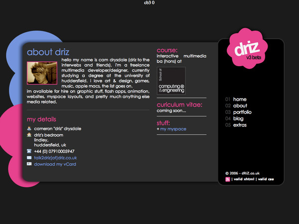
The simplecandy brand is very messy at the moment, their are parts that are fun and vector based, and parts that are glossy and modern looking. I can't decide which style I prefer, so for the time being I'm trying my best to mix the two. The new business card mockups hope to mix the two mediums.Feedback welcome. x
Related content


Comments: 2


I feel that the side with the just the dot needs something else. It looks too basic and not enough time had been put into it..
It kinda looks like a coaster.......
I do like the other side with text though, but I would have preferred it if the dark grey background was a bit darker.
👍: 0 ⏩: 0