HOME | DD
 sinan —
Tekolate II
sinan —
Tekolate II
Published: 2006-02-23 00:32:23 +0000 UTC; Views: 6045; Favourites: 57; Downloads: 1968
Redirect to original
Description
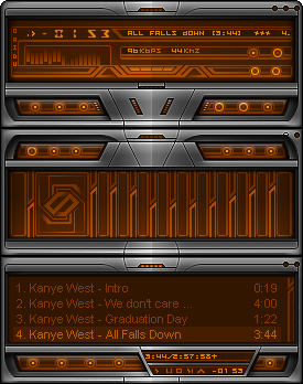
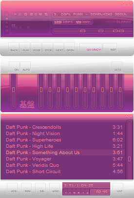
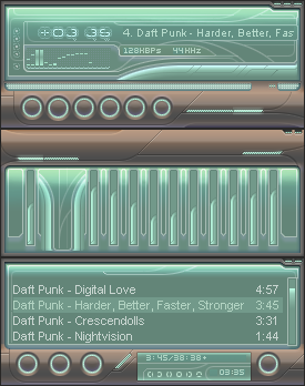
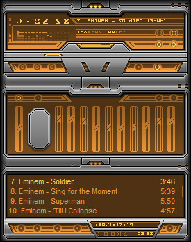
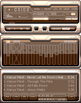
Finally. I finished it.Been working on this for absolutely ages, changed it so many times, if you wanna see what it looked like when I first started it check my scraps.
This is ofcourse a remake of an older skin. Which can be found in my gallery somewhere.
I tried to go for a diff light source for the metal this time round. It was inspired by this goldish metal panel in the last skinmosaic, I think it was done by ~c-specter
The lcd area is more or less jacked from the original, just polished it up a bit.

Dont bitch about the fact that theres no visible stop button. It would have funked the symmetry up and you know how much I like symmetry.
Vis Settings
Right click on the skin> Options> Preferences> Skins-Classic skins> Classic Visualization
Slide Visualization refresh rate to max (70fps),
Tick fire style,
Slide the "Analyser fall off speed' to the middle.
Update: I've added a stop "button".
Oh and everyone please visit my dear friend who pointed out there arent any visible buttons
Another Update: DD


Have Fun
 (Smile)")
Comments, favs etc are welcome as always
Related content


Comments: 67
 (Wink)")
")

haha joking
btw great work on getting a daily deviation

👍: 0 ⏩: 0

fun to se a new wa skin! really nice work, clean and fresh! but i don't like the numbers!
👍: 0 ⏩: 1

Cheers, glad you liked it (well most of it) Tbh I just jacked the numbers straight from the 1st version, so blame my laziness
👍: 0 ⏩: 0


very nice! i really like the way you made the button areas on the bottom of the main window and the top of the EQ. your skins are always really cool. i'm a fan of symmetry myself, so i know what you mean. however, you could add a little light (just like the one in the center of the titlebar on each window) on the side of the metal where the stop button is. i don't think that would look bad or ruin your symmetry too much (just a thought). i also like that you can stack the windows any way you want. regardless, this is definately top notch material!
👍: 0 ⏩: 1
Thanks for the expansive comment
👍: 0 ⏩: 0

Wow, this is pretty good?
")
👍: 0 ⏩: 1
The ONLY thing I'd like to complain about after using is is that the two colours u chose kinda... well... LOL they're not easy to read one on the other.
👍: 0 ⏩: 0


Maybe my winamp is just bieng retarded. >> It went back to classic mode when I tried to load it.
👍: 0 ⏩: 1
Nope, it works now. ^_^ Thankyou.
👍: 0 ⏩: 0

oh my gosh, thanks for giving me reason to use winamp again!
👍: 0 ⏩: 0

C buttons look hot! As does the EQ, good work man
👍: 0 ⏩: 0

I like this one - especially the way you made the player buttons! Nice colour too!
👍: 0 ⏩: 0
