HOME | DD
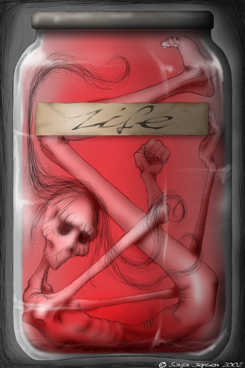
 Sirhurt — Life in a jar
Published: 2002-11-20 13:16:45 +0000 UTC; Views: 9109; Favourites: 171; Downloads: 658
Redirect to original
Description
A spin off from the picture "Preserved agony" [link]This picture will be up for print.
Wacom and ps 7
----------------------------------------------
About the cards:
For you how are interested in bying the card deck pleas visit the forum.
[link]
I am also working on a solitare game that will be avalibl for download and perhaps also as a online game, so stay tuned
Related content


Comments: 191


mmmmm...pickled peoples...looks yummy. love the color and the flowey hairness.
sweet job!
👍: 0 ⏩: 0


huhu its me
fantastic dev !! just awesome !! +fav
just a gudu
👍: 0 ⏩: 0

Hehe.. like it. But would be cooler if the liquid doesn't has the level until up the glass, so that you can see the surface, you know what I mean? My english is so bad.
👍: 0 ⏩: 0

yay! great work!
i love the coloring that´t definitly going into my favs
-cove
👍: 0 ⏩: 0

WOW!
This is beautiful sweetheart!
All of your work is but this is especially disturbing and delicious!
I loved your other jars but i like the singularity of this one....the way the form is twisted and trapped...it totally makes me think of those jars in Science Lab in highschool that had dead things in them!
Amazing Piece hon!
+fav
👍: 0 ⏩: 0

and if you save yourself... you will make you unhappy... they'll keep you in a jar... and you'll think you're happy...
favorama.
👍: 0 ⏩: 0

great job! This is exactly what i've been craving since i saw Preserved Agony. I like the use of color and the sketch itself is very well done. thanks for sharing with us, your work is simple amazing.
👍: 0 ⏩: 0

You have outdone yourself again.I love these, I'm glad to see one in a larger [link] really brings out the details.. keep it steady on the shelf!!
👍: 0 ⏩: 0


This spin off is better than the original IMO.
Great work as always,
C
👍: 0 ⏩: 0


Excellence as always. You don't dissapoint do you?
👍: 0 ⏩: 0


funkay ...would be good with more detail tho but i like it
👍: 0 ⏩: 0


Hey you... Another lovely work from the swede across my border
You're great with the wacom Keep it going..
👍: 0 ⏩: 0

i love the hair and the label!!!!
maybe if you put some more textures on the skin it'd look more dramatic. looks too smooth right now.
👍: 0 ⏩: 0

If the jar was filled with a very cold hue of blue it would capture the meaning of my life, I think.
As always, more than wonderful. But you know that already.
👍: 0 ⏩: 0


Nice, I was wondering what the jars said, that is if this is the same premise. Nicely done saga, your work is awesome like a possum
+fav
👍: 0 ⏩: 0

Another excellent image. I really loved the other version with all the jars. and this one is great too! I guess about it is that it wont take long until it shows up in the "top fav" section!
👍: 0 ⏩: 0

Ok now that I got the whole 'First Post Rush Idiocy' out of my system Ill leave a real comment.
First off, I really love the color. Your work (in general) seems to lack much color. There are of course exceptions. And Im not saying it doesnt have any color at all, it just doesnt have... alot of it. I know its just simple colors. Red, tan, etc. But its not the same gray I think of when I think of "Zzaga's work". So this is a nice change of pace. At least, thats my opinion.
Continuing with the color, you used it very well. The red glow adds vibrance and.. 'life' to the jar. Like theres actually something in there. Its very symbolistic and adds to (what I concider to be) the meaning of the 'painting'. Its very soft and yet do to the lack of.. spectrum, it carries a very powerful message. Again, this is simply opinion because what I concider to be the meaning, could be nothing more than an false assumption.
The tan label stands out alot more than one would exspect when you first look at the image. It has a 'darker' or more contrasted tone than the rest of the image. It, in a way, looks out of place. Not to say it stands out so much as to make the image bad, it just seems like it isnt really on the jar, but more pasted in front. Like a label to the image itself, instead of the jar.
Something else I noticed is the lid, and even the edges of the jar itself also seem.. out of place. As if they dont belong with the rest of the image. I think in part this is due to the new usage of color. Since I am unaccustom to seeing your work done like this, I am exspecting things that are simply not true in this image.
All around, I think its an excellent change of pace from your normal work. It has your style and your touch and its fabulous, and at the same time the color and vibrance of the image adds to it and makes it.. different. Of course theres the usual comments about how much I like your style of art, etc etc. But those all go unsaid.
Very well done, good work.
Till next time
👍: 0 ⏩: 0

goes to my favvies of course.... check out my gallery [link]
👍: 0 ⏩: 0

sister that`s great work as always.really nice represtented and the title suits it very nice,too
Love it!
👍: 0 ⏩: 0

nice work.. you did a great job by selecting a red substance in the jar .. gives a nice twist to it
👍: 0 ⏩: 0
wow, this is awesome work... like the symbolism behind that pic (whatever you realy intended to say with that )
great sketch
👍: 0 ⏩: 0

wow! this is my fav, you are wonderful my friend.
you got the style keep it going!
... exellent work again!
👍: 0 ⏩: 0

the message of this piece is STRONG!
I love it!
sometimes life is like you show it here...
PS:
👍: 0 ⏩: 0


That kicks ass!
Awesome linework and gorgeous coloring... and I love that 'dead doll' kind of look.
👍: 0 ⏩: 0

Wanted get the first comment! Only the 2nd! Maybe next time!
👍: 0 ⏩: 0

just plain awesome.
the red is very eye catching.
great!!!
=]
👍: 0 ⏩: 0
Yehaaaa! THANK GOD another great work from! I was desperately waiting for your work!
LOVE IT!
👍: 0 ⏩: 0
Good work ^^ As always!
I wonder if Ill get first post?
👍: 0 ⏩: 0
<= Prev |