HOME | DD
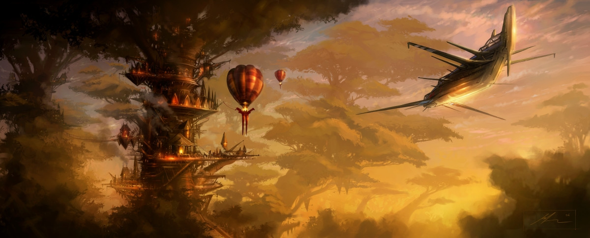
 skybolt — Tree House
Published: 2006-11-07 22:21:12 +0000 UTC; Views: 29661; Favourites: 826; Downloads: 525
Redirect to original
Description
3rd in the series (to Subzero/Afterburn).........4th coming soonThis was a piece I started a few weeks back, but I wasn't happy with it, so chucked it in a folder with all my other unfinshed work. But today I had another go, and made some major changes. Pretty happy with it now. Shame the compression loses all the detail.
Canvas Prints of this, and more wil be avaliable VERY soon. So watch this space for more details.
Hope you like?
Matt
Related content


Comments: 110

I'm gonna try to get in-depth of this one since I'm a digital illustrator and painter myself
Let's see...what is the focus here? The tree? The plane? Whichever it is, our eye is not leaded to it. And this is something important, to define a focus, a protagonist, in your images.
As far as I can see I'd guess that the tree is our main focus, ok. But, the problem both with the tree and the plane is that both merge their colours with the background they have behind'em. If you want to make something stand out, you should focus in colours and lighting. Yours are not bad but they could use some refinement, like enhacing contrasts and highlights, for example.
Well, 'till here the bad critique, but not everything is gonna be bad my friend
Technically, the amount for detail is impressive and the warm atmosphere created by colours is great, but I can see some unfinished spots like the bottom right corner, it seems that it could use some work.
Something that would be great for this image is more sharpeness. No, it is not blurred, of course, but it could use it. Just a though.
Conceptually I can feel tension in the ambience, because we don't know what's gonna happen or why those elements have been put in their concrete places. The plane adds the tension, I guess.
Overall, great piece with great detail and minor fails. Just needs some refinement but it is very good as it is. Congratulations
*2envision - your art through our eyes.
👍: 0 ⏩: 0

It looks like this place I dream about, called Treah.
👍: 0 ⏩: 0

i'm not really into that whole phantasy and sci-fi section and i'm a photographer.
but i have to say that the first impression of this art piece amazed me. I like how the plane stands for itself and the background is kind of schematic.
I can only guess how much details there are in the tree-houses-lights section. it's a pity that, as you said, a lot of details got lost there because of the smaller version here.
the only thing bothering me here is the light. i dunno... the yellow light at the bottom feels so "unnatural". somehow it makes me feel like something is missing. if i can word what i mean i'll tell you later. thanks for let us critique and talk about that.
*2envision - your art through our eyes
👍: 0 ⏩: 0

Is this all your design? If they are they are incredible.
I read a comment above that said the ship seemed a little out of place. The only think I'm concered about are the sharp edges and those balloons.
Haha. I love this ship though. It's a beautiful design. I'd love to have a model or something.
Anyways, I'm not usually into sci-fi so much, but this is beautiful.
Also congratulations on being the first featured.
-Tony
👍: 0 ⏩: 0

Tension was mentioned in one of the comments below... tension is what I'm feeling. This surprised me a little, because the reflection of the sun would suggest hope and a bit of cheer, especially since the angle of the sun seems like sunrise (though it might be intended as a sunset). The softness of the background should (the 'should' is just what I feel like I 'should' be feeling - hence the surprise) inspire calm; yet, strangely enough, it accentuated the edgyness. There is a very crisp, clean - and metallic quality to the focus of the picture. And this despite the warm, intimate colours you used! Did you intend this?
I think it's the lack of people. There is an indirect reference to living creatures, such as the... er, what should I call them? Okay, flying objects. But nobody is visible. Not a nose poking out, not a tail flickering. Mind you, that balloon has eyes. But they look scared.
This painting is absolutely wonderful. The contrast between the soft background and the sharp, detailed focus on the foreground tree house and the plane & balloons directs the eye - presumably exactly where you want it to be directed. I would very much like to go and explore there, and find out where everyone went. By the way, now that I'm thinking of the climb, the clouds between the trees (above the rope bridge) are a accentuated a bit too much compared to the bridge. The perspective a little off there.
Lovely theme. Seriously, I'd love to go exploring in that forest.
--
*2envision - your art through our eyes
👍: 0 ⏩: 0

Matt, this is a wonderfully imaginative and detailed painting. You have a lot of detail to the right back of the main tree as well, but the darkness obscures that wonderful detail. The great "rope" bridge is well designed and leads the eye, but then is lost in the darkness. I want to see all of your detail clearly visible to the viewers eyes. You put the effort in to do this wonderful detail, so let it be seen.
Your color palette impresses on me a military theme. The plane is very imaginative, and I find myself wondering about its purpose and how it is powered.
I feel a tension as I view the plane, getting a feeling it is going to fly into the trees or a near miss. Perhaps if the attitude turned to hint that it is in a turn toward the open area, I would lose that tension. A curiosity is, where is it going to land?
The tree to the left back of the distant balloon might benefit from a little more contrast and a smoother blend of the tonal changes to give it more of a realistic appearance and sense of midpoint in the distance.
You really capture my imagination with all the cranes and suspension apparatus. I am begging for a story with this. I think you stimulate a lot of curiosity and creativity in the mind of the viewer.
Matt, my approach to viewing art is not as much a critique of technique as what I see as one who looks to discover what the artist is trying to communicate, either to the senses, a story, an atmosphere. How does the art impact my emotional response.
Your painting gives me a sense of a functional operation of a work setting. I feel the tension and a sense of purpose in accomplishing a project, mission or simply sustaining life in a foreign setting. And now, the work day is ending and a sense of relaxation begins to enter into the atmosphere.
Wonderful work Matt!
Suzanne
2envision [link] - Your art through our eyes
👍: 0 ⏩: 0

first off I'm not a fan of science fiction/fantasy.. but I'm marveled by this piece. The compliments and the contrasts that you've included in it truly work together to make an incredible vista. You made mention that the compression caused it to lose some detail, if that's the case I would have loved to see it in it's original form, because this is just incredible. I'm not a painter so I can't find many if any faults at all, so well done!
*2envision your art through our eyes
👍: 0 ⏩: 0

first off, this is one of the most entrancing pieces on this site. I love the colors, the composition, but most of all the way you dealt with the subject matter. you really conveyed the dreamy/magical feel that people associate with the environment.
2 specific comments:
1) I'm not sure the red in the base of the balloon that is at dock fits the color scheme and/or feel of the piece. It sticks out.
2) The sleek, metalic look of the ship at the right contradicts the organic nature of everything else. I wish it were a balloon or at maybe some wooden glider or something.
peace,
keep it up.
I'm watching you.
👍: 0 ⏩: 0

I love the range of colours you used in this. The tree in front is intrigueing in subject matter- lots of questions come to mind who, what, why lives here, and that is excellent.
The plane and background are also well executed.
However, I am struck by a sense of duality. With the way the picture is structured, detail in front tree, blurry in back, there should be lots of depth. But it is not quite working for me.
*ponders*
It is almost as though there are two pictures side by side - one a wonderfully fantastic image of a world in a tree, with other, similar trees in the distance, and a second one where we see the plane come in -for landing?- toward the center tree.
I see it now - the plane draws the eye to the center tree, being very light and somewhat distant, echoing the colours in the plane.
And the foreground tree keeps drawing the eye towards itself, the eye wanders one tree to the left, right as far as the balloons and back to the tree.
I feel that if you introduced elements joining the left and right halves, this picture would become even better. I would have some of the light colours on the left foreground and some of the detailed subject matter pertaining to the tree society on the right, and the eye would take in the whole thing, not two halves.
Good work!
👍: 0 ⏩: 0

Well done, there is a wonderful atmosphere created here. Despite the loss of detail to conversion the image does still have a enormous level of detail. (IMO) The lighting effects that you have considered when creating the work are astounding, and really bring the piece to life. As far as constructive criticism goes, I am not experienced enough in digital painting to offer any useful advice. Congrats on being the first *2envision participant.
👍: 0 ⏩: 0

Okay, here’s my first shot at this one. I might come back with some more thoughts on the themes when I’ve had some more time to think about them.
One of the first things that struck me about this piece was the lovely mix between old and new… mixing trees and hot air balloons with the futuristic ship and certain elements of the buildings. The colour pallet is serene and I really dig the way the background fades into the colours of the sunset.
Although it seems as if it is perhaps there to give a feeling of depth of field, I feel as if the blurriness of the lower trees lose something. There is a nice notion of a mirroring between the shape of the foliage and the clouds of smoke, and the more background trees look fantastic… I just feel like a little more texture to those in the foreground could really help. It could also be interesting to play with the smoke/clouds/leaves thing some more as well, though that would be a rather difficult task… (which your painting skills do seem up to attempting.  (Smile)")
To help with the issue of the darkness of the left that Dave mentioned, while these may become lost because of compression, bringing out the lights and fires like those of the main tree would lift that area and balance it out. I also felt as if the ship could benefit with some very small details. Not to the extent that it would become cluttered, as its smooth form is a nice contrast to the much busier tree, but if some of the existing details were enhanced with very fine brush it could bring it out the match the level of details implied in the tree.
The strongest area of the image to me is that foreground tree, which is utterly gorgeous. There are some beautiful little details going on there (I especially like how the balloon looks almost as if it has dragon heads on there). The use of spindly, delicate construction has a beautiful, almost organic feel to it while still standing apart from the natural environment it’s situated in. I adore the mix of textures you have going on there and the almost jumbled collection of building styles which still fit together in a pleasing way. It gives the landscape a real ‘mongrel’ theme which goes great with the idea of ports and docks that the approaching ship implies. There’s also a lovely contrast between nature and technology, and a strong feeling of being at the border of somewhere, a great sense of transition and potential that is enhanced by the lighting.
In general I think this is a very strong piece with a wonderfully painterly style and gorgeous colours, with a very imaginative subject. It is let down slightly by some elements not quite matching up to the detail and clarity of the focal elements, but even so is very evocative, intriguing and beautifully executed.
And now I want to read about the people who live on that tree.
KT
*2envision - Your art through our eyes
👍: 0 ⏩: 0

This blows me away, It reminds me of a splash page in a marvel comic that mybrother showed me. Each and every bit of the page was covered with mindblowing detail and even if it was something minor like your sky for examle it was still amazing. I have nothing negative to say at all about this peice, its just amazing.
👍: 0 ⏩: 0

Being a photographer I look for overall harmony in an image. While this scene itself is harmonious in content, I think it’s a bit un-balanced. The darkness of the left third of the frame throws the image a bit off kilter for me. The darkness in the bottom right helps offset this feeling a bit but also allows for the image to look a bit slanted.
I’m a huge fan of negative space and I think the ‘lightening’ of the background really helps bring the plane to the forefront of the image and allows there to be a true ‘subject’ to the creation. It also gives a real feel of sunrise/set and creates a wonderful overall mood. Yeah, the background area isn’t a true ‘negative space’ but it serves the same purpose; to allow us to focus on the important.
I love the color choices throughout the piece. Wonderful earth tones abound giving a sense of warmth and comfort. It’s amazing how color can set a mood and you’ve done a wonderful job here IMO.
My first thought on this creation when I saw it (and before reading your comments) was ‘I wish there was more detail’. After reading your comments it’s obvious my thoughts were yours also. The one thing I do question about detail is in the tree. There seems to be some pretty detailed areas and then some really blurry areas. I’m guessing that’s not as much image compression as it is the way you created it. I would love to see the trees that are important to the image (forefront subjects) to be fully detailed and leave the ‘blurry’ trees in the background giving it some real depth of field and in return adding a lot more dimension to the image. As it is now, it’s looks a little flat to me.
Thanks for giving us the opportunity to view and comment on your art. I really enjoyed giving it a close look.
Dave
*2envision Your art through our eyes
👍: 0 ⏩: 0

Very beautiful vision! I guess it's a sunset, cuz the light is so warm - the reflections are great! I like is a lot ")

👍: 0 ⏩: 0

Wow. Amazing! There is so much detail! How long did this take you? I have always wanted to do concept art.
👍: 0 ⏩: 0

I like it, but at the same time, I can only think "Ewoks!"
")
👍: 0 ⏩: 0


This is an awsome image! Do you have a larger resolution one? It would be great as a double screen wallpaper
👍: 0 ⏩: 0

What an amazing piece! We're all glad you had a second go at it, otherwise we'd have been deprived of ever viewing this. There is such a grandiose feeling of adventure... and it looks like there's enough tree houses to go around. Well done!
👍: 0 ⏩: 0

Beuatiful image! I love the warm lighting; it gives a tranquil feel to the piece. The treehouse looks so darn inviting. Just the sort of place an adventurer would want to come home to. I like the contrast between the sharp, angular, man-made lines of the flying ship at the right with the organic and baloon shapes at the left. Great concept, with good balance and symmetry. Oh, and the painting technique is awesome!
-Peter
👍: 0 ⏩: 0


WOW ! So much detailing! and awsomenes.. there are no words.. im sorry,
its just too grand. It reminded me of the story I wrote last year. It had a scene like this... when the main character "look over the mount and saw this beautiful city of lights, attached to large thick trees. You could hear the ceremonies and jester rave. It was as so non-fiction as the fairy that was next to me. "
o.o!! Gawd I remember even what I wrote.. ish is suprised..

👍: 0 ⏩: 0

Seriously stunning.
This should have a lot more attention, because it's just gorgeous!

👍: 0 ⏩: 0

Everything but the aircraft looks simply freaking Amazing dude!!!! Awesome colors! Great mood!
simply amazing.... +Fav!
👍: 0 ⏩: 0


amazing! i would love to look through what you think scraps are : ).
👍: 0 ⏩: 0


The details on this are amazing. I love the style of trees combined with technological advances.
👍: 0 ⏩: 0


Really very beautiful... i think this one is probably my favourite piece
Excellent colours, composition and focus...hard to fault...
👍: 0 ⏩: 0

hey man,
GREAT work. your style has really evolved! come on MSN soon, i haven't talked to you ina long time.
👍: 0 ⏩: 1

Yo Dude
Thanks man, so has yours. Ive been on MSN a bit lately, not seen you online yet though
👍: 0 ⏩: 0


You are the master of lighting. Beautiful.
👍: 0 ⏩: 1
hummm not sure what that link is...
👍: 0 ⏩: 0

Awesome... I like the warm color scheme and the futuristic, yet primitive overall tone it has to it. I always like how you do your ships too.
👍: 0 ⏩: 0

nice!! i like the warm colors and the sens of gigantic space and big trees
👍: 0 ⏩: 0

I wonder if I should this to an architect if he can make me one? O.o +fav~!
👍: 0 ⏩: 0

IT IS MARVELOUS...(sorry for the scream) looks like an elves house in Heroes of Might and Magic or some sort of fantastic roleplay. In my opinion You sholud make pictures for roleplaying game. I will repeat this is MARVELOUS.
👍: 0 ⏩: 0

great job
the composition of the picture is put together very well.
and the colors are awsome!
👍: 0 ⏩: 0

I call dibs on that treehouse! Anyone occupying it at the moment, get out!!
👍: 0 ⏩: 1
| Next =>