HOME | DD
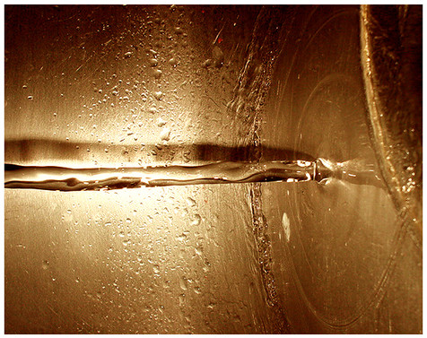
 skyfire — ANOTHERMODERNVIOLENCE

Published: 2002-10-09 19:41:05 +0000 UTC; Views: 1318; Favourites: 12; Downloads: 136
Redirect to original
Description
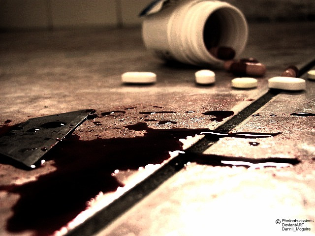
ANOTHERMODERNVIOLENCE. Print will soon be available for this.Related content


Comments: 30


Great image, great message conveyed well....
but 'anothermodernviolence' isn't centered underneath the red cross perfectly!
👍: 0 ⏩: 0


this is well thoughtout, i like the vibe this photo gives off....very creative. i may actually buy the print when it's made, +fav
👍: 0 ⏩: 0


i like this alot. the overall color tone of the picture is what i like the best, although the imagery is right up my alley. but i love photos where its got a greenish/yellow tint to it.
the blood is pretty thick and painty though. Maybe try a shot like this again, but get some fake blood at a novelty store...the fake blood is surprisingly real looking. And, although the repetition of the pills is nice, maybe add some varity? I'm not sure if it would give the same effect, but it would be a nice experiment.
overall, great work.
👍: 0 ⏩: 0

i love this shot....the blood looks a lil like paint....but its still fabulous great composition and i love the typo with the title
👍: 0 ⏩: 0

oh that's great *smiles*
hmm, reminds me i'm outa pills...ahhw shit...*goes away to get some more*
Vickie
👍: 0 ⏩: 0

Beautiful shot..emotional and very well done. Great work
👍: 0 ⏩: 0

very graphic statement, i think it's what studio photo of still life is about searching for visual metaphor more than abstract form. it's even better when merging both of them.
👍: 0 ⏩: 0


oh wow....pretty i hate the yellow light though, but i suppose u wanted it that way... anyways it's weird and cool and the wite frames really fit. good work
👍: 0 ⏩: 0


wow thats really creative nice idea! i love the lighting!!
👍: 0 ⏩: 0


"OH MY GOD...what happened?"
"You wanna phone the police?"
"No, let me shoot this first."
👍: 0 ⏩: 0

i really like this, the message, is fantastic, well thought out. i would like to see some other lighting sceneros though, maybe some cross light, side light etc. but i will probably have to order a print of this
👍: 0 ⏩: 0

i love it when i see images that were 'staged' .. or setup .. then photographed .. not randomly, but with a particular design in mind at the time of assembly.
chuck, you are an amazing artist and i have to say that i hope you continue in this working process .. its wonderful.
👍: 0 ⏩: 0

aw, see, ... now that table cloth is ruined!
Do you know how expensive those pills were, young man?
------------
Interesting composition. Nice use of lighiting. It'll make a great print.
👍: 0 ⏩: 0

I Like the concept and the lighting.
I would have made sure that the imprint wasn't visible on any of the tablets, however. L484=Acetaminophon 500mg
👍: 0 ⏩: 0

freaky. very good idea... powerful message. disturbing.
👍: 0 ⏩: 0

I bet it was more fun creating the image than anything else!
👍: 0 ⏩: 0

contraART Rating System
: Great Piece. it sends out a powerfull message. drugs are bad.
: the blood could look a little more realistic but other then that its perfect.
Overall:
👍: 0 ⏩: 0

wow.... this is a really good peice of art. i love the way you put the meaning, it just blares what your trying to get across
i dont think that made sence... haha, lets just say i love it!
👍: 0 ⏩: 0