HOME | DD
 skyfire — EndeavorV2

Published: 2002-04-14 19:51:49 +0000 UTC; Views: 1056; Favourites: 5; Downloads: 162
Redirect to original
Description
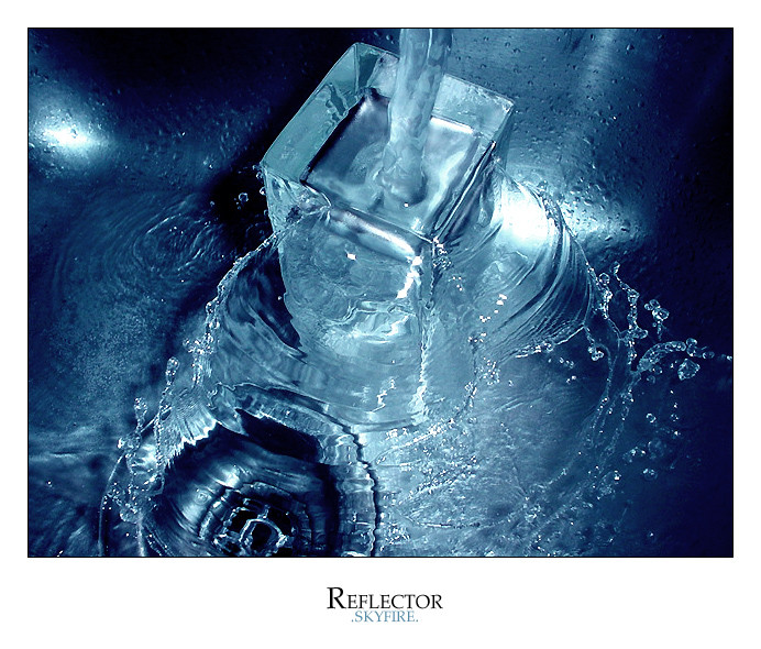
a variation on my Endeavor WP. i love these colors on my desktop...all bryce/photoshop. check out the other version also.Related content


Comments: 17


ooo.. weird, funky and definetely very cool
nice work!
put the link to the other version in the description. now i'm off to find it.
-----
worst signature EVER
👍: 0 ⏩: 0


that is a very nice WP.
It's only fault is that I didn't make it.
serious - ly cool piece of work there.
-----
F/S
👍: 0 ⏩: 0


awesome job, I hope to see more stuff like this from you
👍: 0 ⏩: 0

the color is pretty good, but the right lines/distorted parts kill it...
good work~
-----
Angel of the Night
Visit Angelworld now
http://angel.debugnet.com/
Version 7 - State of Iridescence
👍: 0 ⏩: 0

pretty good pretty goood, little jaggie here and there but its good!
-----
~(`¯¨²°ª•–¤~¤-•ª°²¨¯`)~
👍: 0 ⏩: 0


gj
-----
Better to die on your feet than live on your knees
please check out my Unity flag : https://www.deviantart.com/deviation.php? id=282499
👍: 0 ⏩: 0

yea this pic is good the thumbnail doesn't do this any justice, it has to be full viewed to appreciate you might want to loose the larger grids but it's not crucial I still like it lots
👍: 0 ⏩: 0

i really like the colors used here, it could probably make a really sweet splash page for a website.
The only thing i would suggest is smoothing some of the lines out, they look a bit un-antialiased.
-----
i r weasel
👍: 0 ⏩: 0

Cool man.. I love the colors, Shapes and offcourse the renders.. you gave me anew favorite... plus you go on my devwatch
👍: 0 ⏩: 0

Killer piece, I like it. Excellent work.
-----
WWW.insiteswebdesign.com
WWW.insiteswebdesign.com
WWW.insiteswebdesign.com
👍: 0 ⏩: 0

oh my god that's nice. i already added the other one to my faves, but i wouldn't of, if i'd known i would've gotten these colors out of it. fantastic!
-----
chaos
👍: 0 ⏩: 0

this spells coolness. I love the bright colours. Ok, when I saw the thunbnail...it looked something out of a car comertial! That is not a complement or a bashing. It is awsome!
-----
----------------------
.: :.
CrystalBlue3d.com http://www.crystalblue3d.com
DrominixStudios.com http://www.drominixstudios.com
👍: 0 ⏩: 0