HOME | DD
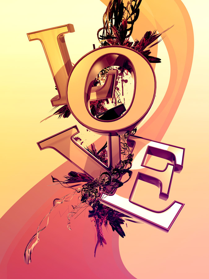
 smashmethod — What More Is There?
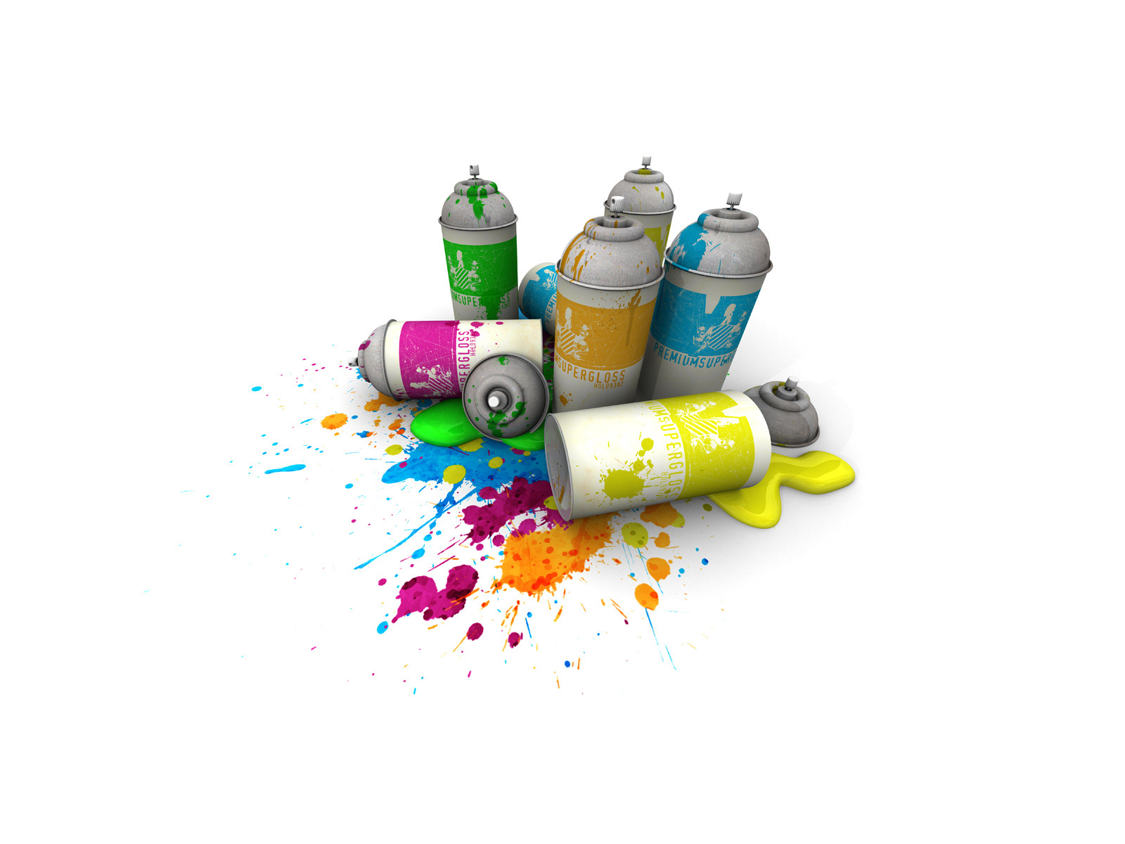
Published: 2006-11-27 03:47:20 +0000 UTC; Views: 23508; Favourites: 735; Downloads: 768
Redirect to original
Description
For tips and techniques on how to make digital art like this, check out my YouTube channel.YouTube: www.youtube.com/user/fictional…
Facebook: www.facebook.com/fictionalhead
Twitter: www.twitter.com/fictionalhead
Google+: plus.google.com/+fictionalhead
Portfolio: www.fictionalhead.com
Related content


Comments: 224


the render blend in well , and nice name ~
👍: 0 ⏩: 1

Thank you, it's from "Pig,' by Dave Matthews Band.
👍: 0 ⏩: 0

I like this - it works well with the part of me that is a big sap
 (Smile)")
👍: 0 ⏩: 1
Everyone's got a sliver of sap in them, nothing to be ashamed of.
👍: 0 ⏩: 0


I love the composition of this. What software did you use?
👍: 0 ⏩: 1

That is amazingly awesome... and shiny!
👍: 0 ⏩: 2

Tad too similar shinybarys stuff but I still like it
")
👍: 0 ⏩: 1

I really like the colour theme and what you did with the text, the renders are a nice touch.
👍: 0 ⏩: 1


I like it, dunno what it is about it, I think it might be the rendered shape around the letters...
Anyway +Fav
👍: 0 ⏩: 1


amazingly beatiful! I just love the renders and colors...not so sure about the spatters, though...maybe have more, or not have any at all? just a thought...
+fav
👍: 0 ⏩: 2

liking it dude, reminds me very mch of nik ainley purely because of the letters, but na it's quality, although bo good to see more stuff going on
👍: 0 ⏩: 1

Reminds me alot of shinybinary s typo piece
nice work
👍: 0 ⏩: 1

What more is there?
How about bird bones and feathers...?
Or that's what it seems like...
Me likes.
👍: 0 ⏩: 1
I forgot about the bird bones and feathers. Damnation.
👍: 0 ⏩: 1
You are fond of that word, aren't ya.
👍: 0 ⏩: 1
Used it twice in the last week, that borders on excessive.
👍: 0 ⏩: 1
I used "preposterous" three times, it's ok.
Or is it preposterous...


👍: 0 ⏩: 1

wow, just... wow. i love it. i want the print.
👍: 0 ⏩: 1

It looks and kinda just feels Romantic, ya know.
👍: 0 ⏩: 1

i like the blending of the abstract with the typo
👍: 0 ⏩: 1

oh wowwy!!!! That is soo cool!
I love the colors and the way, its set!
Lovely!
👍: 0 ⏩: 1


<= Prev | | Next =>