HOME | DD
 SnakePrince55 — Batman TAS - The Decline of Design
#animatedseries #batmantheanimatedseries #characterdesign #animationart
Published: 2024-05-22 05:29:53 +0000 UTC; Views: 8245; Favourites: 72; Downloads: 0
Redirect to original
Description
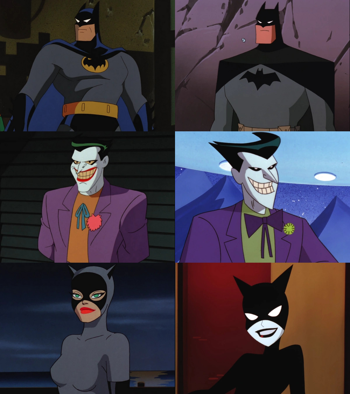
What you see on the left is the characters from the original Batman the animated series, what you see on the right is their redesign in the series fourth season. As the title says, yes it is clearly a decline in the overall design. I remember being just a preteen reading about the changes and even then once I saw them, I was very disappointed.I remember Bruce Timm saying that a significant reason for this redesign was for simplicity and more efficiency in dealing with the animation. Well it certainly wasn't for artistry or style. Now I know that TV animation demands greater speed and far more cost-cutting measures due to the fact that you're dealing with limited animation, but I have to say that there are numerous examples of shows that were able to make it work, and did not have to effectively butcher their own style. The styles on the left lend themselves to a fuller animation style and emphasize squash and stretch (to the utmost that you can do it on a limited animation Television style) as well as curvature of from (particularly Catwoman's!) and allow for greater sense of the ability to visually read the fluid motion. Moreover, a significant sense of style from character to backgrounds and layout was the Fleischer Superman theatrical shorts which emphasized mood, tone, lighting, atmosphere and a sense of a natural human movement in the characters (well that last part involved a great deal of rotoscope, but you can sense my point regardless) that allowed for a grand vision played out. It is completely understandable that budget and efficiency standards are different for a televised animated program in comparison to a theatrically distributed animated short, but there is a greater sense of organic feeling with what they attempted in the first three seasons of the program as opposed to that of the last season which featured the designs on the right.
I'll try to give my opinion on the design forms and hopefully you'll agree with me (but I'm just as pleased if you do not!)
To begin with Batman, I have always hated when either in the comics or the TAS they reverted from the oval symbol and the blue cape and cowl to the plain black bat symbol and black cape and cowl. I understand it's significance in Year One, but I always thought by the time of the fully developed confident Batman that we know and love by the time of his peak - his costume evolved to where it is effectively the colors of the night sky. Coupled with this is that when the costume was played out in the show there is a shimmering sleekness to it that showcases both simplicity and intricacy in its style and design. Additionally, it seems to be of the world of the Art Deco stylings that the series early seasons were known for. All in all it developed and showcased a Batman who was a crusader with finesse and sleekness in his inner focus as well as his outer cosmetic look. The style on the right I just have to say is utterly DRAB. Once again, the look harkens back to YEAR ONE (no, not Pre-Crisis Batman, for those of you who even know what that is anymore) and it makes sense in that story that Batman has a more, shall we say, "homespun" look - that is something simple and ready - particularly before he has spent time developing his tools and arsenal into their more developed and far more sleeker form. Thus you need to showcase that when he is beginning his crusade, he is more simpler in tools, appearance, and style. To argue that this is an evolution - Well I simply cannot accept that. And I am not trying to argue for it, simply to argue for it, but rather the costume on the left gives an immediate visual impact of bold dynamism, a Batman who symbolized the more wondrous and exciting look of the world he lives in - the look on the right is simply blase.....
Then we come to the Joker. Oh my what a drastic decline in overall design. The look on the right screams a sinister malevolence. The face with its yellow eyes, black lining around the eyes, the red lipstick and the yellow grin give it not only a ghastly and eerie human quality, but also the look of a figure you'd see in a nightmare. In a way he reminds me of a cross between Count Orlok from Nosferatu and Cesare from the Cabinet of Dr Caligari (not surprising since Conrad Veidt who played Cesare would also play Gwynplaine from the film, The Man Who Laughs - which was a significant influence on the look of The Joker) giving him a chilling inhumanly otherworldy quality that rides that line of the real and the unreal. This is all but missing in the profile on the left. They have all but eliminated those more devilish features resulting in a character who looks rather elfin. This is the version of the Joker they used to adapt the Harley Quinn Story, Mad Love. THIS VERSION!?!?! It lacks a real sense of menace, unease, and sinister malevolence. Like a lot of the villain designs in the fourth season it represents an overall missed opportunity.
And then we come to Catwoman. The style on the right is quite honestly a very lovely and elegantly sensual look that was composed for the character. Taking different elements including the Year One Gray costume that Selina Kyle wore, the belt that Julie Newmar wore on the Batman 66 version of the Catwoman costume and gave it a sleek and stylish elegance. Along with that was a proper juxtaposition of elements on the costume. The balance of black on the costume - the eyepiece of the mask, the long black gloves, the boots, helped to wonderfully play off the gray - and the addition of the golden ringed belt added a sense of style that also pronounced the curvature of the character. Plus, the ability to see her eyes gives a warmth to the character that is played with in many scenes (and often to her advantage!) Moreover, the style of the character worked to give a very elegant and sensual look in terms of her body which was presented in an athletic and voluptuous manner that when wearing the costume showcased her curves and her athleticism all at once (Along with the fact that she is voiced by the one and only Adrienne Barbeau and her husky voice fits perfectly with this character model). The costume on the right however - Well, not at all. Shifting to a total black outfit, and whiting out the eyes portion of the costume - it suffers from what I said about the Batman costume up above from the same season - it reeks of DRABNESS. There is no imagination, no style, and no sense of character. Also, the character is presented more as a type of uniform quality in line with Harley Quinn and Poison Ivy in this same season - in the sense that all curvature and sensuality of form is totally lost - All you have is a flat and angular style that gives off a type of lifeless design.
And on that last point, I have to say that I am still utterly surprised by that to no end when I think about the series and the people at work on it in any depth. Why would these characters appear so flat and lifeless. Bruce Timm, Ronnie Del Carmen, and Shane Glines were all working on this season in particular and their artwork is definitely not lifeless. All three can certainly draw superheroes, style, and WOMEN. Yet, here none of that is apparent - it all falls utterly flat.
Further, its not simply the design of characters that declines in this last season of the series - I find that nearly all elements begin to struggle. The general sense of atmosphere is gone, the overall wondrous ART DECO style - LOST, and the sense of dark majesty of the previous seasons - MISSING. Its really a sad state of affairs, but also you that around this time this effectively is the dominant sense of DCAU style for quite a while. By the early 2000s, Justice League is released on Cartoon Network - and while that is certainly a return to form in some manner (particularly the drama and the action) - the great sense of visual bravura, atmosphere, and sensual feeling of those early Batman seasons are all a thing of the past.
Hopefully, you enjoyed this essay - more in the future! And feel free to share your thoughts below!
Related content


Comments: 13

👍: 0 ⏩: 1

👍: 0 ⏩: 0

👍: 0 ⏩: 0

👍: 0 ⏩: 0

👍: 1 ⏩: 1
👍: 0 ⏩: 0

👍: 2 ⏩: 0

👍: 2 ⏩: 0

👍: 1 ⏩: 0

👍: 0 ⏩: 1

👍: 0 ⏩: 0
👍: 0 ⏩: 1
👍: 0 ⏩: 0