HOME | DD
 softer — Turn It Down

Published: 2002-02-01 12:07:15 +0000 UTC; Views: 1038; Favourites: 2; Downloads: 418
Redirect to original
Description
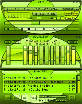
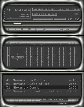
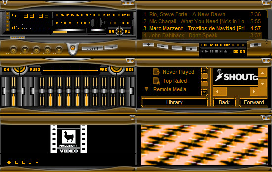
My very first Winamp skin. It probably looks like 1001 other skins but what the hey. It did originally look much different but then I discovered that you have no control over the positioning and size of the elements. I should really pay more attention. The scalability of the playlist and minibrowser window threw me a bit and consequently those windows look a bit dodgy.Hope you like.
Related content


Comments: 19

Just downloaded it, and I'm liking it alot!
-----
Rogue
...breathing is a foreign task and thinking is just too much to ask...
👍: 0 ⏩: 0

the color sheme rocks! I really like it. many skins look the same, but I like it. it's easy to use and has great colors (I love red and grey)
👍: 0 ⏩: 0

you're right, the general design looks like hundreds of other skins, but the colour scheme is quite original!
keep up the good work!
-----
p a u l o
👍: 0 ⏩: 0

Ass kicking great
jupiter like
-----
Jupiter is king
👍: 0 ⏩: 0

Great skin. i cannot believe this is a 1st skinning attempt!!!
👍: 0 ⏩: 0

not bad. I like the color of red used in this.
Proffasee :: Seeing The Future
__________________________
http://www.digitallypoetic.com
👍: 0 ⏩: 0


Good first attempt keep working!
Cheers!
// xjoshuax
👍: 0 ⏩: 0

You put a good skin together, great job for a first time. My only beef is that the metal looks blurry. Maybe it's on purpose. Good job none the less.
:agent:
This comment is provided AS IS without warranty of any kind, either express or implied. The entire risk arising out of use of the comment lies entirely with you.
👍: 0 ⏩: 0

nice job. i really like the change-of-pace colors.
👍: 0 ⏩: 0

Nice! Good work...especially for a first attempt to Winamp!
👍: 0 ⏩: 0

Looks very nice. Only thing you should redo is the buttons
👍: 0 ⏩: 0

GREAT STUFF!!!
Try to add more detail next time!
.:THK:.
----------------------------------------
When one has learnt love, he has succeeded in life no matter how he has failed otherwise
👍: 0 ⏩: 0

well done! great first go....
keep it up!
-------
I AM THE PENGUIN BOI!!!!
BEWARE THE PENGUIN MILITARY IS COMING!!
Marduke https://marduke.deviantart.com
-------
👍: 0 ⏩: 0

very good for your first attempt, blows my first attempt staright out of the water
-----------------------
Zlatko Kreso
Breed Skin Division Head - http://www.breedart.org
Project Pallus founder - https://projectpallus.deviantart.com
DeviantArt member - https://zkreso.deviantart.com
Plastik v4 webmaster - http://plastik.pillboxed.com
And occasional skinner
👍: 0 ⏩: 0

good skin for your first attempt, and I dont think it looks a lot like other skins, thats very good. I especially like the metal stuff, the titelbars are very stylish. But I think you should change the numbers.bmp too, its too bright, you should try to use a font of your own that makes a skin complete.
overall its a very good and original skin.
........................................ ..................
make love not war :: good guy revolution
👍: 0 ⏩: 0

hahah its does look like some of the other skin.. though it is a good skin for a first attemp... but a dark red isn't really my color...
The Darkest Realms Exist Within The Brightest Minds.
👍: 0 ⏩: 0

Top first go. The design itself is quite pleasing, but the colours are a little dull for my tastes. I think the numbers font could do with a change -- perhaps something a little more bold?
Skinning those resizable windows really throw you a bit, eh? I know, i've been there myself At least it'll be easier next time around.
👍: 0 ⏩: 0

It looks like a wallet to me for some reason. Still really good. Great Efoort for your 1st go
👍: 0 ⏩: 0