HOME | DD
 sone-pl — Simple Web Page Design 2

Published: 2007-10-29 09:17:14 +0000 UTC; Views: 62730; Favourites: 251; Downloads: 8036
Redirect to original
Description
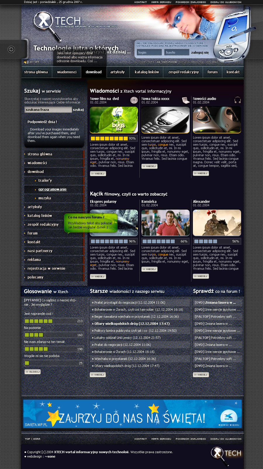
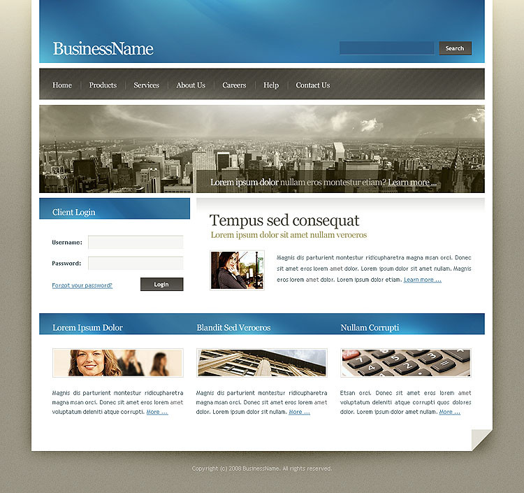
Simple corporate design (for sale)Related content


Comments: 31

I like the overall style and design :
www.psd2html5.co/
👍: 0 ⏩: 0

Your Design is so nice. And your color collection is so good. I like it very much.... Thanks
👍: 0 ⏩: 0


You really thought outside of the box  (Wink)")
Great job mate 
")
👍: 0 ⏩: 0


Excellent design !!
Which font do u use for navigation and header texts?
eg: About us, Company profile, Our team etc
👍: 0 ⏩: 0


Hi, great work you have there, i have featured your artwork in my Journal [link]
👍: 0 ⏩: 0

O..E.. Bez komentarza bo bardzo zajebiste proste. Też tak chcem!
Zostawię tylko po sobie ślad.
👍: 0 ⏩: 0

very nice simple, adaptable, pro design. what fonts do you use in headers and slogans? they always look so sharp and crisp, i never get them to look that sharp....
👍: 0 ⏩: 0

Czyste, czytelne , proste ale trzymające fason.
well done
👍: 0 ⏩: 0

 (Smile)")

do you use Myriad Pro font? great site I love the simplicity of it...
👍: 0 ⏩: 0


clean and professional, where do you find your great stock photos?
👍: 0 ⏩: 0

just one thing!
why did you used narrow/condensed typeface in title and main navigation link, when you keep such a good amount of space in your layout?
👍: 0 ⏩: 0

całkiem fajne choc fotki kojarza sie z inna, notabene lepsza Twoja praca
👍: 0 ⏩: 0


Problemy z zagospodarowaniem czasu? Jest świetny, nie mam siły na rozpiskę - może nastę
👍: 0 ⏩: 0


very simple work, but really does look nice indeed man
👍: 0 ⏩: 0
