HOME | DD
 sonic — Cyberoptic Wave

Published: 2002-03-07 01:44:14 +0000 UTC; Views: 3792; Favourites: 25; Downloads: 346
Redirect to original
Description
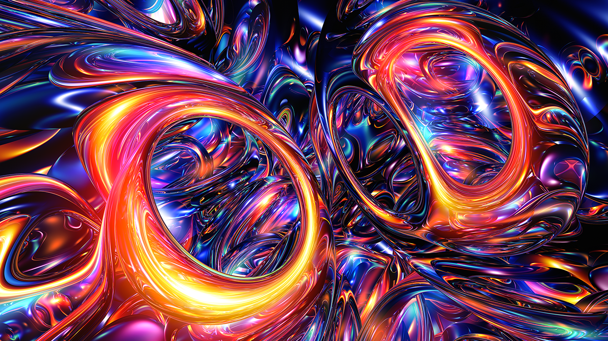
ahhh fun times heh i took some wireframes i made in max and some other things and i added em i also left a spot on the right for icons cause i get pissed when the icons cover up something so there lol ad no i dot give a shit if i spelt anything wrong in the wallpaper.Related content


Comments: 65

Of all your works, I think this is the best! Your real good at these things.
👍: 0 ⏩: 0


Hmm very nice peace. I like it, very good choice of colours, hehe the devine!!..
I like the movement of the wave too
great job
👍: 0 ⏩: 0

well this is nice tho the filesize is rude
And i think there's too much fireframe also
👍: 0 ⏩: 0

wow this is amazing im wondering how you made this !
i couldnt do things like that
SOMEBODY HELP ME !!!
-----
pLz drop some comments [link]
the true rulage of somebody can only be experienced by hitting a box thats inside his head while riding the wheelz of steel on the way to hell
( if somebody understands this :: plz note me cuZ i dont )
👍: 0 ⏩: 0

Wow very nice... great choice of color (Me wuv blue )
Its all put together very well...
Great job
-----
[link] (--Evil I tell you! EVIL!
I like Cheese ^_^
👍: 0 ⏩: 0

not a bad trendwhore peice!
-----
____ +++
___/ /¯¯¯siron+++ [link]
+++ ¯¯¯¯¯¯¯¯¯¯¯¯¯¯¯¯¯¯¯¯¯¯¯¯
👍: 0 ⏩: 0

this is really amazing... i love the lines and composier of this... great job
-----
Even God would stop the world every now and then to fix his mistakes
👍: 0 ⏩: 0

Awesome
-----
Grabule / Psychotronic & Apocalypse 999
👍: 0 ⏩: 0

I want! I want! I want! I want! I want! I want! I want! I want! I want! I want! I want! I want! I want! I want! I want! I want! I want! I want! I want! I want!
-----
.:: MorphishScum ::. Productions now operational
👍: 0 ⏩: 0

Very nice with a lot of depth.
-----
Avoid the Gates of hell Use Linux
👍: 0 ⏩: 0

really beautiful!
Nice color
-----
My pic [link]
My music [link]
My kitty IRUPE [link]
My best PHOTO [link]
NeninA
👍: 0 ⏩: 0

i like it but i am getting tired of that kind of look.
-----
the only difference between suicide and martyrdom is press coverage.
👍: 0 ⏩: 0

Nice but a tad to trendy for me.
-----
.caustic.
I hate numbers.
👍: 0 ⏩: 0

kick ass format like the creation
-----
material hazardous
👍: 0 ⏩: 0

the piece itself isn't bad...but the bright white is on the LEFT, not the RIGHT, and its THROUGHOUT, not threwout.
-----
Violence and Vitriol for eVeryone!
👍: 0 ⏩: 0

This looks great, nice color and nice everything
-----
----------------------------------
Come check out my graphics at [link]
👍: 0 ⏩: 0
Very trendy. I'm not really into trendy stuff, but I do like the colors in this piece.
-----
.caustic.
I hate numbers.
👍: 0 ⏩: 0


reminds me of a wallpaper i used to use for ls back in the day
-----
--------
between your ears
theres a million rotating knives
chopping apart the words that enter
sending them out through your mouth
👍: 0 ⏩: 0

I like, i like The Very Bright bits i dont like
But its really good
-----
_____Devotion to excel_____
👍: 0 ⏩: 0

Wow. This one is amazing. It has that sort of airbrushed/3D feel to it. Amazing. I really like how you overlapped the wireframe to crate the optical wire feel. Great job!!!
-----
---Caution: May explode or go berserk and cause serious injury if recharged, disposed of in fire, or dissassembled.---
👍: 0 ⏩: 0

OMG again, I am just speechless!~
love the colors!!!!!!!!!!!!!!!!!
nice job!!!!
-----
Angel of the Night
Visit Angelworld now
http://angel.debugnet.com/
Version 7 - State of Iridescence
👍: 0 ⏩: 0

OMG... my favorites have been waiting for this...
-----
Ed Nunes | sh4vo
http://www.soadweb.pt.vu
👍: 0 ⏩: 0


Sonic drops another fat wallpaper bomb on my desktop!
-----
http://www.smellkid.com
[Smellkid.com - an exercise in design]
👍: 0 ⏩: 0

*Wishing I didn't go to work before seeing this*
This would have brightened my whole day. And to think only a few months ago while working as my staff you have now grown to be an individual of such great talent. Sonic, you impress me everyday because I have had nothing but your wallpapers up.
*Remembers when the only way you could make graphics was if it was already made (DBZ character pictures)*
*laughs, to cover the cries, knowing that this once student of mine has grown to be such a great scholar*
👍: 0 ⏩: 0

The colors are beautiful! Very nice wall, makes me feel nice and cold.
-----
Proffasee :: Seeing The Future
__________________________
http://www.digitallypoetic.com
👍: 0 ⏩: 0

ah, damn man freaking schweet..
how do u ppl get wireframs into your renders?
👍: 0 ⏩: 0

looks great man, i love the chaos here, and the blue is great
-----
-
++The VS.: https://www.deviantart.com/deviation.php? id=204380
++The Colaboration: https://www.deviantart.com/deviation.php? id=191575
++TrickSoft:: http://www.tricksoft.net
++My Whore: https://ekud.deviantart.com
👍: 0 ⏩: 0

yeah jedeye it is lmao read the discription i said it in there heh o well im to lazy to read em to so screwit
-----
-------------------------------------
up..
👍: 0 ⏩: 0

You misspelled some words: Throughout and Future.
Its an extremely nice wallpaper. I like the colors and the style, as well as the addition of some wireframes. A very techno look.
The only thing I'd change is the font selection (it looks too thin) and the spelling, as I indicated above.
Good work.
-----
__________________
L Í Q Û Ï S Õ F T™
Viva La Revolucion!!!
👍: 0 ⏩: 0

cool, i know id use it as my background... but then people wuld see how much better u are then me, and i wouldnt want that!
.... by the way... you didn't hear me say that! got it?
lol, its real excellent
-----
dream... sulk... love... die....
-A.E.
👍: 0 ⏩: 0


Nice I agree with jedeye I think the left is for icons.
-----
some people are born to be artist, while others arent
Oh, and did I mention
rulz??? Chek out some of my stuff https://liquidsilver.deviantart.com/ That is my deviantart page.
This is his site http://www.jedeye.com
Thanks leave comments
👍: 0 ⏩: 0

very smooth sonic, but is it just me, or is it the left side that was for the icons? maby its just me
-----
May the Force be with you!
Jedeye.com http://jedeye.com
👍: 0 ⏩: 0

sssssssssoooooonnnnnnniiiiiiccccccc
how do you do it man? another great piece of work...vestigial tail up.
-----
[::VorteX Technologies::]
vtx.deviantart.com deviantART; vtx
vtx.homeip.net vortex technologies
👍: 0 ⏩: 0

Excellent dynamics, excellent piece! although i agree a coupla bits are too bright...
👍: 0 ⏩: 0

nice render and cool colours!
i agree with 7thsign about the bright side
-----
smoking
👍: 0 ⏩: 0

nice wall.
-----
5t3iggy
.:I decided i want you now i know...i need:.
👍: 0 ⏩: 0

A tad bit on the bright side, but a nice wall. Uhhm same problem again like your last wall, the text is not good. Either take it out or work on ot more. Nice render though.
-----
I mah
s!
👍: 0 ⏩: 0

Yeah that's a really cool work, you know I love your stuff man...
👍: 0 ⏩: 0

Cool. I like the blue and the harsh contrast. The chaos flow is nice. I don't like the text though. It may look better without any text, or just the title of the work
👍: 0 ⏩: 0

Awesome! *Is jealous of such talent* There's so much activity here, it's very much a picture that you can lose yourself looking into.
👍: 0 ⏩: 0

Love all the thin strands, gives it lots of movement. Very cool.
👍: 0 ⏩: 0

That is one sweet wall. Nice detail.
-----
Make
Not
👍: 0 ⏩: 0
| Next =>