HOME | DD
 sowmiles — audioplayer

Published: 2004-10-07 08:21:44 +0000 UTC; Views: 5223; Favourites: 12; Downloads: 1577
Redirect to original
Description
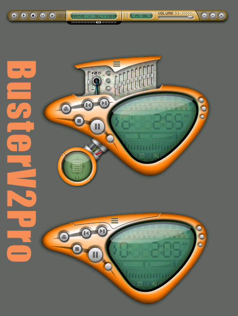
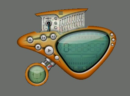
fire away! unfinished as you can see. rought scetch")
Related content


Comments: 21

 (Smile)")


")

Pretty good so far... I think "we" need to re work the color theme on the eq.
👍: 0 ⏩: 0

Beautiful lighting effects - especially on the power and pl-type buttons. I don't care for the 4 ellipsoid buttons as much - the reflection is too dull so that they look too photoshopped or plasticy. I'd prefer a glassier look that's more black. Overall it's stunning though!
👍: 0 ⏩: 0

That Player Kicks My Ass !!! Excelent Work 8)
👍: 0 ⏩: 0

it's great, especially with this background, colours are amazing, they compare with themself perfectly
really good lighting on volume "bar" what else.. hm.. nice shading on LCD
Take Care
👍: 0 ⏩: 0


I don't like the cbuttons at all, they look outta place, I think they would look better in the style of the 'power button'. The layout, shape, composition is ok, although there is quite alot of wasted space.
The vis area looks nice, I like the greeny colour of the vis itself. As always your lighting is brilliant, I reallly like the volume knob and surrounding area.
With some work, this could be another killa skin.
Work!
👍: 0 ⏩: 0

Sowmiles, great to see you back in the game! Love the shine effects on the power button and the orange ones. Clean, readable, and nice to look at!
👍: 0 ⏩: 0

a nice design
as said before, i think the cbuttons don't go..
also, perhaps give the bottom part of the skin a slight black gradient at its top..
👍: 0 ⏩: 0


Värvivalik on hästi hea: must, metalselt hall ja oranž... Keskel olev diplei võiks kuidagi rohkem esile tulla... kas siis mingi peen raam ümber vms...
 (Wink)")
👍: 0 ⏩: 0

rough? this isn't rough, this is hot! i love your concept and the surfaces. my hints to change:
- all the non-pixel fonts should be replaced
- the four buttons unter the main display and the pl/ml-buttons doesn't look very good (btw. a thinger isn't necessary anymore...)
all in all a very very cool skin - i will download the finished product - also looking forward for cool shade modes
👍: 0 ⏩: 0

