HOME | DD
 Speakerbox — Galaxis

Published: 2004-10-23 02:08:52 +0000 UTC; Views: 547; Favourites: 9; Downloads: 190
Redirect to original
Description
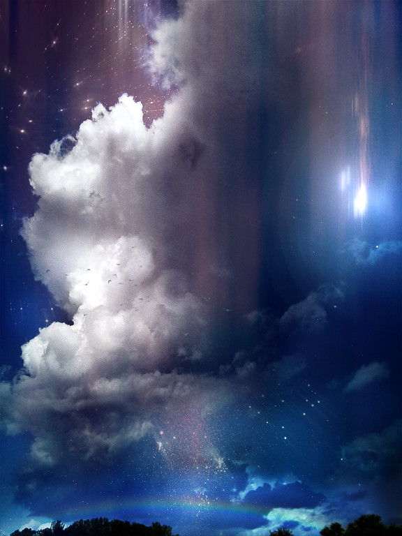
I used Terrastock's #32 terragen stock. ThanksOk, here is a story. Once, there was this little lamb, and it belonged to mary, just kidding.
This is my first space scape, so I'm still learning
Favs and shit are cool
Edit: I changed it up abit, got rid of the bad things, the original is here [link]
Related content


Comments: 9

Well your a freakin good space artist! dude that's beautiful! Awesome job for your first. Keep going!
👍: 0 ⏩: 0

very nice planet , and i like the starfields. dont really like the colors, kinda dull in the bottom. good sci fi pic tho
 (Smile)")
👍: 0 ⏩: 0

I like it a lot, especially the way you touched up on it...
👍: 0 ⏩: 0

DEaMn .. that thing rocks the shit outta this place, i love how its dark and mysterious and the brushign and such rocks.. kickass job yo
👍: 0 ⏩: 0

^_^ I never noticed that, let me fix that, and reiy, no prob, critique is what I like
👍: 0 ⏩: 0

the only thing i dont like is the stars on the ground, but everything else is amazing! for your first time. i love the brushing you did in space and i like that cloud effect on the planet and the colors are cool too nice overall job just fix those stars on the ground!
👍: 0 ⏩: 0

I agree with reiyumekai about the stars on being on the landscape but that is an easy fix, other than that great job! I am also trying to learn that kind of art!
👍: 0 ⏩: 0

it's good, but im not liking that smudging too much..
👍: 0 ⏩: 0

not too bad for your first spacescape. a few things to improve:
the stars should not show up "on" the terragen landscape. I'm not sure why you did that. otherwise, it's implemented pretty well.
brushing for space scenes should usually be subtle throughout the whole piece or focus at one or two points. the brushing is actually pretty good in the bg, but the part in front of the planet doesn't look very well (the smudged look isn't very appealing).
lastly, the atmosphere around the planet should only show up on the light side; having it on the dark/shadow side of the planet hurts the perspective.
don't take the critique too hard, I'm just trying to help.
 (Wink)")
👍: 0 ⏩: 0