HOME | DD
 spellbound — Flowing Shapes v2
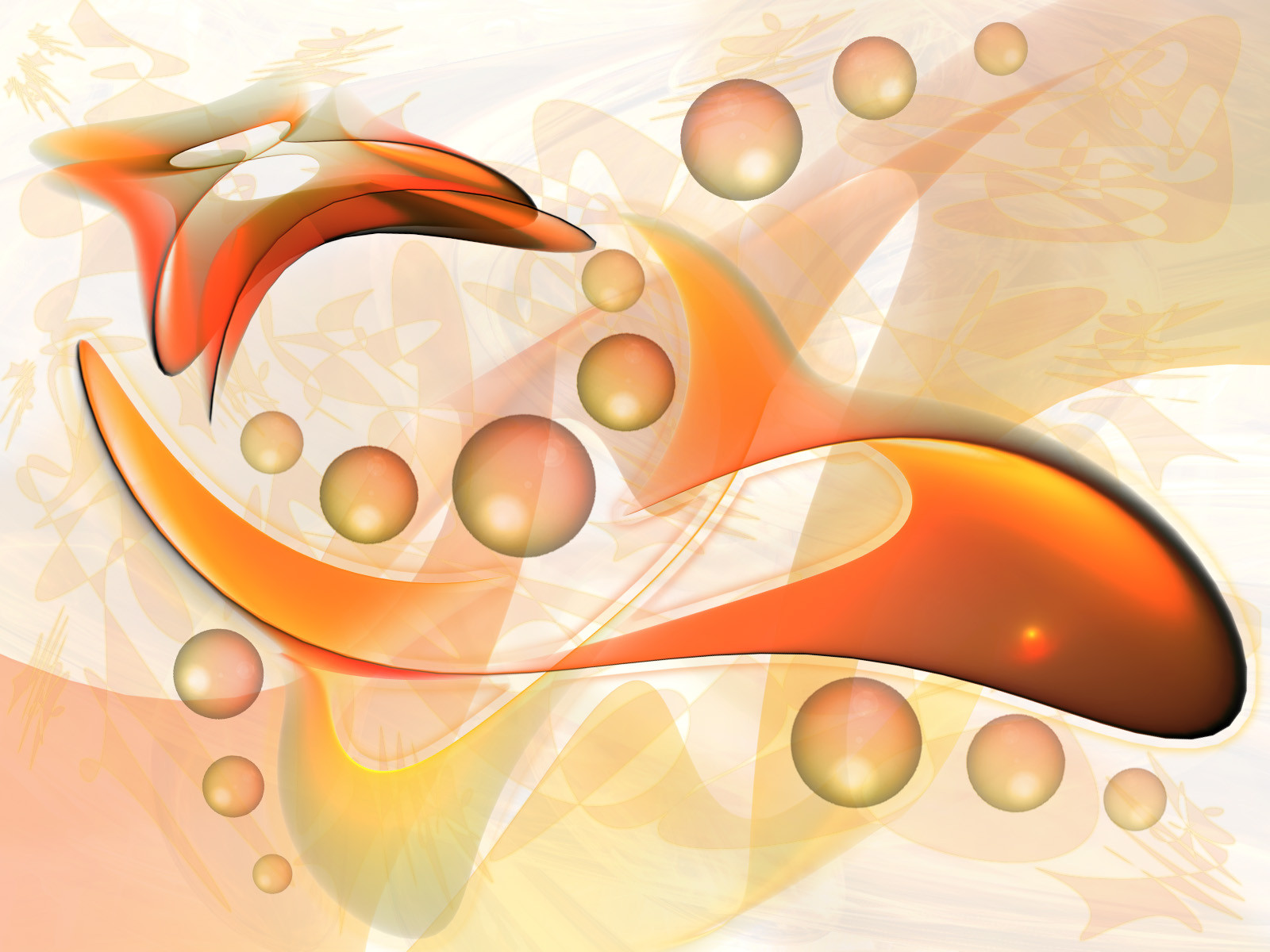
Published: 2002-09-10 11:44:04 +0000 UTC; Views: 22614; Favourites: 73; Downloads: 5081
Redirect to original
Description
played around in photoshop a little bit morethe 2 renderings are made in 3dsmax
here is the [link] to version 1
do you like the changes?
-----
my newest deviation:
[link]
Related content


Comments: 86


")
👍: 0 ⏩: 0
👍: 0 ⏩: 0


 (Smile)")


👍: 0 ⏩: 0


wow, yes it's really nice, I like those fresh colours you have used. And shapes... it looks a bit like orange juice
 (Wink)")
👍: 0 ⏩: 0


I like the orange and white color scheme of this, the simplicity of this is a welcome change. Overall this is a clean piece good work
👍: 0 ⏩: 0


This is truly amazing work! +FAV and my new desktop!
👍: 0 ⏩: 0


Very very sweeet! Doesn't make me think of goldfish so much as orange creamsicle Like it a lot.. definately more progressive than your first version. Cheers man!
👍: 0 ⏩: 0

This looks brilliant.
I really like the textures and colours.
👍: 0 ⏩: 0

I love the changes! Such smoothness and the colors are awesome. Great work!
👍: 0 ⏩: 0


I dont like the background at all, but it´s definetly one of the best works i´ve seen lately on 3d style. Sweet orange
👍: 0 ⏩: 0

apart from blue, orange is my other love... nice work
👍: 0 ⏩: 0

^-- what the girl said. it's very low quality in terms of composition.
pretty colors though.
👍: 0 ⏩: 0

composition is lacking and i see jagginess all over... blurryness too.. bleh sorry .. it could be better.
👍: 0 ⏩: 0

:/ am i loadin the wrong file? idunno.. seems too......... IDUNNO... it's not even asdlkfj;lasd man screw it.. i should add to fav's for the f.k of it..
like OMG AWESOME +FAVS.
i'm just being honest.
👍: 0 ⏩: 0


i like it. a more interesting approach to the abstract pics. the colors are so interesting, and the bg just makes you wanna stare at it more and more to absorb all those abstract shapes and details.
👍: 0 ⏩: 0


teknoavatar [2002-09-11 04:53:58 +0000 UTC]
this is awesome art
this uses many shapes in teh background, awesome coloring, and looks very abstract *the background* but the shapes in the middle bring focus to the picture
great work
👍: 0 ⏩: 0
clearblood [2002-09-11 04:47:16 +0000 UTC]
very cool--reminds me of stingrays. Also, great pallete with the subtle greens and grays.
👍: 0 ⏩: 0

hmmm. The jaggedness makes me mad. The colors dont go with me at all. And the shapes, well i like em.
👍: 0 ⏩: 0

it's cute. sorry o.o;; that's the very first word that popped in my head when i saw this. it's cute ^^!!!
👍: 0 ⏩: 0

Love the changes you made... and the color is a nice change from the more popular blues/greens used by most DAs here. (myself included)
👍: 0 ⏩: 0


Oh very nice! The additions you made are great, because they blend everything together better. love it!
👍: 0 ⏩: 0


well i forgot to say this is quite origonal so i give you props the render coupldve been smoother but nice work man .
👍: 0 ⏩: 0

Wow!! Everything about this is great: colours, shapes...
+favs!!
👍: 0 ⏩: 0

plan9: daily top faves... ::sigh::
yawn2oO: who huh wha
yawn2oO: lemme see
plan9: look at it
plan9: [link]
yawn2o0: o what?@!
yawn2oO: ya.. what the fuck happend to people who like art?@!
yawn2oO: welcome to deviant high
plan9: thats soooo bad
plan9: these people are like sheep, I think...they see it in daily top faves and automatically just figure its good
plan9: so they just +fave it and leave a nice comment
*** no offense intended. .. it just doesn't appeal to me.
👍: 0 ⏩: 0
Deviant: ~plan9 (#44)
Date: 2002-09-10 18:35:03
Vote: Dislike Deviation
Wow..I uh..I dunno what to say. I dont like it at all. There doesn't really seem to be any composition or though given to it, just random shapes plopped onto white with nothing else. The colors dont really appeal to me, they look kind of muted and washed out. Im just not feeling it, at all, sorry...
👍: 0 ⏩: 0

Dang ... that looks so friggin smooth ... so awesome....
👍: 0 ⏩: 0

Wow..I uh..I dunno what to say. I dont like it at all. There doesn't really seem to be any composition or though given to it, just random shapes plopped onto white with nothing else. The colors dont really appeal to me, they look kind of muted and washed out. Im just not feeling it, at all, sorry...
👍: 0 ⏩: 0

My new wallpaper!
This is some good sheeit, man!
👍: 0 ⏩: 0


not bad, you need to clear up the jaggies though.
👍: 0 ⏩: 0

Great image. I love the colors. I'm not a big fan of reds, oranges and yellows, but you made them look really great! Pretty cool how the shapes fit together.
👍: 0 ⏩: 0


hmm.. i like this..the colors go really well together.. good job!
👍: 0 ⏩: 0
| Next =>