HOME | DD
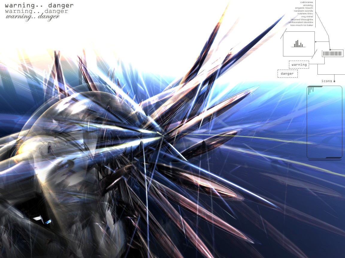
 spin — warning danger
Published: 2002-07-25 12:59:24 +0000 UTC; Views: 610; Favourites: 2; Downloads: 75
Redirect to original
Description
warning.. danger.. warning.. danger..Related content


Comments: 15

i like it very like, o a give +fav
----------->>
Maverick
P.S thanks for comment my wp
👍: 0 ⏩: 0


very cool design...but i agree with the other guys...the txt is not so good.....but good job anytime..
👍: 0 ⏩: 0


For something along the theme of danger, you should probably use red for your primary color. But yeah, I really do like what you've done with it. It's very pleasant on the eyes. And oh, the warning danger words on the left corner looks odd. You should probably use the same font for them, and perhaps just vary the size and intensity for them. Just a suggestion. Keep up the good work!
👍: 0 ⏩: 0


very nicely done spin, good job.
The 3D forms look great
👍: 0 ⏩: 0

I love the all the different colors you used, it sort of reminds me of something from [link] . Nice job
👍: 0 ⏩: 0

Whoa wicked cool! i love the image, i love the colors!! AWEsOME job!! Great sharp effect!
👍: 0 ⏩: 0

man!! that freakin rules! those shapes and the color kick ass, that other guy's right tho the text is kinda unneccessary but it still rulz!! good job
......*sniff*......i wish i had 3dsmax
👍: 0 ⏩: 0

the 3D shapes look pretty good, but the warning danger text repeated 3 times in different fonts isn't necessary. the part you left for the icons is a good idea
👍: 0 ⏩: 0